

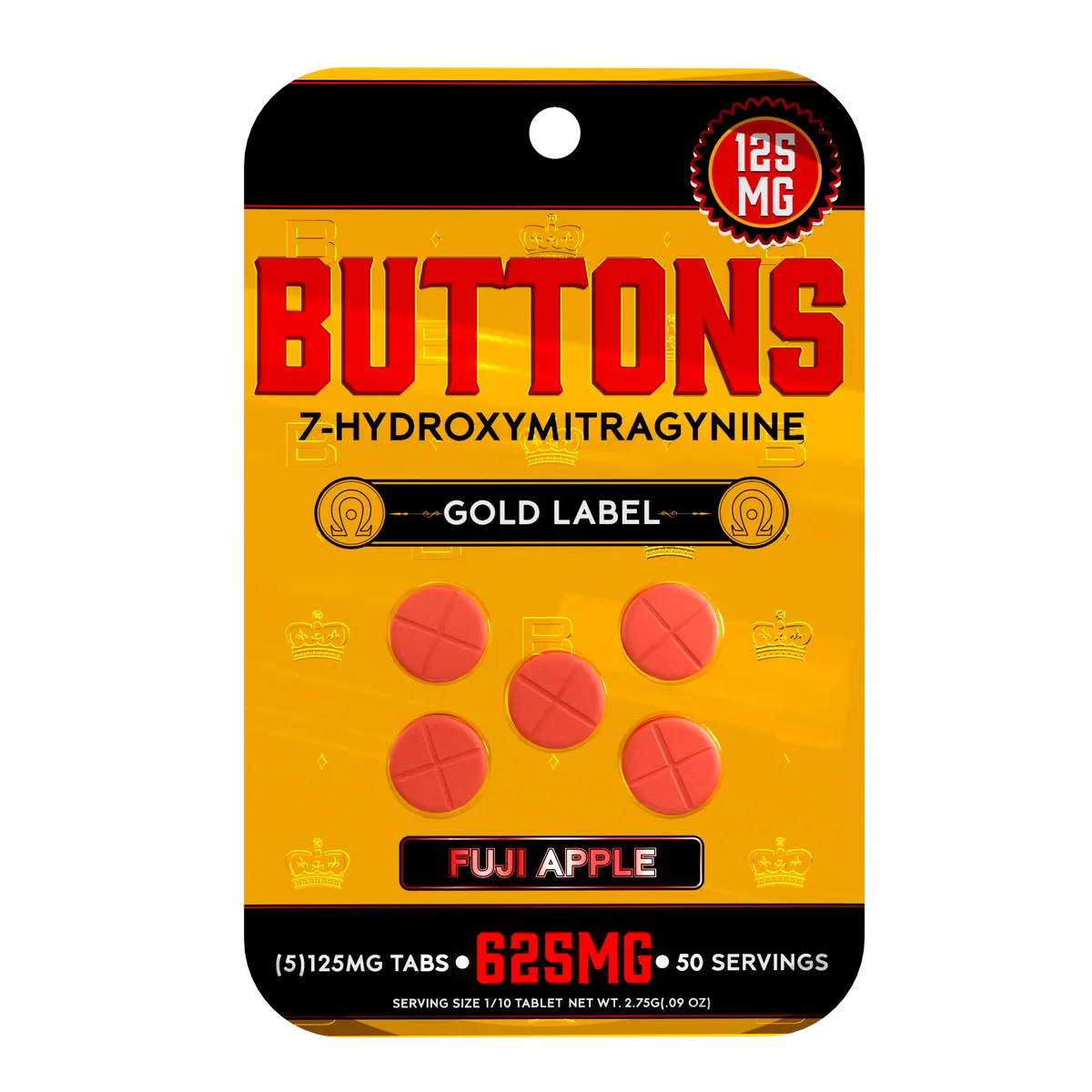
A 7-hydroxy packaging brief needs a clear product description before it needs a visual direction. The intended format, dimensions, approved label information, and destination all affect the space available for design. This resource explains those packaging decisions and how they connect to Mylarmen’s design and production-coordination work.
Product authorization comes first. Review the FDA’s current 7-OH notice with qualified advisers before commissioning packaging for a proposed product. Design work cannot establish that a product may be sold.
Choose the format around the contents
Start with the actual product dimensions, proposed quantity, and filling process. A package chosen from a photograph may leave too little room for the product or its information. Compare physical samples and supplier specifications before building artwork around a container.
- Flexible pouches: establish filled width, height, depth, seal areas, and the approved closure.
- Containers and labels: measure the usable label area, curvature, lid, and any interruption from seams or ribs.
- Cartons and sleeves: check the contents or inner pack against the structural drawing and identify every visible panel.
These are format considerations, not a claim that each option is appropriate or authorized for a particular formulation. Material suitability and any closure requirements need their own documented review.
Make the product information easy to read
The front panel should help a reader identify the product accurately. Supporting panels can organize the remaining approved information without squeezing it into a last-minute block. Establish that hierarchy before choosing decorative finishes.
For a range of products, keep names, units, and counts in consistent locations. Color can help distinguish versions, but the text should also identify the difference. A customer should not need to remember which color belongs to a particular specification.
Bring the right inputs to the design discussion
A useful brief includes an approved product description, the intended market, physical samples or measurements, quantity options, the number of artwork versions, and the label text supplied by the responsible business. Provide the dieline or container drawing when one has already been approved.
If the structure is still being considered, identify which measurements are confirmed and which remain open. That allows a design conversation to stay focused on the actual package rather than promising a production specification too early.
Review materials and finishes separately
Ask for the construction and material specification that will be supplied. Matte, gloss, foil, and other visual treatments affect how graphics appear; they do not by themselves establish barrier performance, recyclability, or shelf life. Any such claim needs documentation relevant to the proposed package.
Check contrast in a physical proof, especially where small text sits on a reflective or dark area. Fold lines and closures should remain clear of information that must be read after the package is assembled.
Connect the design to a controlled proof
Agree on the approved structure, text version, and artwork for each SKU. Review the package at full size and confirm the exact relationship between the container, label, and any secondary carton. Record the approved version so a later production file does not accidentally reintroduce outdated wording.
Read the packaging review guide for information and documentation questions, or the 7-hydroxymitragynine branding resource for identity and range consistency. For a broader view of our work, explore Mylarmen’s packaging and branding portfolio.