
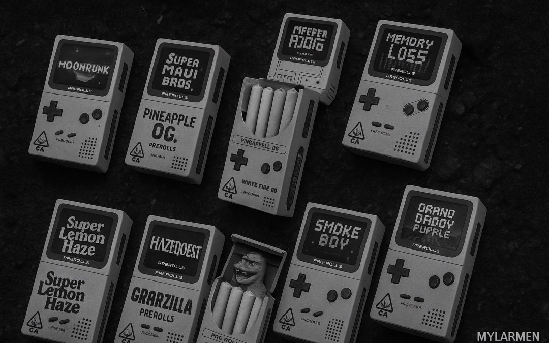
You only get one opportunity to create a first impression. This well-known statement is particularly true for the cannabis sector, where rivalry is fierce, and packaging is the primary thing that grabs potential customers’ eyes.
Because the success of a hemp brand often hinges on its packaging, we’ve compiled a list of the best cannabis packaging designs that are worth looking up to. These styles exemplify elements that can help you stick out a mile, whether you’re revitalizing your lineup or launching a new product.
Best cannabis packaging designs are great-looking but obey regulations
Think laconic color palettes, simple geometric shapes, or dynamic flair with an extraordinary vibe. Enter a luxury and restrained style or nature-praised looks that emphasize the origins of the product. These visual trends run the show in the industry in 2024.
When looking closely, you notice that each successful design appeals to a distinctive group of shoppers – innovators, thrill-seekers, and so on. On the other hand, some designs directly work out specific requirements inherent in the industry. For example, a nature-friendly message on the package could be in line with general attempts to push manufacturers to use biodegradable and recyclable packaging materials.
In addition to sustainability, here is what else shapes things in the hemp and marijuana sectors:
- Essential information. Standout packaging is a delicate dance between innovation and regulation. The most effective designs integrate warning labels, dosage instructions, ingredients, batch information, and more without sacrificing eye appeal.
- Child-proof closures and imagery restrictions. Regulations across various regions mandate that hemp products must be packaged in a way that prevents kids from accidentally ingesting them. Plus, the industry faces strict rules on imagery and branding that limit the use of cartoon characters and overly bright colors.
Besides, like in other sectors related to perishable items, cannabis packaging must keep the optimal level of freshness. That’s why the top-rated designs often include additional protection for what’s inside.
10 Best cannabis package designs: Dissected and studied
Restrictions or not, it’s impossible to miss out on impressive aesthetics and thought-out design elements. Feast your eyes on these 10 stunning styles, each of which can be your source of inspiration to turn your packages into a magnetic force that pulls customers in.
Astro Labs
By thinking outside the box, the brand has created packaging that forges a multi-sensory experience. It uses sleek cylinders that look like they could house moon rocks rather than disposables. The smooth, cool-to-the-touch surface invites handling, while subtle ridges provide excellent grip and visual interest. It’s a perfect example of how a space-themed design can transport consumers to another dimension before they treat themselves to the product.
KOI
KOI proves that pouches hit all the right boxes for CBD products. It draws inspiration from its namesake with packaging that mimics fish scales. Its pouches are made with one-off textural elements that guarantee an easy grip for users. Combined with a pearlescent finish, such a surface creates a mesmerizing effect that stands out in dispensaries and shoppers’ hands.
Flav
Color-based aesthetics have made a strong comeback, and Flav has been quick to capture this trend. Its rigid packaging is a delightful throwback to when hemp products were easily distinguished by hues. Flav’s swirling patterns and vibrant colors immediately catch the eye, while metallic accents give their goods a refined feel.
Fire Cannabis
This brand has cemented its position in our “Best Cannabis Packaging Design” ranking as it successfully shows how the old-school cool meets contemporary flair. Fire Cannabis takes a different approach to a vintage-inspired vibe, opting for a more subdued look. Its packaging often features muted colors (as compared to Flav) and typography that harks back to apothecary labels of the early 20th century.
Dosist
Dosist has mastered the art of minimalism and stands out as a prime example of fancy aesthetics. Its elegant pen-like devices come in white packaging that wouldn’t look out of place in an Apple store. The plain design is complemented by subtle, color-coded labeling that instantly communicates how strong the product is.
Canndescent
Canndescent follows a different route by switching to a more luxurious feel. Even though it still appears minimalist, the brand adopts radiant orange as a basis and plays with it to create a high-end look. Each strain is associated with a specific effect, represented by a compelling catchphrase. This clever use of color psychology and easy-to-predict experiences aids in product differentiation and makes a visually coherent lineup.
Living The Dream (LTD)
We have ranked LTD among the 10 best cannabis packaging designs because it leads the way for an adventure-driven style. The brand is known for the ingrained perception of the hot pink color, which you can see from any corner of a dispensary. LTD’s packages communicate energy, youth, ambition, and rebelliousness. They mirror and intensify the values that are popular with many consumers in 2024.
Level
Level’s packages put together a blend of extra-large typography and subtle graphical elements. The brand name, set in a custom typeface, is accompanied by geometric shapes that resemble the Tetris game. The color palette usually serves as a backdrop for the bold lettering, creating a sophisticated look.
Hippies
Despite the name that evokes associations from the ’60s, any hint of old-school charm is minimal here. The brand’s packaging combines muted tones and circular geometric patterns. The slightly rough paper adds a tactile dimension, while metallic highlights signal that Hippies vapes are in the elite category.
Growfather
Growfather has done an excellent job of using negative space. This style allows the typography to breathe and gives every jar or bottle a modern feel. The brand sticks to matte black with gold accents, conveying a sense of luxury and exclusivity for its pre-rolls and other goods. It distinctly caters to those who view cannabis as a premium product.
All these examples show that the best cannabis packaging design may incorporate different elements and features, given that they live up to consumers’ expectations and create a cohesive brand experience.