

When sales flatten, which layer is broken? Teams often answer with a redesign. The logo gets redrawn, the palette warms up, the pack comes back from the printer looking sharper, and a year later the same customers still can't explain why they should pay more for it. The expensive part isn't the design work. It's fixing the wrong layer.
A brand and a brand identity aren't the same object, and they don't fail for the same reasons. One lives in customers' heads as meaning, reputation and expectation. The other is the system a business controls: names, marks, colour, type, imagery, packaging structure and the rules holding them together. Treat them as one object and every commercial problem starts to look like a design problem.
The brand vs identity distinction isn't semantic housekeeping. It's the difference between a measurable input and a market outcome, and it changes what you test, what you budget and who owns the fix. What follows separates the two layers, gives you tests for each, and sets a limit on what a new pack can deliver.
Table of Contents
- Brand vs Identity Defined and Compared
- Visual Identity Elements That Shape Perception
- Measuring Identity Separately From Brand Performance
- Keeping a Product Range Consistent Without Sameness
- When to Preserve Identity and When to Adapt It
- Choose the Starting Point and Sequence
Brand vs Identity Defined and Compared
A brand is the accumulated meaning, reputation, associations and expectations people attach to an organization, product or service. Brand identity is the system of signals the organization deliberately creates to shape those associations. That framing comes from a review of brand identity research published in the Italian Journal of Marketing, and its operational conclusion is blunt: identity is the controllable input, brand is the market memory that develops over time.
The academic concept took shape in the early 1990s, though its ingredients (names, symbols, marks, product presentation, reputation) are far older. David Aaker's work on brand equity in the 1990s helped establish brand identity as a distinct concept, and his later framework describes identity through four perspectives: the brand as product, as organization, as person and as symbol. Those four lenses still work as a diagnostic. Ask which of them the packaging is carrying, and a vague brief turns into a concrete one.
The two layers differ on every criterion a business uses when deciding what to change.
Brand versus identity at a glance
| Aspect | Brand | Identity |
|---|---|---|
| Core question | What do people think and feel about the company or product? | What signals does the company control to shape that? |
| Typical contents | Reputation, associations, expectations and trust | Name, logo, colour palette, typography, imagery, packaging, tone and SKU architecture |
| Who controls it | Shared with customers and the market | Set by the business through guidelines and production files |
| Speed of change | Builds over years of exposure, product experience and service | Can change in weeks through a redesign or packaging refresh |
| How you know it works | Preference, trust, repeat purchase | Recognition, correct attribution and clear positioning on each SKU |
| Usual owner | Leadership and marketing strategy | Design, packaging and production teams |
Read the speed and owner rows together. A redesign can ship in weeks, but the brand outcome it was bought for arrives on the market's schedule, which is why a fast identity change sold as a fast brand fix usually disappoints.
Packaging makes the split concrete. A logo, colour palette, typography system, packaging structure and SKU architecture are identity assets. The recognition, trust, perceived quality and loyalty that follow are outcomes in the brand. If you need the narrowest version of this argument, this explanation of the difference between brand identity and logo is a useful companion, because a mark is one asset inside a system, not the system itself.
Five-minute test: ask five customers to describe the product with the logo covered. Sort every comment into brand (meaning, trust, preference) or identity (a cue they noticed on the pack). Whichever pile is thin tells you which layer to work on.
Visual Identity Elements That Shape Perception
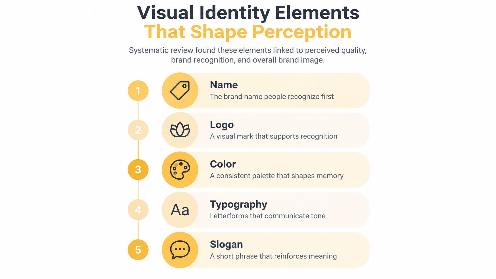
Identity elements rank by how quickly a shopper registers them, and the ranking holds on a shelf, in a marketplace thumbnail and in a social feed. The five below form the recognizable core.
Name and logo do the retrieval work
The name is the retrieval cue, the thing a customer types, says out loud or repeats to a friend, so it has to survive being heard once. The logo is the visual shortcut that confirms the name is the right one. Test a mark at the sizes it will appear, because a logo that only resolves on a presentation slide is a liability.
That's why our logo work covers primary marks, small-size use and one-colour applications, the three conditions a pack, a shipping carton and a regulatory panel will each impose on the same drawing. If you're commissioning a mark for the first time, these logo design steps for founders set out the decisions that come before any drawing starts.
Colour, type and slogan carry tone
Colour is the element people recall before they can name it, which is why it's worth owning one hue rather than a palette of equals. Typography sets tone through weight, width and spacing long before anyone reads a word. The slogan sits last in the hierarchy because it confirms meaning rather than creating it.
A packaging system adds form, type hierarchy, imagery and finish to that stack. Those choices communicate category fit and quality before a customer reads detailed copy, which is the practical reason a visual system defines colour, typography and image direction together rather than one at a time.
Recognition happens in a first glance, so the brief should be built around what makes customers pick your product in 3 seconds rather than around a mood board. The final check is a thumbnail test: shrink a mock pack to the size of a search result and confirm that both the brand and the product type are still legible.
Measuring Identity Separately From Brand Performance
Identity and brand need separate scorecards because they move at different speeds. Identity is the expression a business controls through names, logos, typography, colour, imagery, packaging and product architecture. Brand is the market-level meaning, promise and associations that form in response. A 2025 systematic review of small-business branding keeps those layers apart, splitting conceptual identity (values, vision, positioning, attributes) from visual identity (logos, fonts, colours, imagery), and finds that brand orientation affects performance indirectly through brand identity while consistency and congruence across touchpoints strengthen trust and growth.
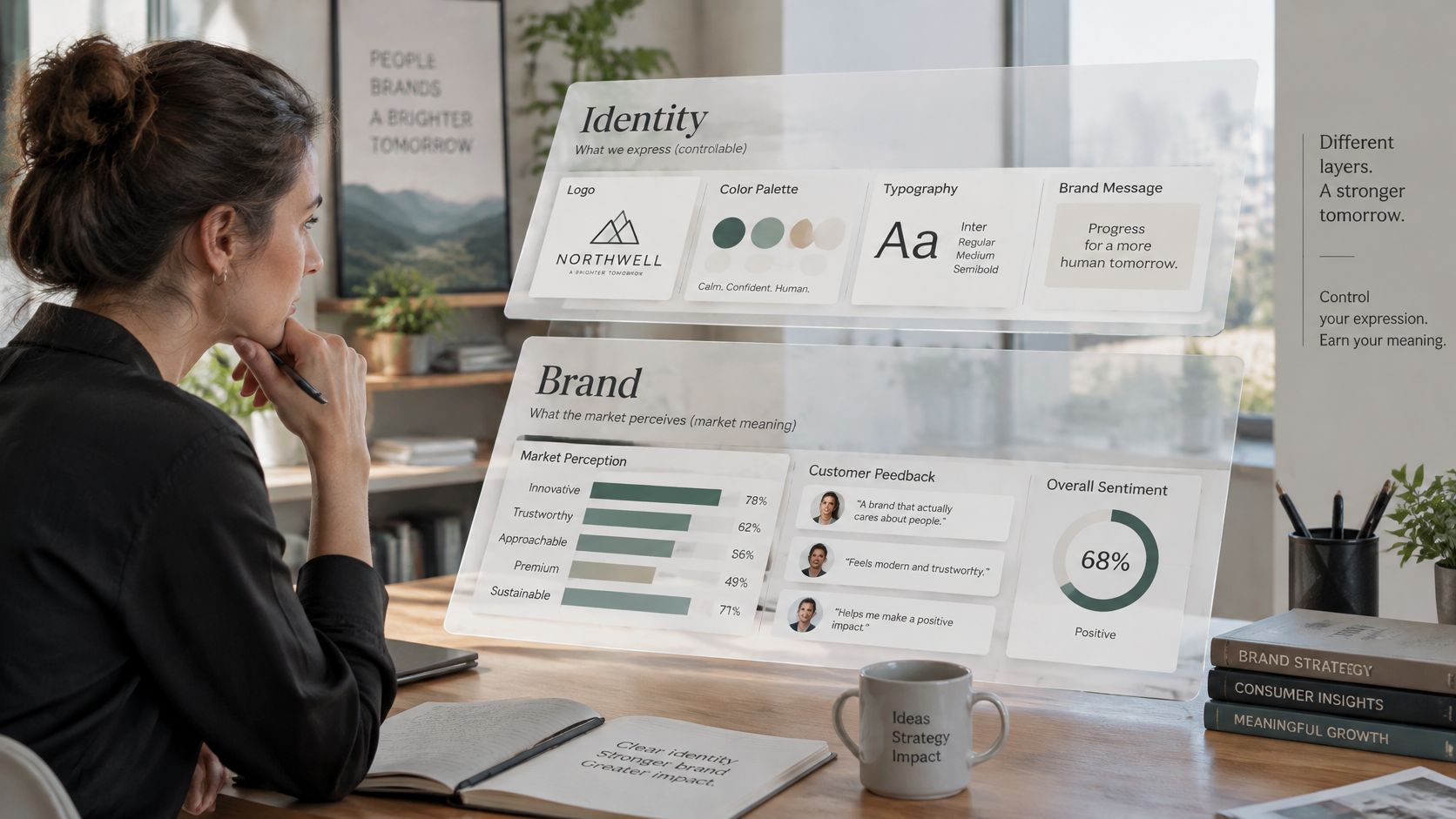
Two scorecards also settle an argument that otherwise runs on taste. When recognition is strong but trust is weak, the pack isn't the problem, so a refresh won't move the number. When every SKU looks like a different company, the positioning is probably fine and the execution isn't.
The split also sets a working sequence. Run the checks before any redesign to get a baseline, then run the same checks after. A lift in aided recognition with no lift in trust confirms the identity layer moved and the brand layer didn't, which tells you where the next spend belongs.
Seven checks and what each one tells you
| Check | Layer it tests | What a weak result suggests |
|---|---|---|
| Aided recognition | Identity | Distinctive assets are too generic or inconsistently applied |
| Unaided recognition | Brand | The cues aren't stored in memory yet, so exposure or distinctiveness is short |
| Attribution from the pack alone, name hidden | Identity | The visual system can't carry the brand without the wordmark |
| Message association | Brand | The promise isn't landing, even where the pack is recognized |
| SKU-family attribution | Identity | Variant coding is too loose, or so uniform that SKUs blur |
| Production artwork error rate | Identity | The standard isn't documented tightly enough to survive a print run |
| Preference and trust | Brand | Product experience, proof or claims are the issue, not the artwork |
The most expensive diagnostic error in this table is treating a brand-layer failure as an identity-layer problem. A packaging refresh can improve recognition while leaving product quality, service, availability and claims untouched. BERA's 2025 metrics framework, drawing on responses from more than 59,000 consumers across eight markets, found consistent quality across online and physical experiences was the leading customer-experience driver, at 25% of the UK index weight, 22% in the United States and 21% in Germany. That framework also separates leading indicators such as meaning and uniqueness from lagging ones such as familiarity and regard. Read together, the pattern is that identity can win attention and still lose the sale to an inconsistent product experience.
The reasoning behind the two-scorecard split comes through faster in conversation than in a table.
We build identities at realistic sizes and test monochrome reproduction, narrow panels and the longest variant name early, before artwork is locked. Those four checks cost an afternoon; fixing them after plates are made costs a reprint. They also give the artwork-error row above a clean baseline, since an identity documented tightly enough to survive a print run scores low on errors by default. For the wider measurement picture, brand marketing fundamentals covers how recognition, association and preference get tracked over time.
Keeping a Product Range Consistent Without Sameness
Portfolio consistency can be scored instead of argued about. A 2025 peer-reviewed study of UK packaged-goods branding analysed 125 brands and 1,023 products across nine categories with a Portfolio Branding Cohesion Metric, which rates how consistently branding elements are applied across variants on a 0 to 100 scale. The sample average was 65 out of 100 (Journal of Brand Management portfolio branding study). A range can hold a strong individual pack and still lose recognition when colours, logo scale, typography, information hierarchy or distinctive assets drift between formats.
That gap between a respectable average and a broken shelf is exactly what a cohesion audit exists to expose.
How to run a PBCM-style audit
Start by naming the core elements that must appear on every SKU: master mark, core hue, primary typeface, signature asset, family name. Score each product from 0 to 100 against those elements, awarding points only when an element is present and correctly applied at the size it ships at. A logo that survives on a full-size carton but disappears on the smallest format counts as a failure, not a near miss.
Weight the high-salience cues. The mark, the core hue and the family name carry recognition. Secondary graphics and photography carry variety. A missing logo costs more than a swapped background image, and the scoring should say so.
Report two numbers. The portfolio average tells you how the range reads as a family. The lowest-scoring SKU tells you where the range breaks, and that pack gets fixed first because it is the outlier a shopper's eye catches. An 80-point average can hide a 30-point product that teaches buyers the range has no system.
Pair the score with a findability test. Time how long someone takes to locate the brand on a shelf or in a digital feed, then ask them to name the variant. A high cohesion score with slow findability means the range is consistent without being distinctive, which is a different problem requiring different fixes.
Fixed and flexible elements across a product range
| Element | Keep fixed | Can vary by SKU or channel |
|---|---|---|
| Logo and wordmark | Master mark in every application | Scale and clear space adjusted for small formats |
| Primary colour | Core hue held within a set tolerance | Secondary accent shifted to code flavour or strength |
| Typography | Primary typeface and hierarchy | Size and weight adjusted for thumbnails |
| Signature imagery or pattern | Distinctive asset on every SKU | Photo subject changed per variant |
| Variant names | Product family name | Descriptor changes for flavour, strength or size |
| Claims and regulatory panels | Required wording and placement | Language adapted per market |
| Packaging structure | Shape and closure family | Size and insert changes by format |
Consistency is not identical repetition. Retain the fixed assets and the structural hierarchy, then code the variant through controlled colour, flavour or strength signals. The business case for doing so deserves careful wording: much of the research linking consistent presentation to revenue growth relies on self-reported survey data, so read it as directional evidence rather than proof of cause.
Our packaging branding projects can cover visual identity, artwork systems and applications across a whole range, so variants are designed together rather than one at a time. Brand guidelines then set the rules that keep the visual identity consistent once production files start moving between suppliers.
Launch rule: no new SKU goes to press until it passes the identity checklist, and the lowest-scoring pack in the range gets fixed before the next one is added.
When to Preserve Identity and When to Adapt It
Most redesign budgets get spent on the wrong layer. Identity works as a modular system: some parts carry recognition, others carry context, and each fails differently. Preserve the recognition assets: the master mark, the name, the core colour family and the type hierarchy. Adapt the parts that carry context: density, language, claims hierarchy, format and imagery. Change the first group and you rebuild memory at full price. Change only the second and the brand stays findable while the pack stays relevant.
The evidence for treating these signals as load-bearing is broad. A systematic review of brand visual identity research published through MPRA identifies the name, logo, colour, typography and slogan as core elements and reports effects on perceived quality, brand personality, satisfaction, loyalty, favorability and purchase intention. Experimental research in the Journal of Brand Management suggests biomorphic visual elements can shift responses through perceived sustainability and credibility, improving likability and purchase intention.
Consumers reward stability more than novelty. A 2025 Clutch survey on rebranding and consumer response reported that 80% of consumers said brand consistency affects purchasing decisions, and 52% preferred brands to keep a consistent look and feel with only modest updates every few years. Read together, those numbers support a stable core with controlled change around it, and they make a standing redesign cycle hard to justify.
Preserve or adapt by situation
| Situation | Preserve | Adapt |
|---|---|---|
| New flavour or strength | Logo, colour family and type hierarchy | Variant colour code and descriptor |
| Marketplace thumbnail view | Logo and primary colour | Simplified layout and larger product name |
| Entering a market with different language rules | Master mark and core brand assets | Language, measurements and mandatory panel wording |
| Regulated or health-related claims | Brand name and core assets | Claim wording backed by evidence |
| Insert or secondary panel | Typeface and colour palette | Reduced detail and simplified layout |
| Pack refresh after several years | Recognisable assets and name | Finishes, photography and spacing |
| Full rebrand after a positioning change | Nothing by default; review purpose first | Name, identity system and packaging together |
Read every situation through the Preserve column first. A quick test separates the two groups: if customers still pick the brand out from the mark and colour alone, the recognition assets are working and the problem sits in the adaptive layer. The last row is the exception. A genuine positioning change reviews everything, because assets that express the old position keep the confusion alive no matter how well they are recognised.
Compliance sits outside this trade-off. Quantity, identity and required information must stay legible on every format, and decorative finishes should never crowd out approved wording. A metallic finish is a visual choice. It offers no evidence of protective performance, so a foil flourish has no business covering the panel a regulator will read.
The decision rule costs nothing: classify the situation, find its row, then open the artwork file. Skip it and a packaging question becomes an identity overhaul. That is how teams end up rebuilding recognition when the problem was context, or repainting context when the position itself had moved.
Choose the Starting Point and Sequence
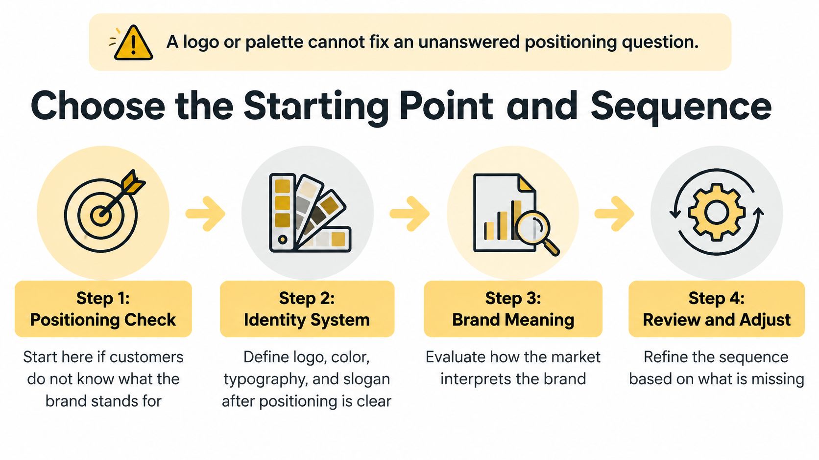
Sequence is a diagnostic choice. A logo or palette cannot answer a positioning question, and a sharper position cannot rescue a pack that customers cannot find, read, or tell apart from its siblings. Route the problem before anyone opens a design file.
If customers cannot say what the brand stands for, start with positioning. Design work will only decorate the confusion.
If they know the brand but cannot tell SKUs apart, start with the identity system: variant coding, hierarchy, naming logic, and the rules that hold the range together.
If recognition is high but trust or preference is low, review the product, the claims, and the proof before touching artwork. The pack is doing its job; the belief around it needs evidence.
The six-step sequence
1. Define the brand meaning. Decide what must be said, to whom, and what promise sits behind it. Reason: identity assets are answers, and an answer without a question is decoration. The usual slip is booking a designer before anyone can state the promise in one sentence.
2. Confirm the product, dimensions, components, quantities and sales route. Reason: panel space, structure and hierarchy all come from the object and from where it is sold. In regulated categories, establish the permitted role and product plan first, because a finished logo does not resolve an unanswered licensing or product question. The slip is designing a label before the container and channel are settled.
3. Translate the meaning into identity assets. Naming and positioning cover the name and the story behind it; the identity system turns that into wordmarks, logos, colour palettes, typography, image direction and graphic rules. Reason: guidelines set clear rules that keep the visual identity consistent when suppliers, SKUs and channels multiply. The slip is a guideline that describes a mood and leaves artwork decisions to whoever opens the file.
4. Extend across SKUs and formats. Build one master structure, then code the variants inside it. Review the range together, including the longest variant name and the smallest format, before any single SKU becomes the template. Reason: variants designed together share a family resemblance that variants designed in launch order never do. The slip is treating each new flavour as a fresh design project.
5. Prototype and proof at real size. Check primary marks, small-size use and one-colour applications, then test monochrome reproduction, narrow panels and the longest variant name early. Reason: screens flatter artwork and hide weak contrast, while required information has to stay legible on every format. A metallic finish is a visual choice, not evidence of protective performance, so finishes should never crowd quantity, identity or approved wording.
6. Launch, then measure the two layers separately. Track recognition and attribution for identity, and preference, trust and repeat purchase for brand. Adjust whichever layer failed. The slip is watching sales alone, which cannot tell you whether the pack was invisible or the product disappointed.
That order mirrors how the work is scoped: brand identity projects start with what the brand needs to communicate and where the identity will appear, while packaging projects start with the product, its dimensions, the brand, and the way it will be sold.
What the brief should contain
A precise brief is part of credibility. Put dimensions, components, quantities, artwork responsibilities and approval steps in one document, and name who signs off at each stage. That gives design, engineering and production the same object to work from and keeps late decisions from reopening settled panels.
The commercial upside of getting the layers right is real: Fresh Bros increased its retail sales by 30% in one month after a rebranding by Mylarmen. Treat that as evidence of impact, then diagnose which layer earned the change before copying the surface.
If you are mapping which layer to work on first, this guide to brand development strategy walks through the sequence from positioning through packaging.
The brand decides what must be said. The identity decides how it is shown. Any change that starts in the wrong layer gets paid for twice.
Mylarmen is a studio offering branding, packaging design and production, with services spanning naming, positioning, identity systems, wordmarks, guidelines, type and lockups, artwork systems, prototypes and manufactured stock. If the problem could sit in either layer, bring the product, its dimensions and the way you sell it; that is enough to find the right starting point before anyone draws a logo. Visit Mylarmen to see how identity and brand come together on real packs.
Powered by Outrank