
BPM
Keep the beat up.
Branding and packaging for BPM, a 3 g nootropic chewable sold as a night-out product rather than a supplement — from smoke shops to bars and nightclubs. A chrome 3D wordmark drawn from retro Miami club graphics, three gradient families lifted from the lights of the room, and a sachet-and-counter-box system that takes the whole identity a different colour for each of three flavours.
A party for everyone
BPM gives the night its rhythm. A patented nootropic blend supporting energy, euphoria and sensation, sold on the moments it extends rather than on what it contains — from smoke shops to bars and nightclubs, for people who want to move through the night on their own terms.
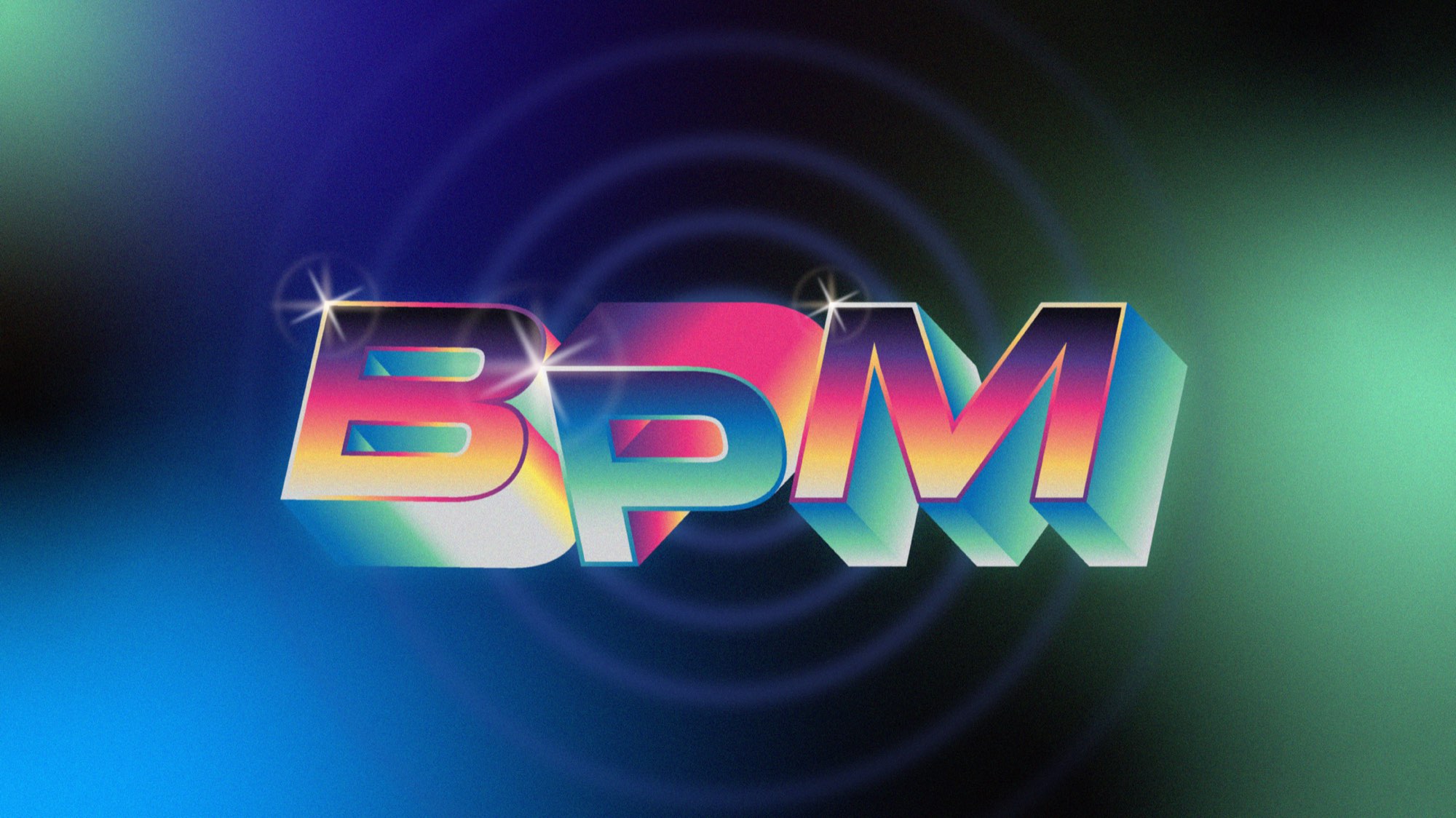
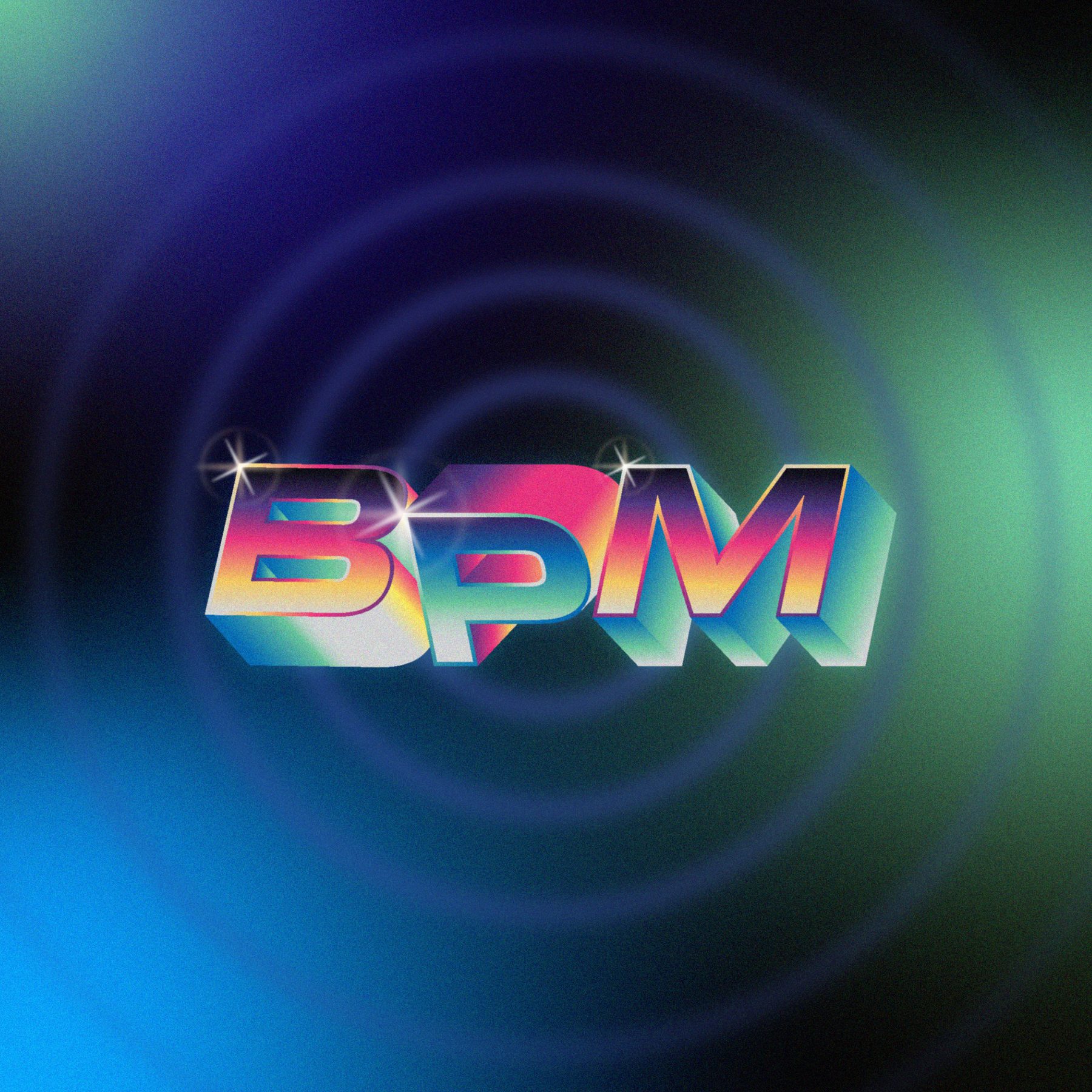
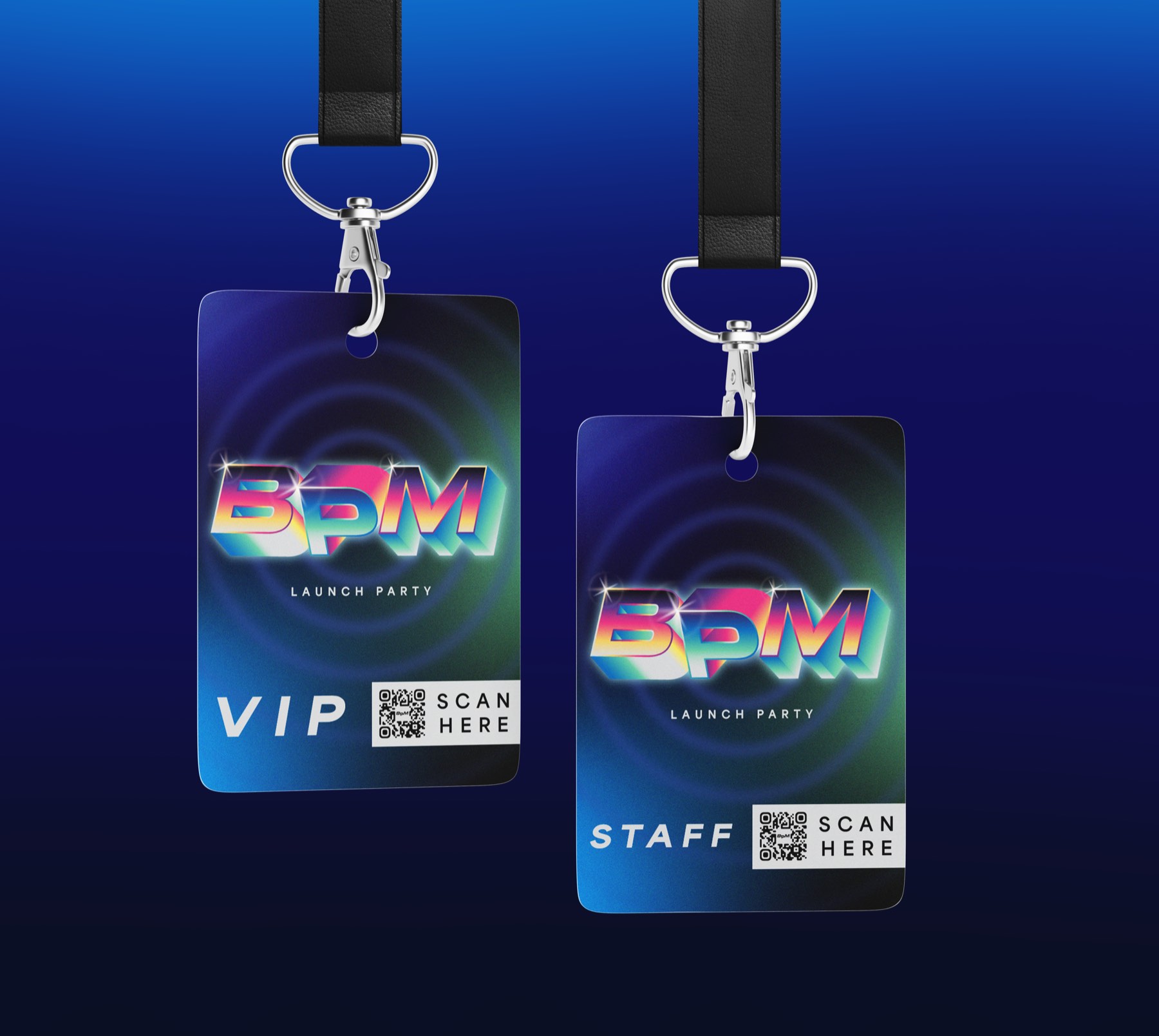
The mark blends music and motion into a multi-perspective 3D form. Its dimensional construction reads as the up and down of the beat; its chrome finishes carry the energy and excess of retro Miami. It runs in three cuts — full-colour 3D as the primary, a monochrome 3D vector for black-and-white, and a flat 2D vector for small sizes.
Motion, light and energy
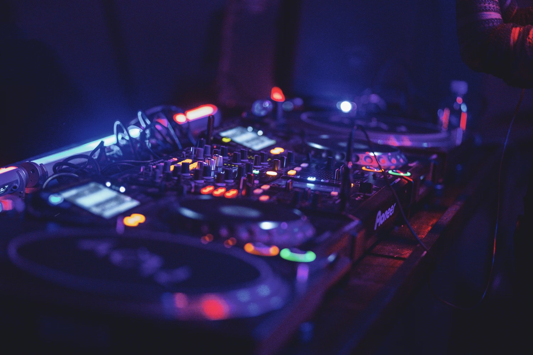
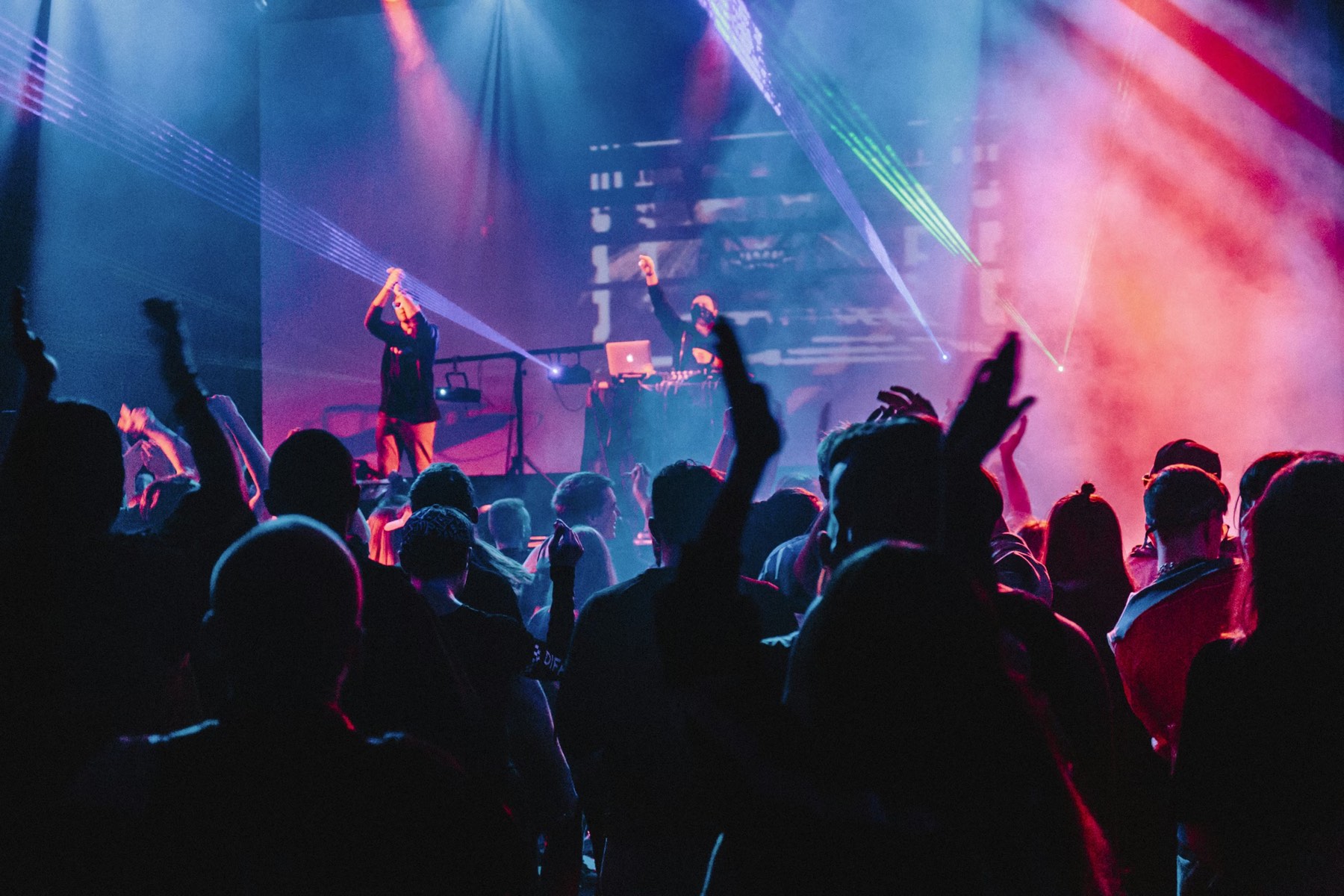
The identity is rooted in nightlife and retro Miami club culture — energetic colour on a dark foundation, layered with graphics borrowed from music production: audio level meters, control dials, pulsing indicators. The photography follows the life of the night: the anticipation that draws people out, the thrill of not knowing where it leads, and the moments with friends old and new that turn into memories.
Levels, dials and pulse
A small kit of graphic elements does the work around the wordmark — a levels graphic, a volume dial, a glare, the concentric pulse and its container, and the split-tablet mark. The palette is wide but organised into three gradient families: Sunset, from Afterhours Violet through Strobe Magenta to Encore Yellow; Club Lights, from Phase Blue to Harmonic Mint; and Night Sky, from Midnight into Subwave Indigo.
Type is the Area family — Extended Black Italic for headlines, Bold and Regular for everything else, with the letter-spacing opened up outside body copy for a little mystery and edge.
One sachet, three temperatures
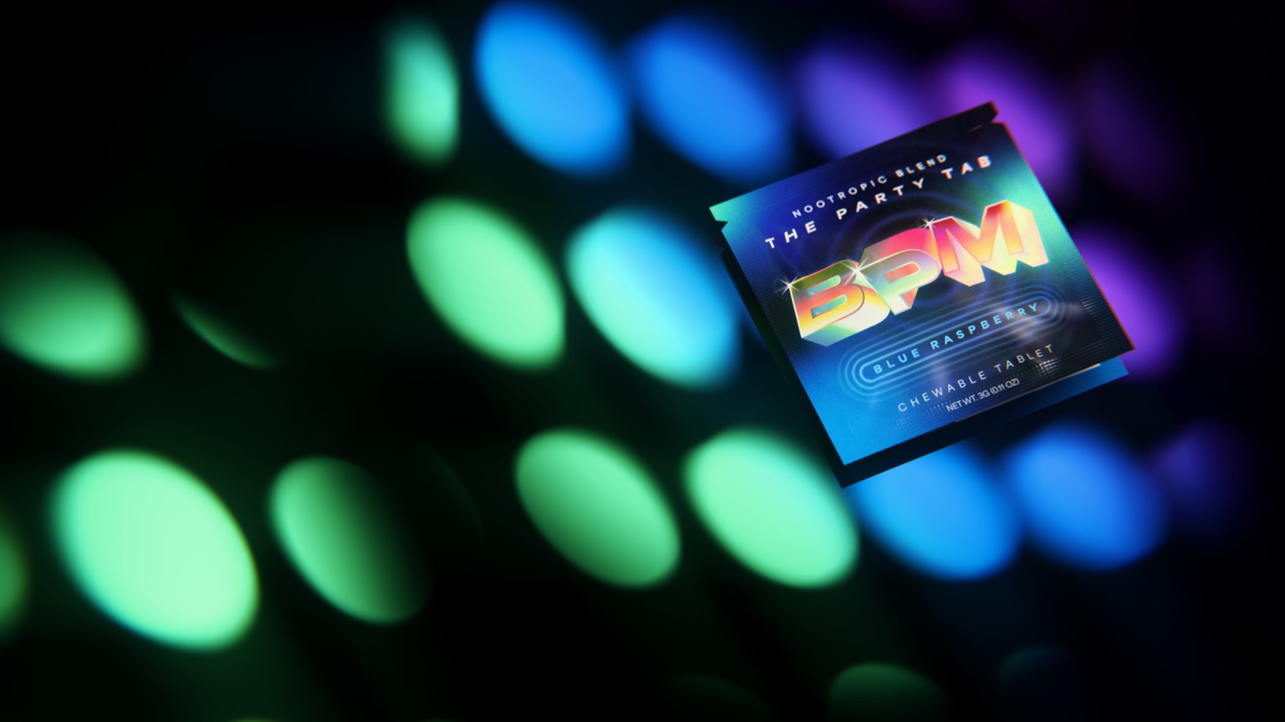
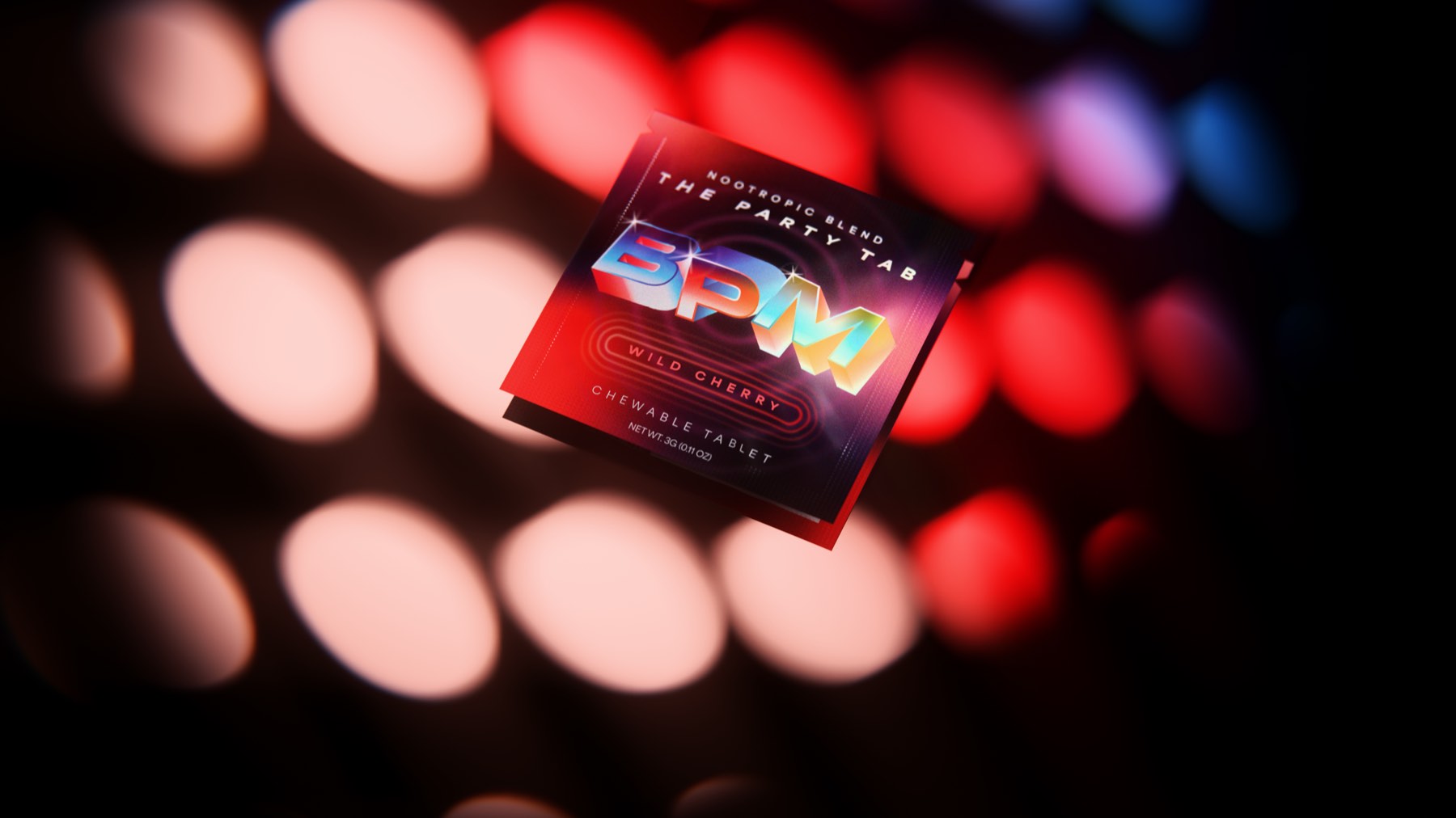
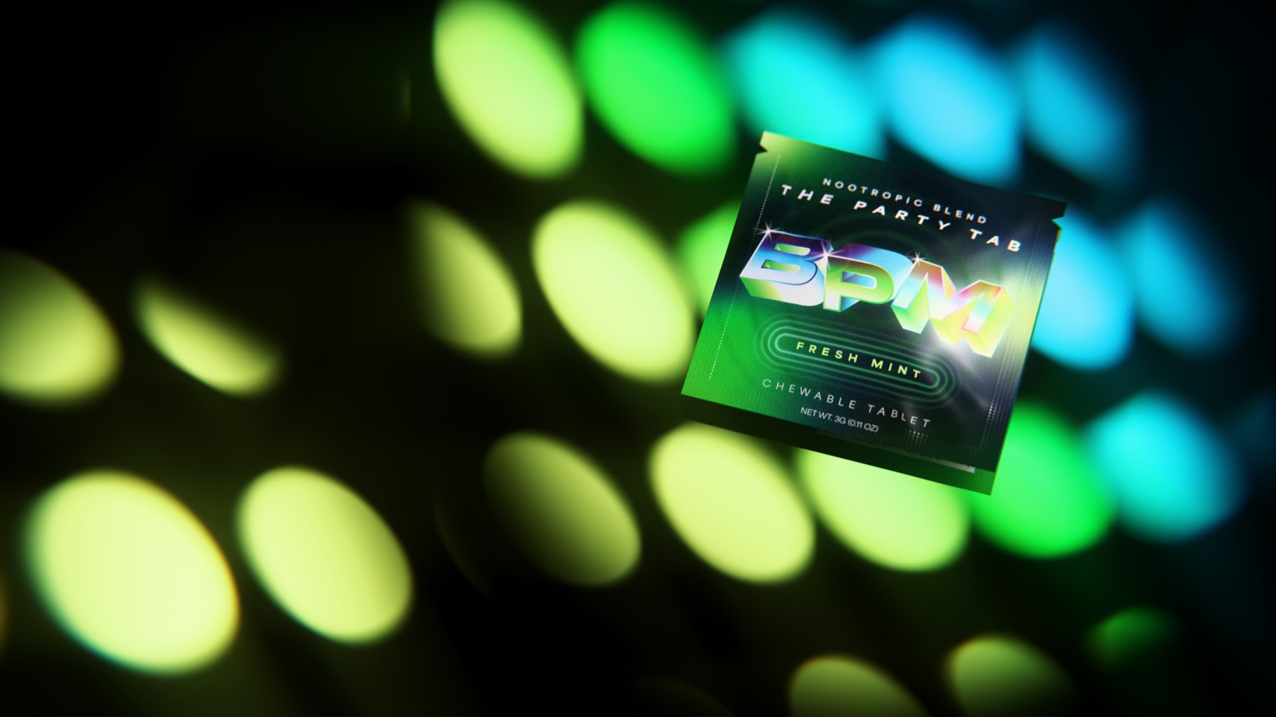
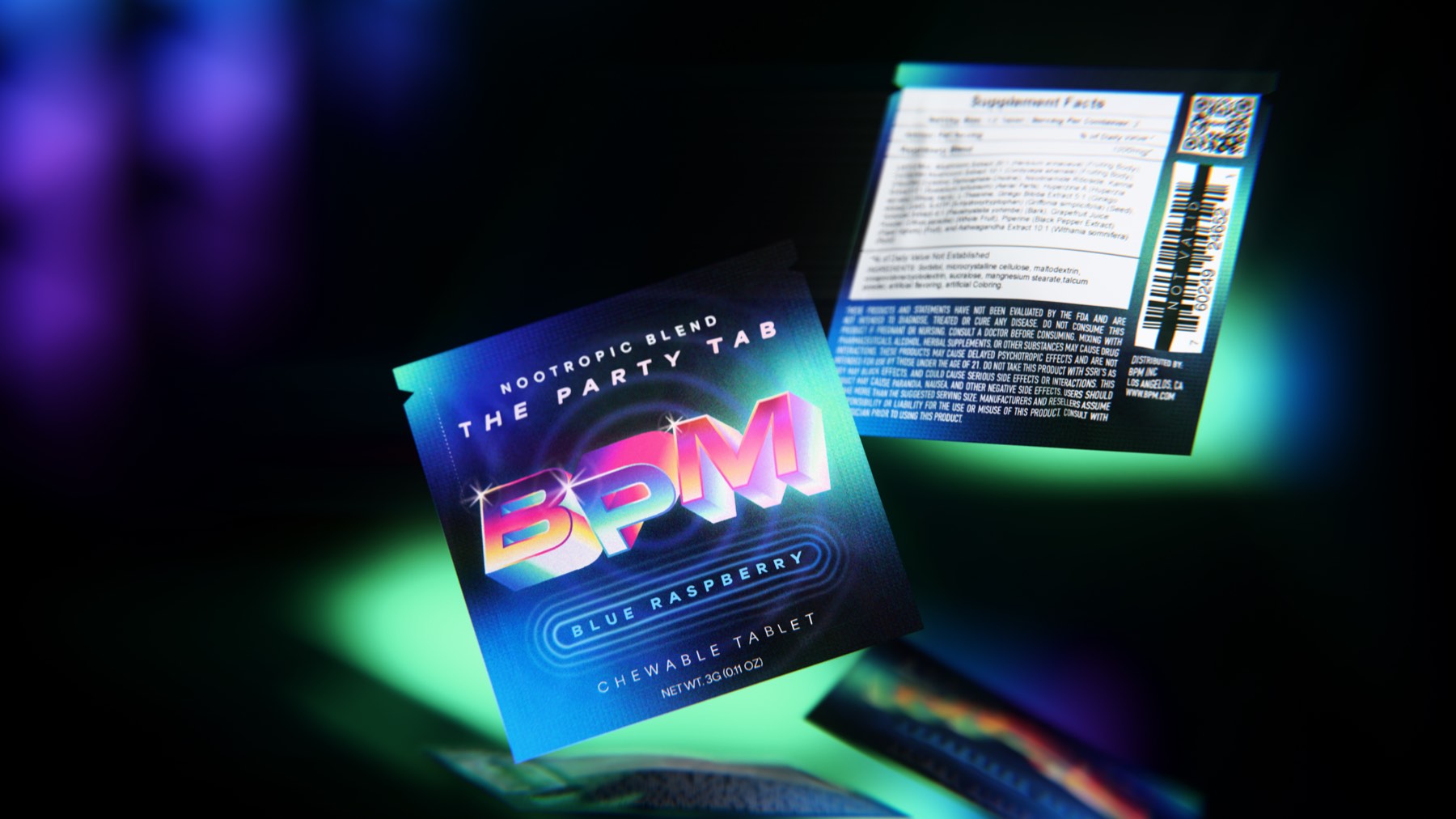
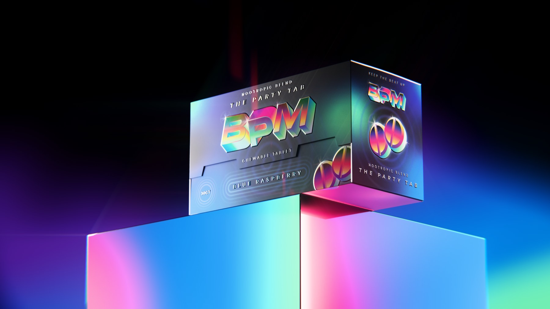
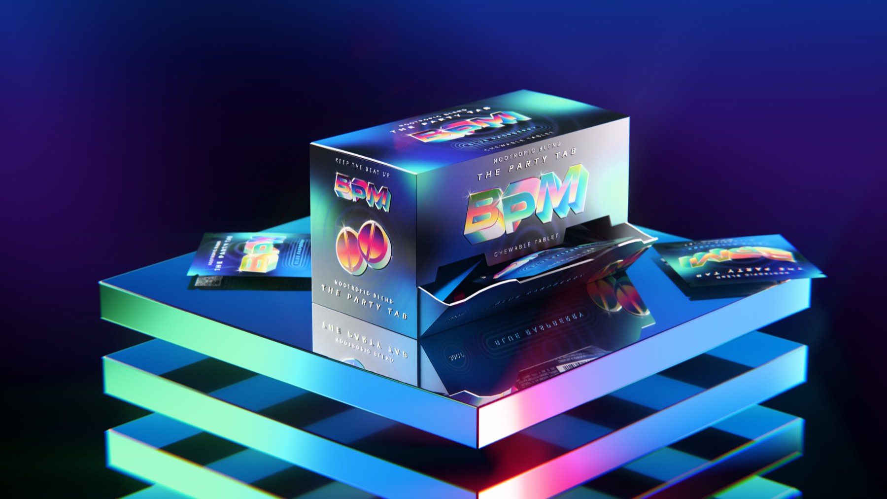
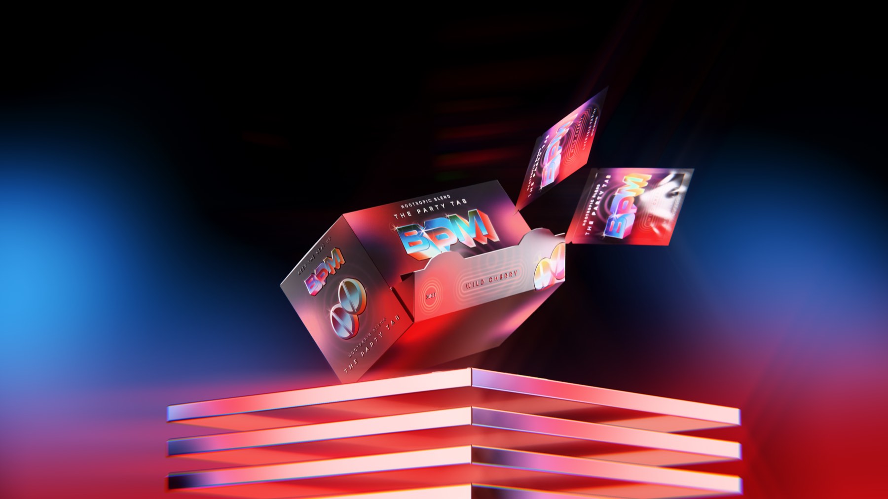
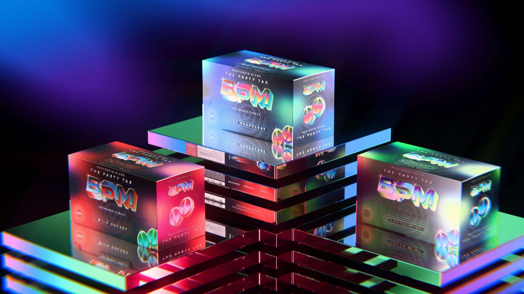
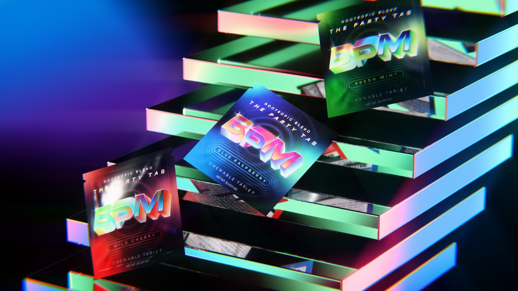
A 3 g chewable tablet in a single-serve sachet. Each flavour takes the whole system a different colour — Blue Raspberry in blue, Wild Cherry in red, Fresh Mint in green — with the wordmark, the pulse rings and the foil shifting together. Shot under club lighting rather than on white, so the pack is read the way it will actually be seen.
Thirty up, tear away
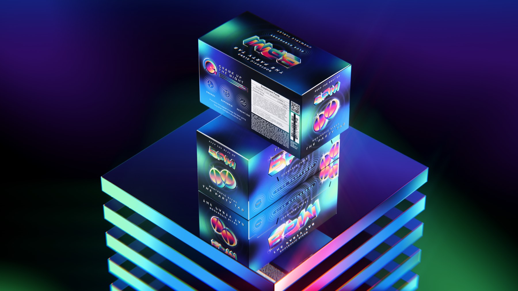
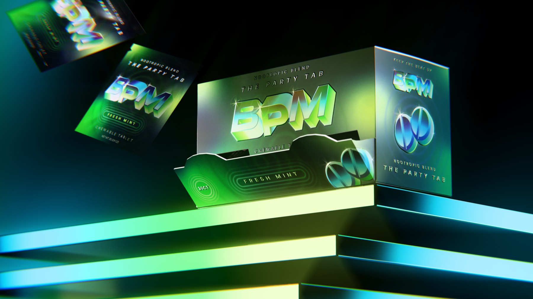
The 30 CT box is built for a bar back or a smoke-shop counter. A scalloped tear-away front turns the shipper into the display; the reverse carries the supplement panel and the Crank Up The Night dials — Energy, Euphoria, Sensation. Every panel repeats the wordmark and the split tablet, so the box reads from any angle in the stack.
Three, side by side
Blue Raspberry, Wild Cherry, Fresh Mint. Same die, same wordmark, same pulse — only the temperature changes.
The party only has to stop when you want it to
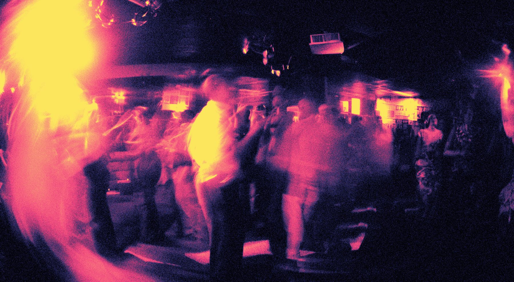
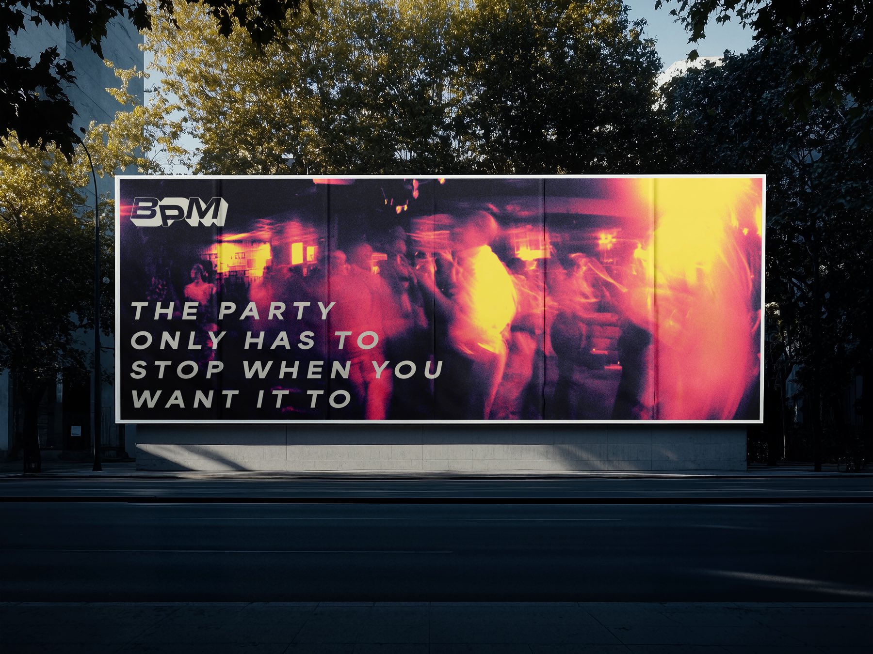
Out-of-home pairs the flat wordmark with the brand’s long-exposure club photography and a single line of Area Extended Black Italic.
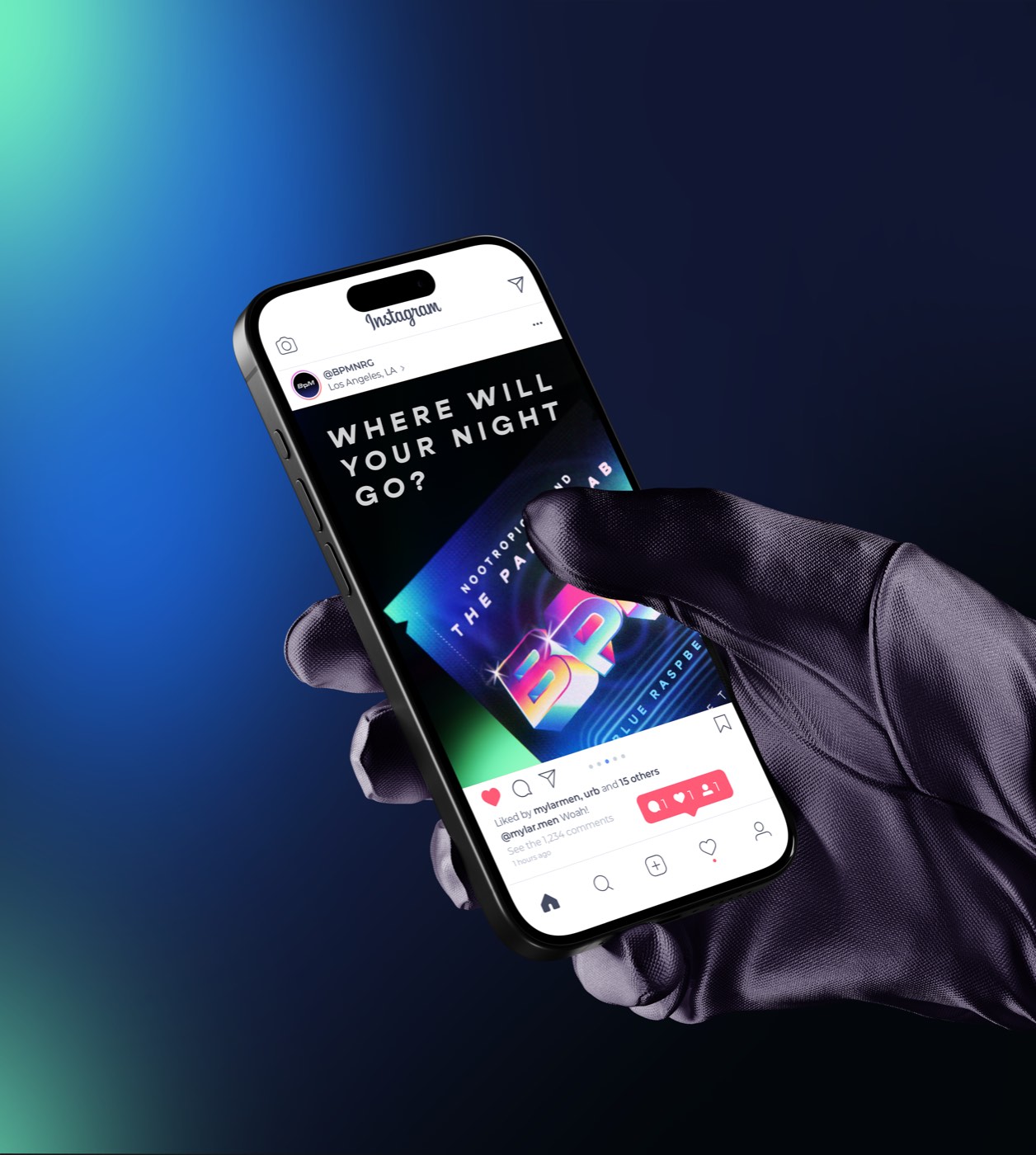
Where will your night go?
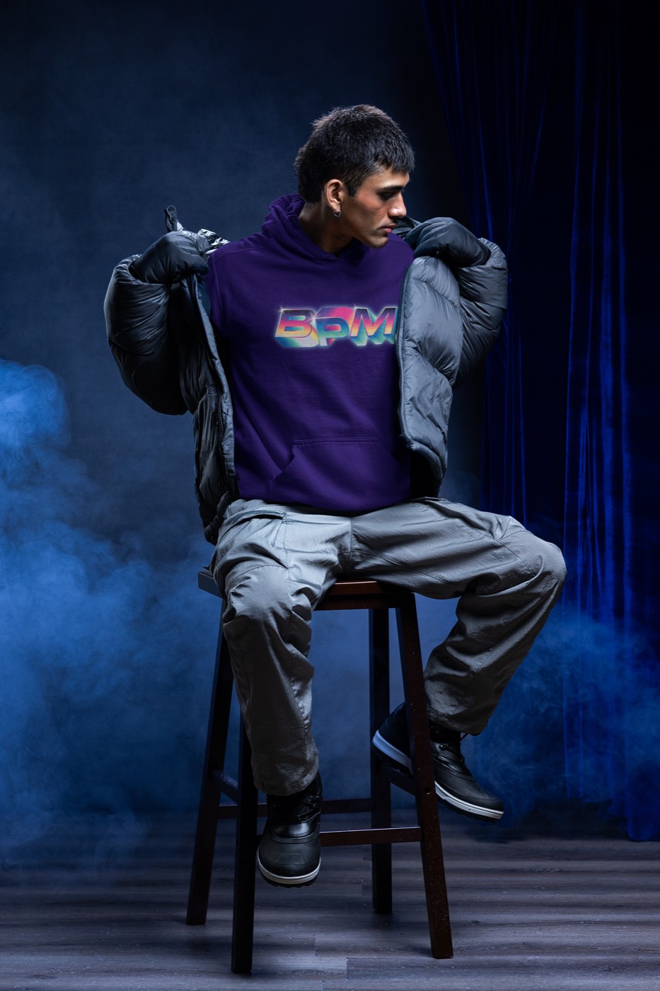
Merch and social carry the same chrome mark on a dark ground — a hoodie, the @BPMNRG feed, and the blurred room the whole identity comes from.