
Cheefin
Honor the herb.
Identity and packaging for a Native-owned cannabis label on Long Island, New York — organically grown flower from cultivators rooted in the island’s twelve tribes, sold through Native Land Dispensary. A thunderbird mark built from Native geometry and Americana vintage type, Kombu Green and Bone White cut with Flame Orange, a 3.5 g flower bag in Calm, Focus and Relief, and The Totem Pole, a 1.5 g pre-roll in a printed paper tube.
Honor the herb
Cheefin is organic cannabis from a Native-owned label on Long Island, New York. The flower is grown by Native American cultivators with roots in the island’s twelve tribes and sold through Native Land Dispensary — quality first, no confusing blends, no artificial additives, and a brand that means to know its customers by name.
One line carries the whole thing and is printed on every pack: honor the herb.
The thunderbird
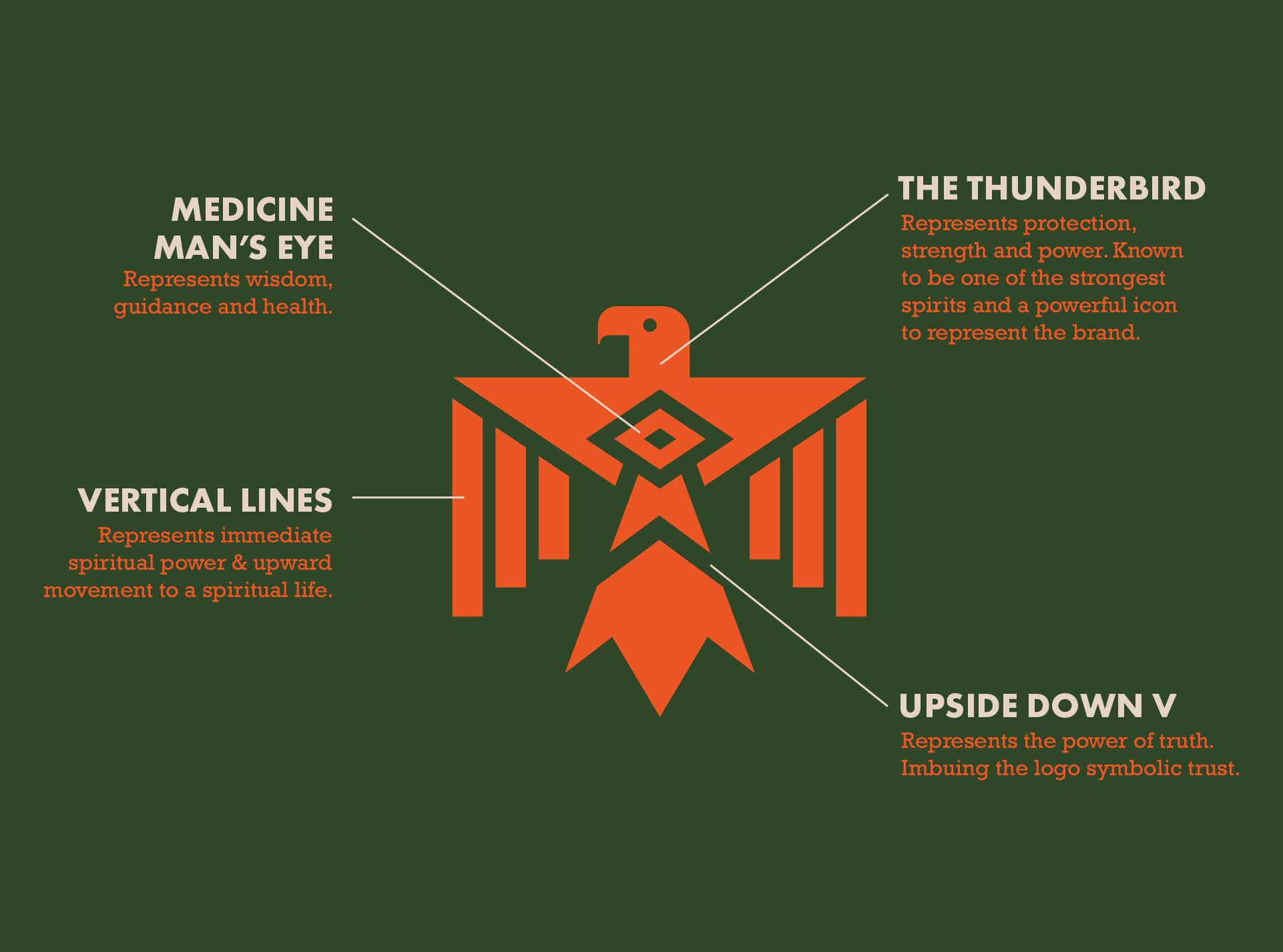
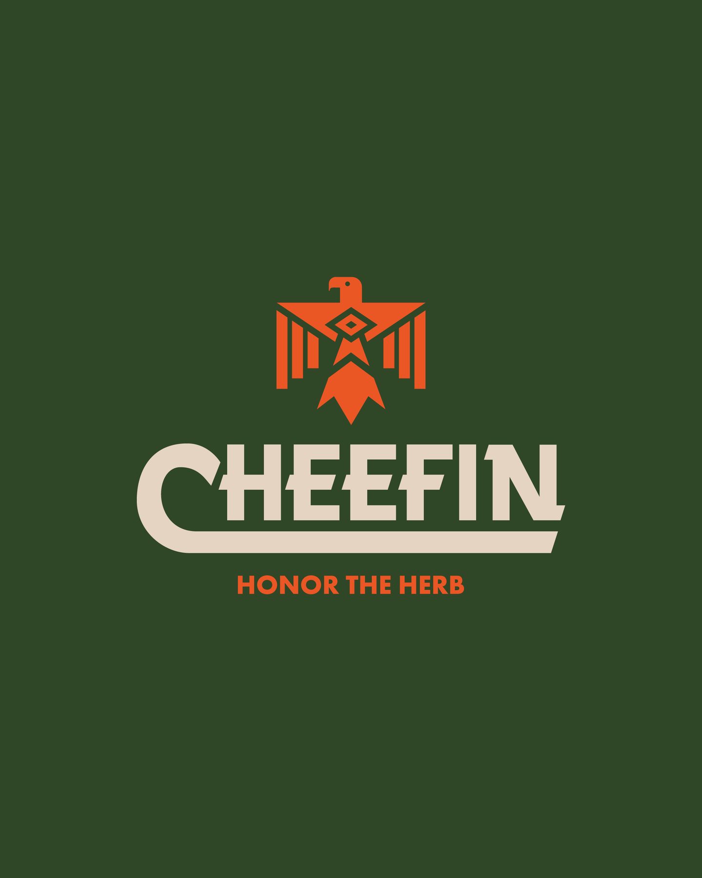
The icon is a set of nested symbols. The thunderbird at the center stands for protection, strength and power; the medicine man’s eye for wisdom, guidance and health; the vertical lines for upward movement to a spiritual life; the upside-down V for the power of truth. Its geometry is drawn from Native American art and iconography, which is what keeps it legible at 100 px.
Icon, wordmark, subtitle
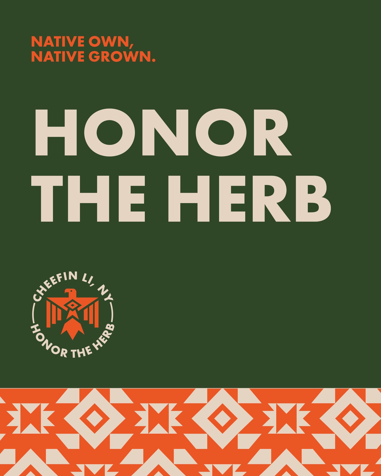
The full logo interweaves the icon, the wordmark and the Honor the Herb subtitle, the swash off the C running under the word as its baseline. Native American art meets Americana vintage — bold enough to carry nostalgia and presence at once. It breaks into vertical, horizontal and circle lock-ups, and a poster line: Native own, Native grown.
Kombu Green sets off Flame Orange; Bone White brings the vintage warmth. All three were picked to sit alongside the Native Land Dispensary building itself.
The Totem Pole
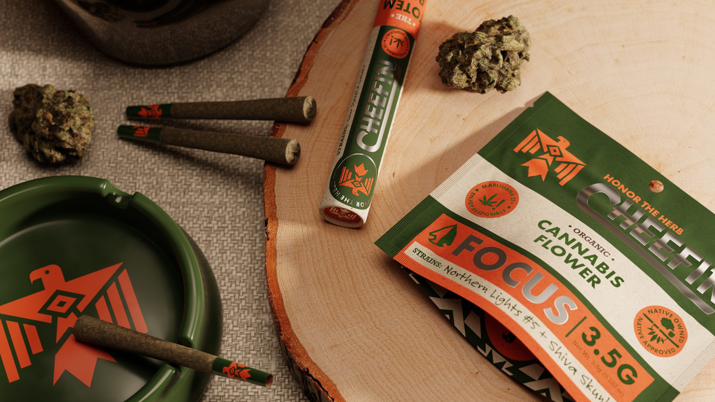
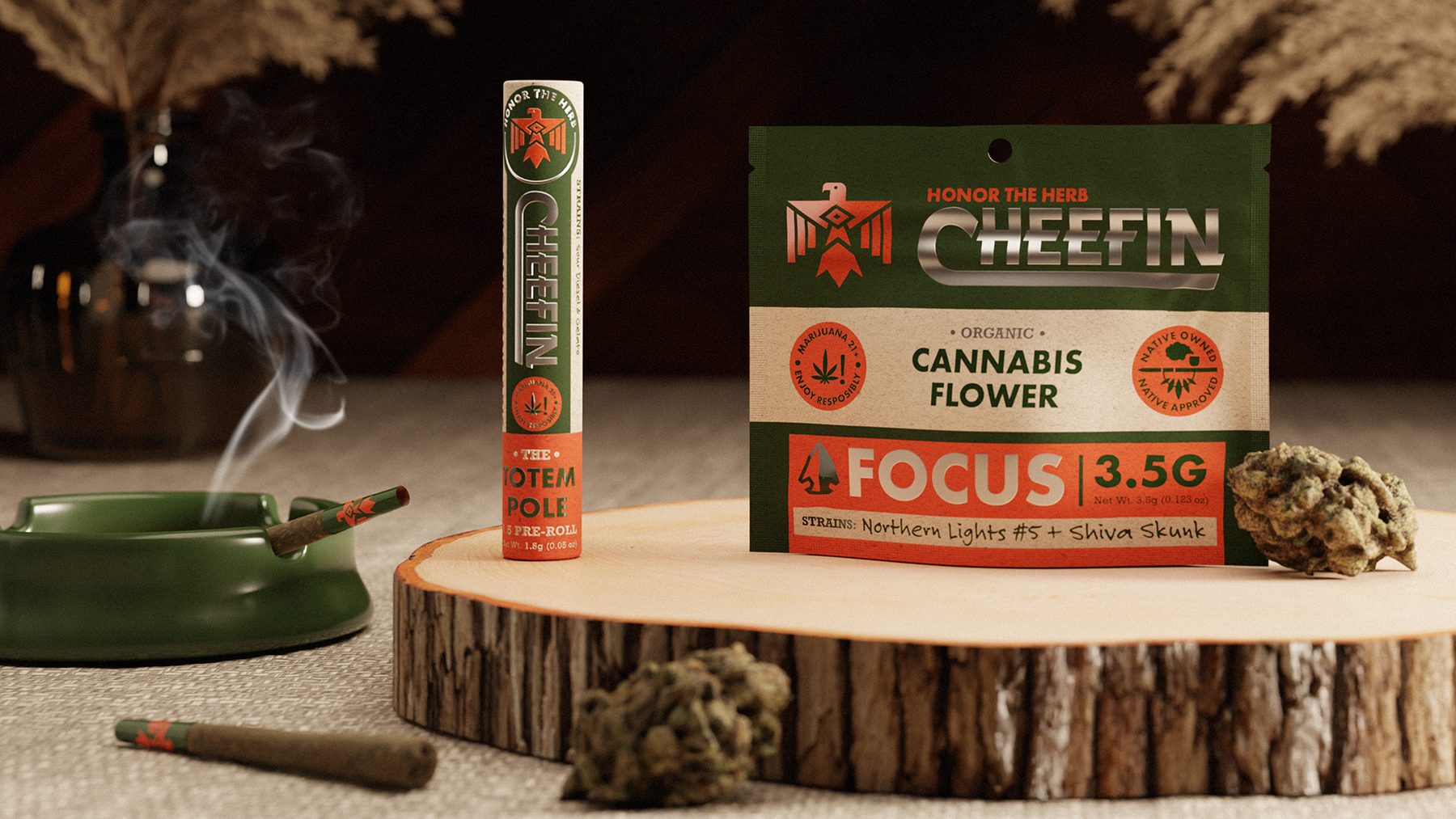
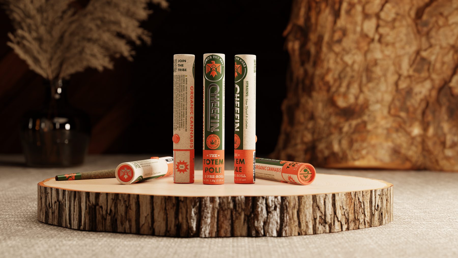
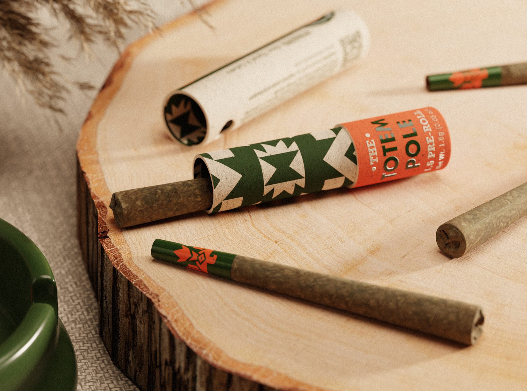
Pre-rolls ship in The Totem Pole — a Bone White paper tube carrying the wordmark and badges on a Kombu Green panel, the geometric pattern, and a Flame Orange band at the base that names it. Join the Tribe and a QR code sit on the back. Net weight 1.5 g (0.05 oz); the launch strains are Sour Diesel and Gelato. Three stand in a row on the shelf. One opens to the pre-roll.
Native owned, Native approved
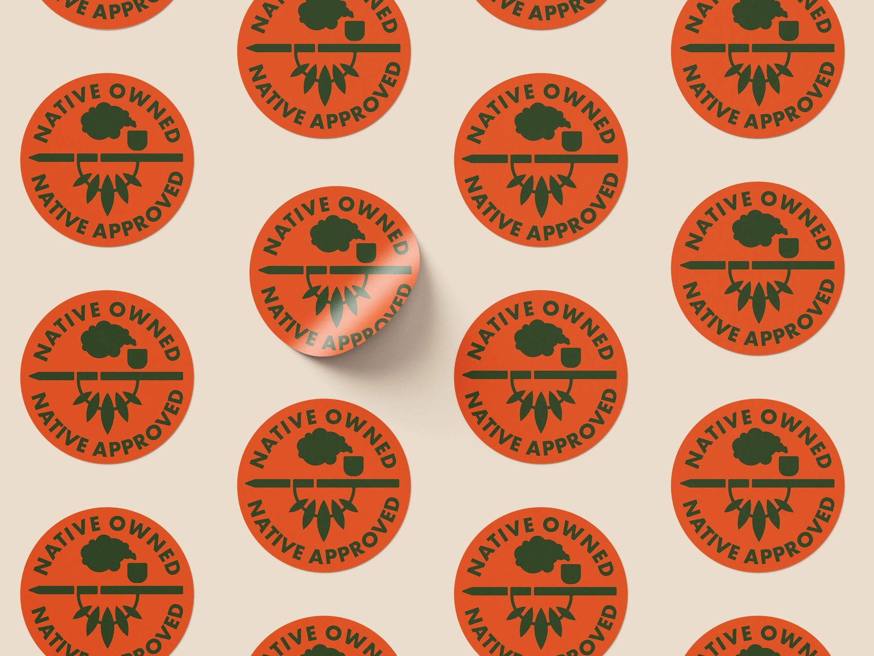
A peace-pipe badge does two jobs — it marks Cheefin as Native American owned, and it acts as an endorsement seal that other brands under the Native Land Dispensary umbrella can carry. Around it sit the working icons: a Marijuana 21+ Enjoy Responsibly compliance sticker, which faces the badge across the front of every bag, GMO Free and 100% Organic value-adds, and a whale for Long Island Natives.
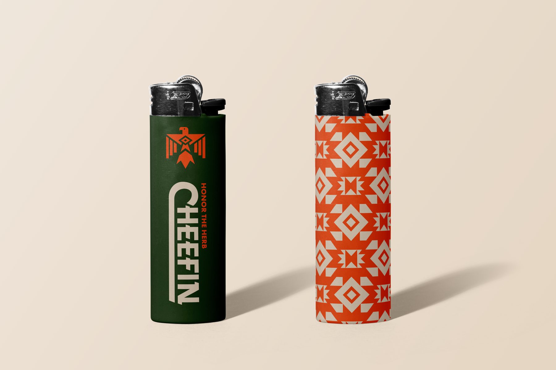
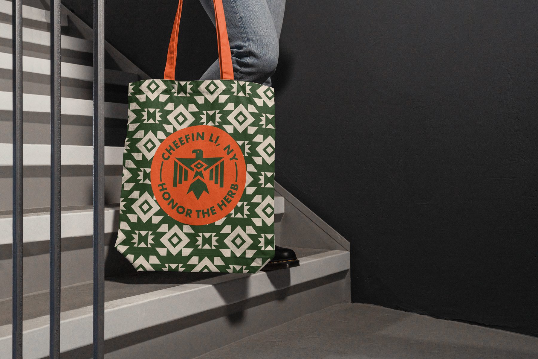
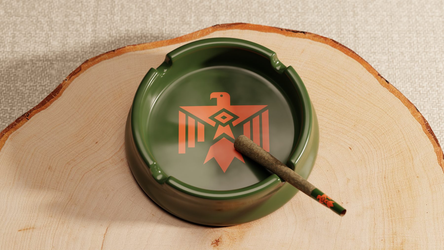
Pattern, lighters, tote, ashtray
The brand pattern reworks the Native butterfly symbol — a sign of happiness — as a geometric repeat. It wraps the orange lighter and the tote; the green lighter and the ashtray take the thunderbird alone. Merch concepts built entirely from the existing assets.
Calm, Focus, Relief
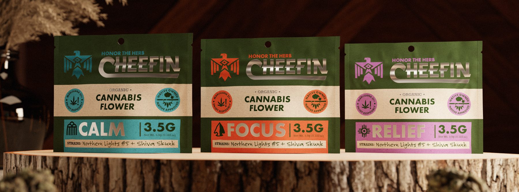
Flower goes into a 3.5 g bag: a Kombu Green field up top for the lockup, a Bone White band through the middle reading Organic Cannabis Flower, and an effect block that changes color by SKU — teal for Calm, Flame Orange for Focus, lavender for Relief — over a strip of the brand pattern at the base.
Each effect carries its own icon — an arrowhead for alertness, a rain cloud for tranquility, a sun ray for happiness — with the strains, Northern Lights #5 and Shiva Skunk, written in script along the bottom edge.