
Cielo
Modern science made human.
Identity and packaging for Cielo, a peptide wellness brand named for the sky. A rounded lowercase wordmark, a C-with-a-star brandmark and a sunshine gradient carry across multidose vials, sublingual strip cartons, a three-vial kit and merch — with seven category colours coding each compound to what it does.
The new wellness
Cielo is Spanish for sky. The brand applies modern bioscience to wellness through peptides — thoughtfully formulated, with fewer downsides and more room to customise — for people who feel worn down or stuck.
The message is simple: feeling better matters. So the identity is built on clarity and restraint, and a bioscience product ends up feeling approachable instead of overwhelming.
Rounded or sharp, never both
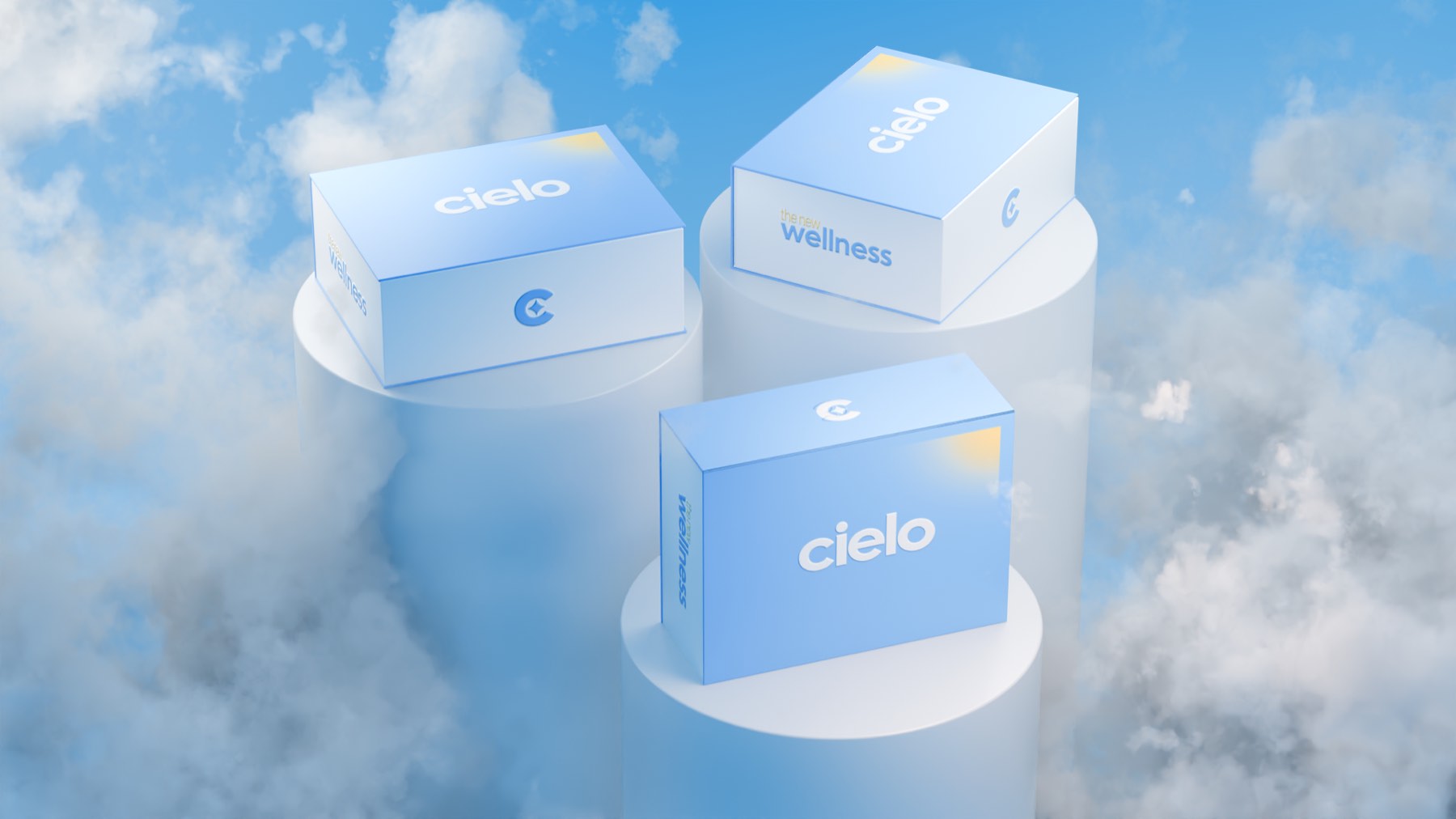
The design language commits to one of two things at a time — fully rounded forms or fully sharp corners — to hold clinical precision and approachability in the same frame. The wordmark pairs soft letterforms with hard-cut shapes.
The brandmark reduces the system to a C with a small star inside it: the meaning of Cielo, and the idea of looking upward. It stands alone wherever the full wordmark is too small.

One label, seven colours
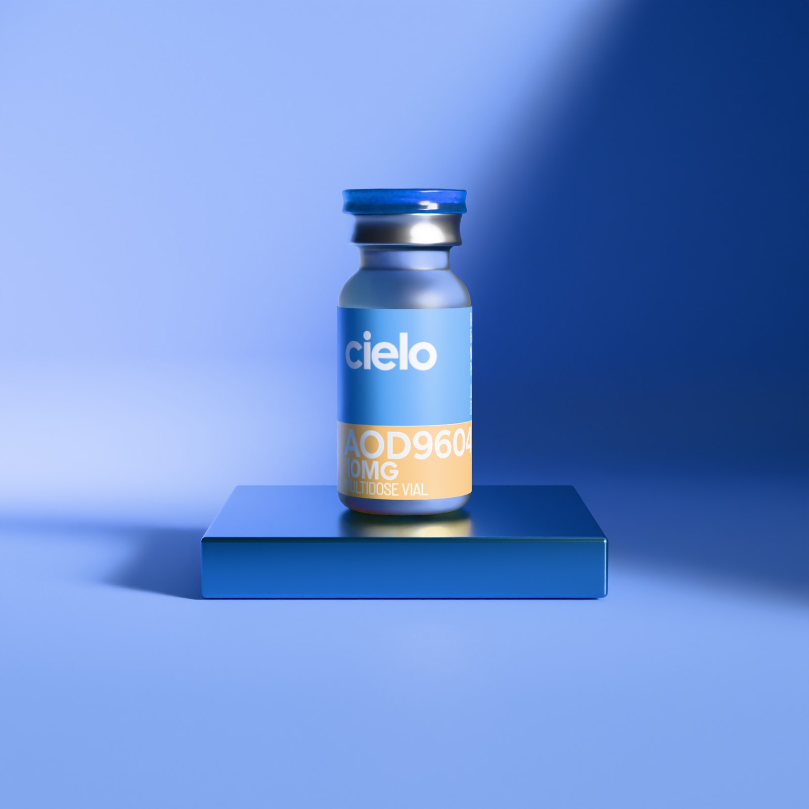
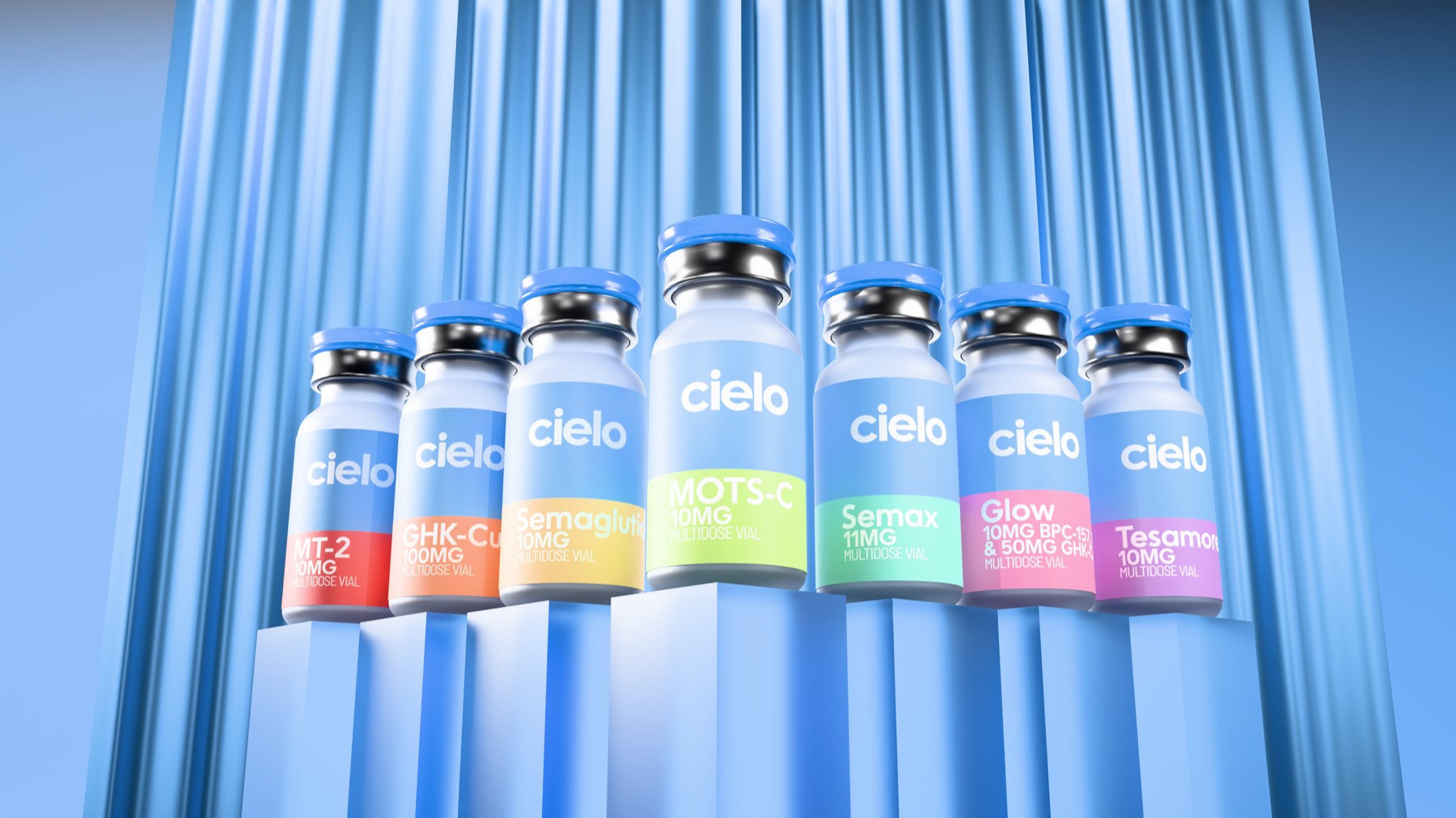
A 10 mL multidose vial under a crimped cap. The sky-blue label carries the white wordmark; a band in the category colour carries the compound and the dose. Because peptides do very different things, each category owns a colour tied to its function — red for intimacy, orange for muscle recovery, yellow for metabolic health, green for cellular energy, teal for cognition, purple for growth hormone, pink for skin.
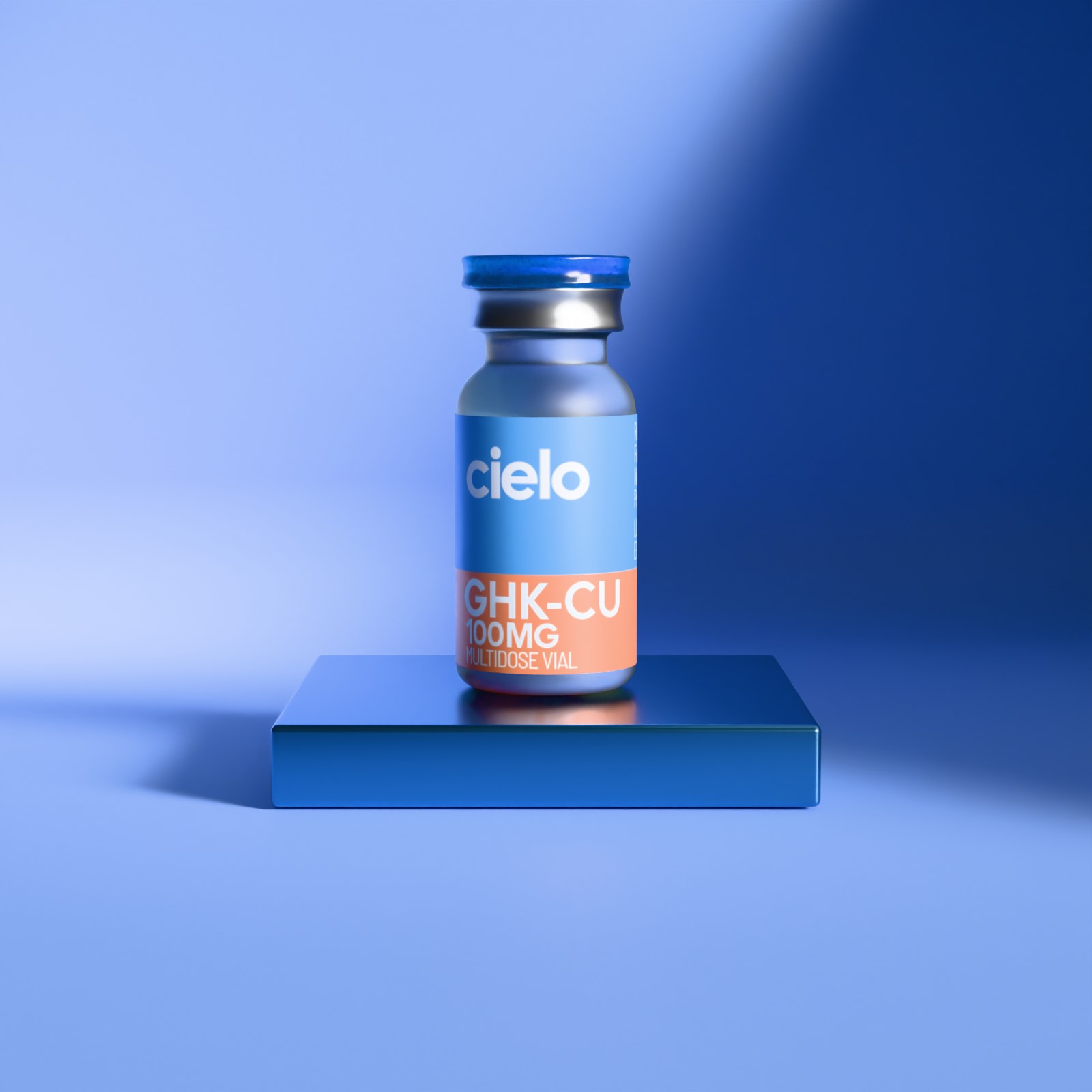
Read the shelf at a glance
Seven categories, seven colours, one lockup. Every vial carries the same white cielo over a band that changes with the compound, so the line reads at a glance and the system stays clear as it grows. The renders stage the range in the brand’s own light — a curtain of sky blue, lit from above.
Light coming down
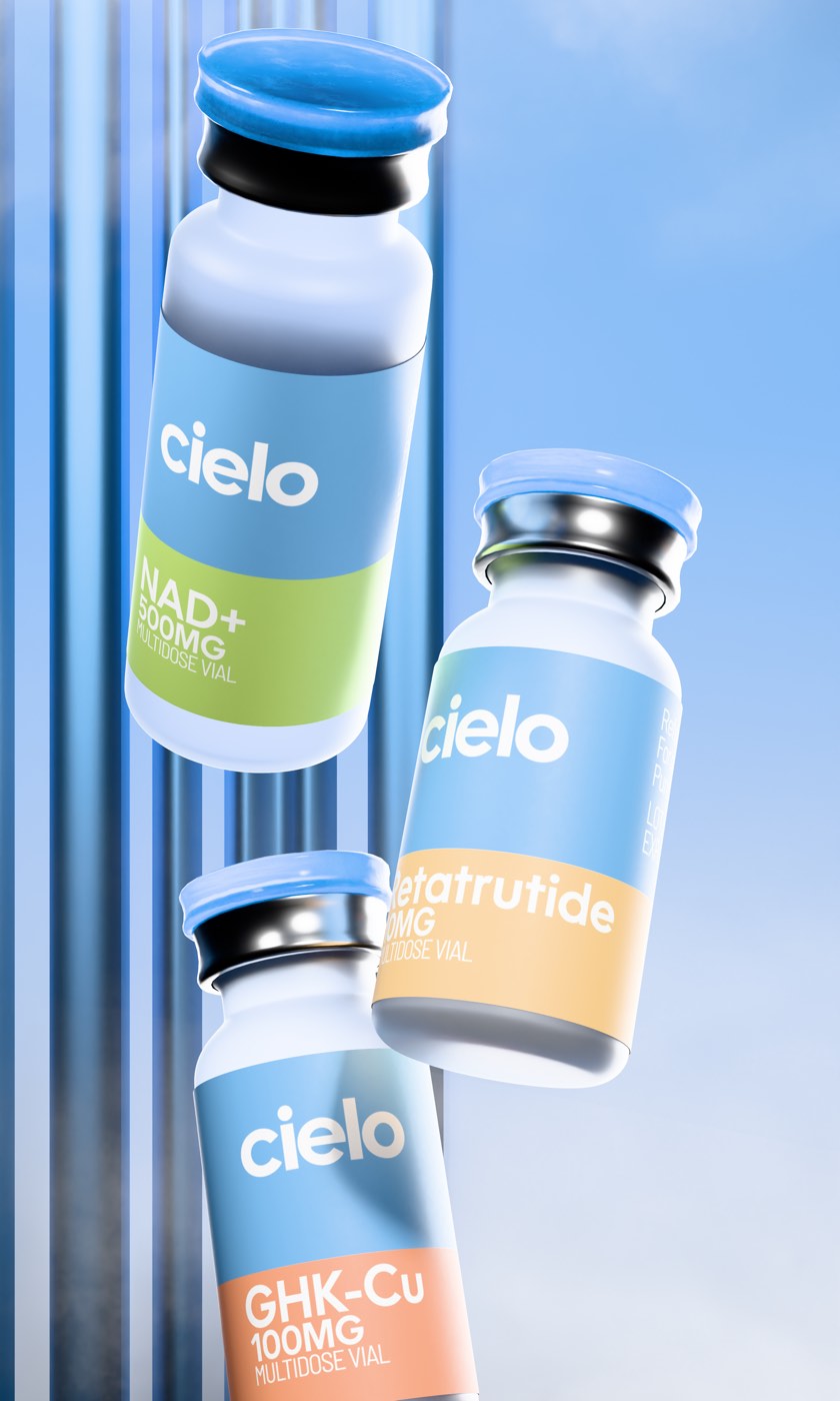
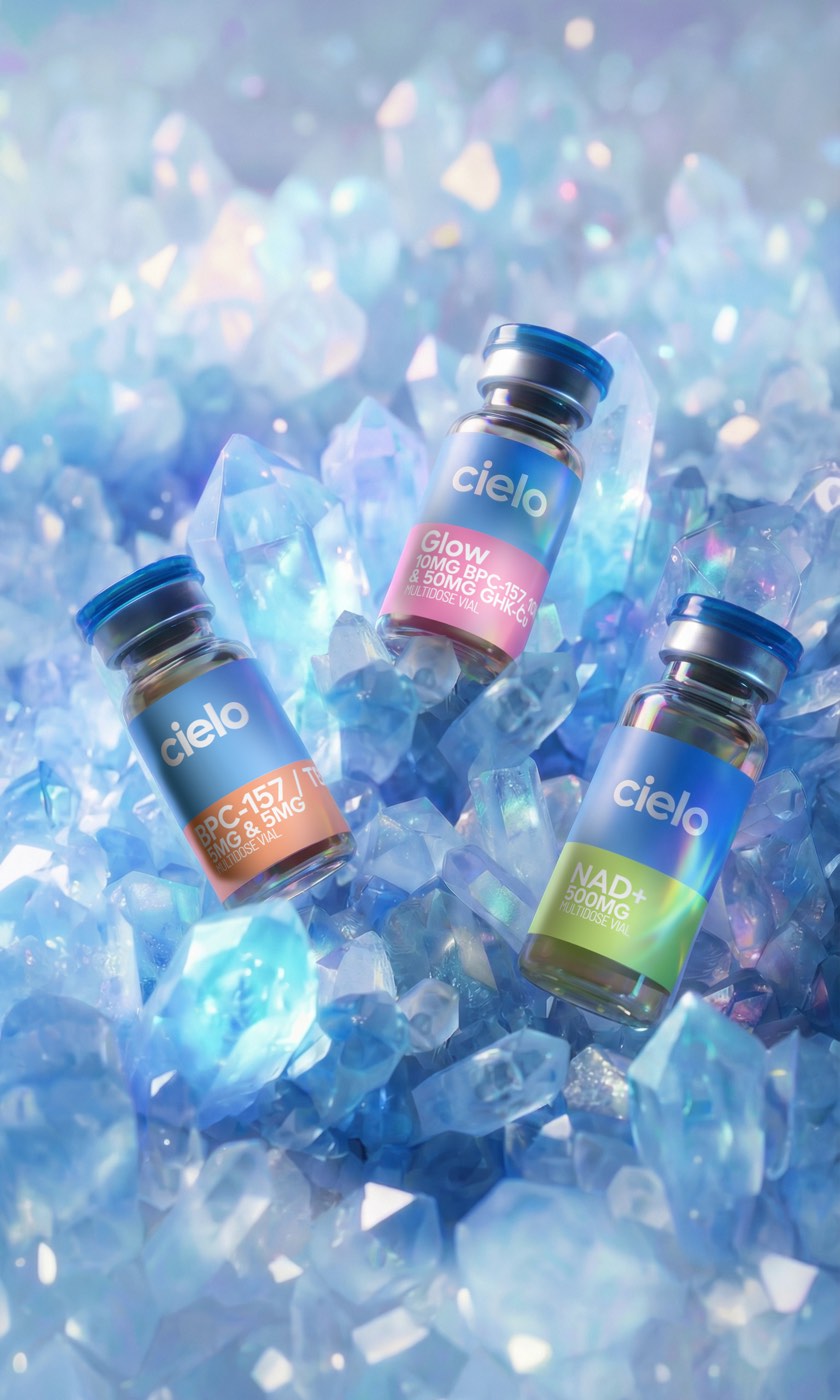
The sunshine gradient is the system’s signature: light coming down from the sky, a hard-cut edge dissolving into soft diffusion. It holds the tension the whole brand runs on — clinical precision on one side, ease on the other — and it follows the vials off the plate and into the air.
Three wells and a lid
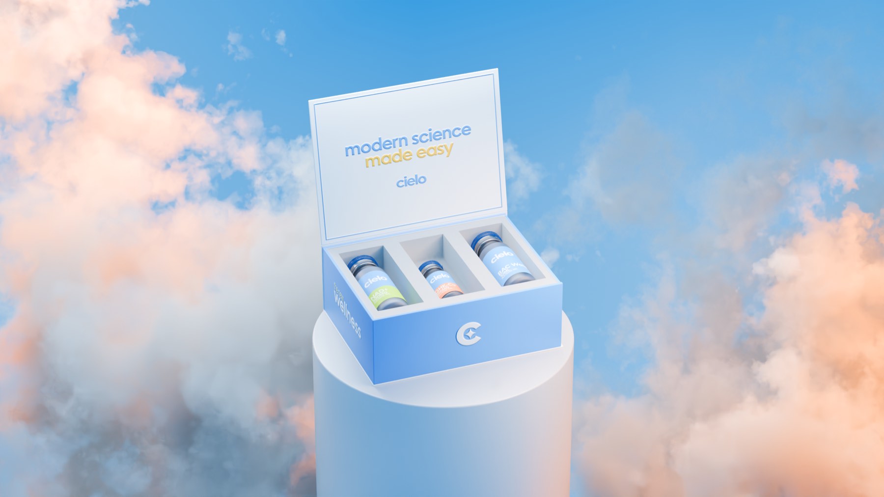
A rigid wellness box holds three vials in fitted wells. The lid prints the line on the inside; the outside carries the wordmark and the brandmark on a pale sky blue, with the sunshine gradient burning in from one corner.
Blue, and bodies at ease
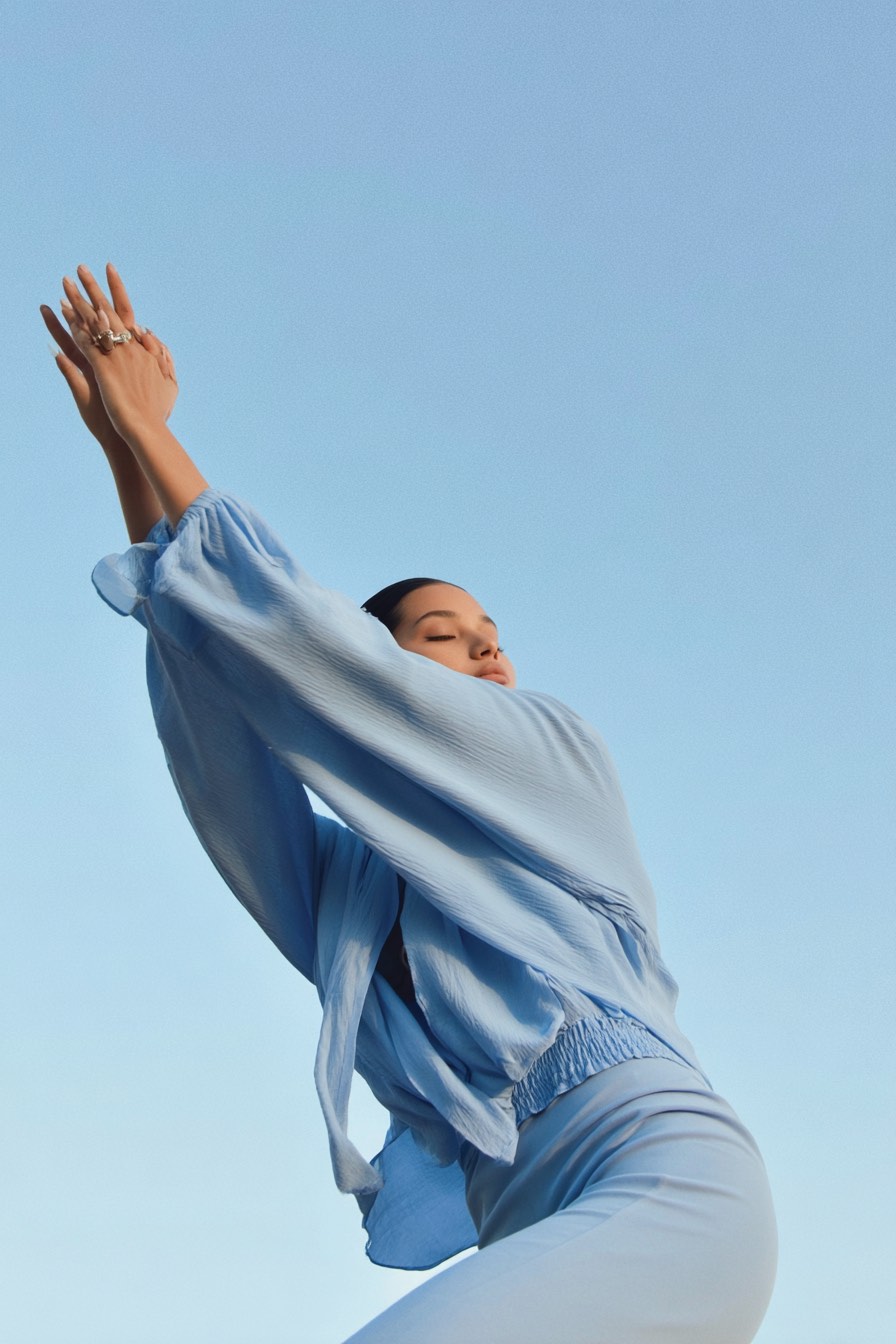
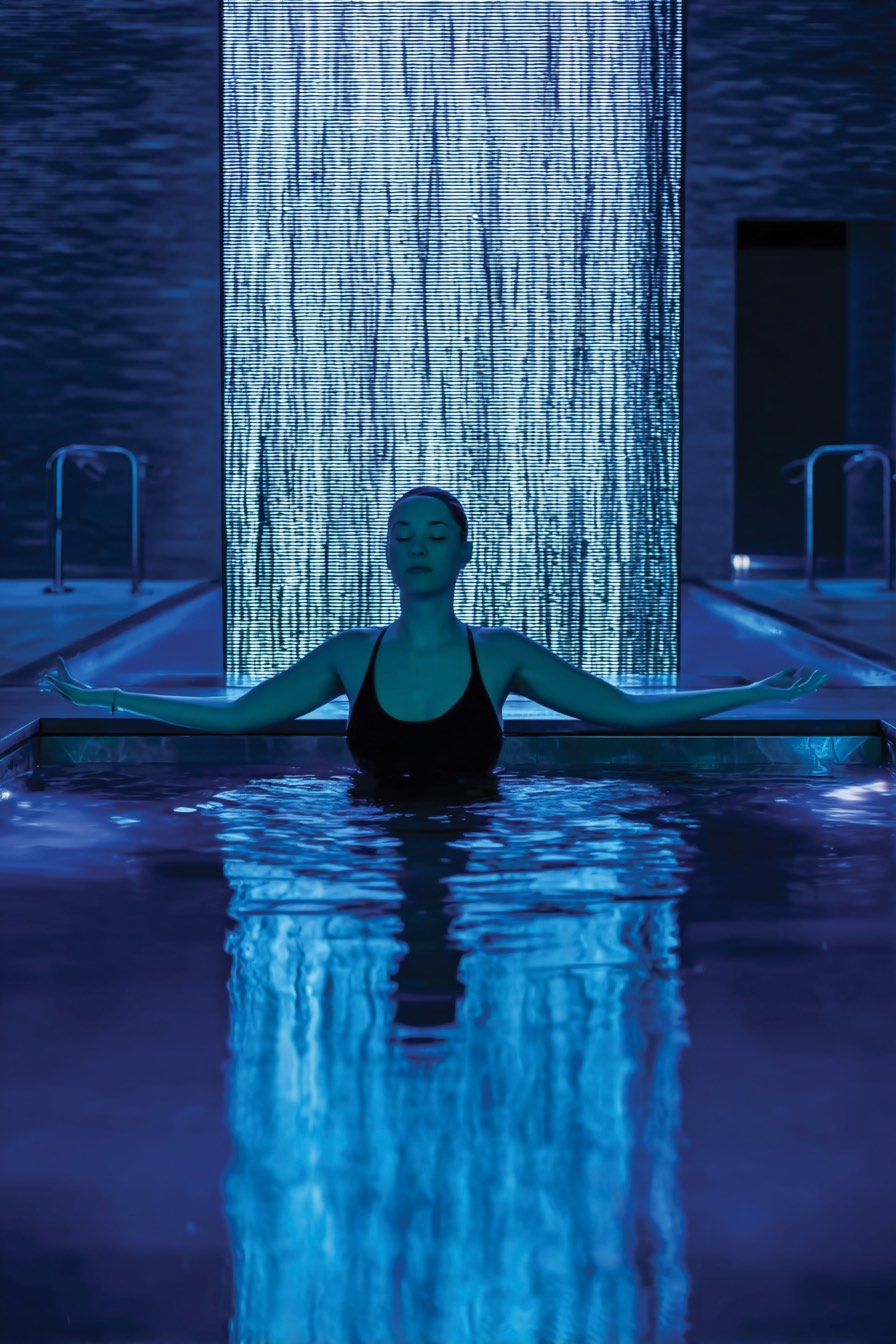
Photography centres on blue tones and body-focused moments — stretching, training, floating in pools and open water. It shows what peptides support, energy, recovery and wellbeing, as a life lived in the body rather than a molecule under glass.

Real routines
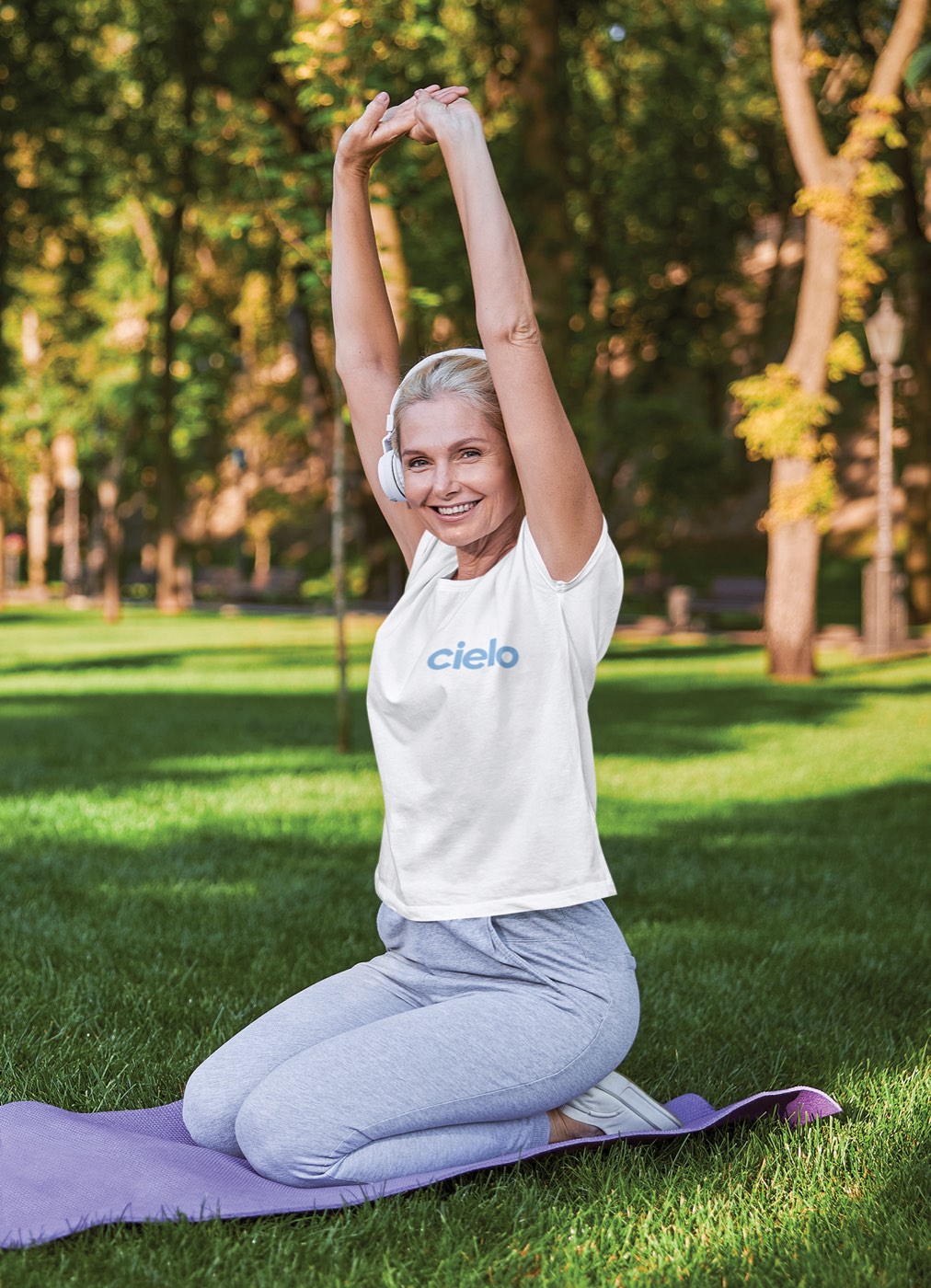
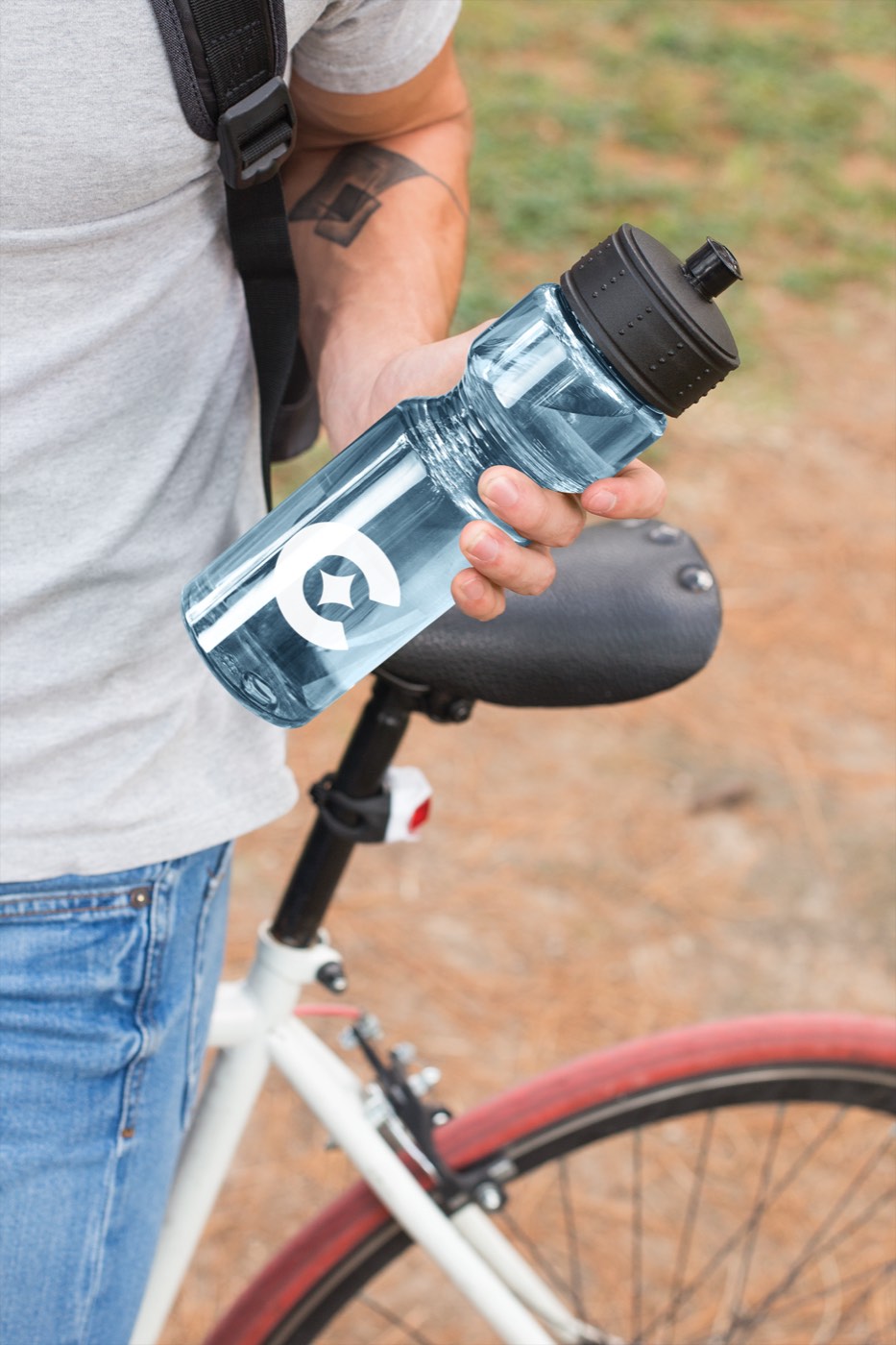
Cielo turns up inside everyday movement — a training session by the water, a tee on a yoga mat, a cap, a bottle on a bike. Straightforward and human, rather than staged or unobtainably aspirational.


The wordmark on its sunshine gradient — white out, light in from the corner, nothing else on the plate.