
Elegant
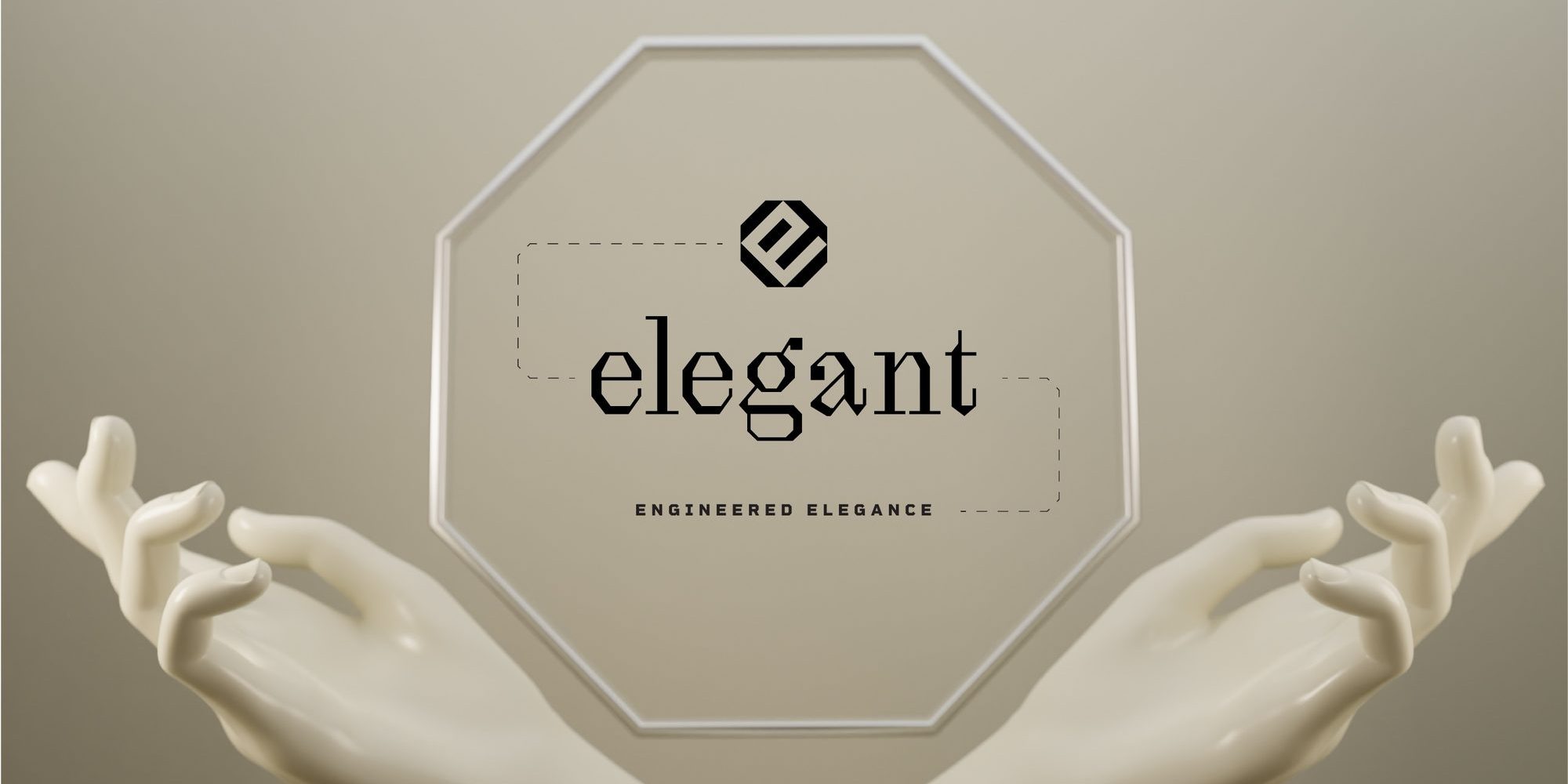
Bone, black, octagon.
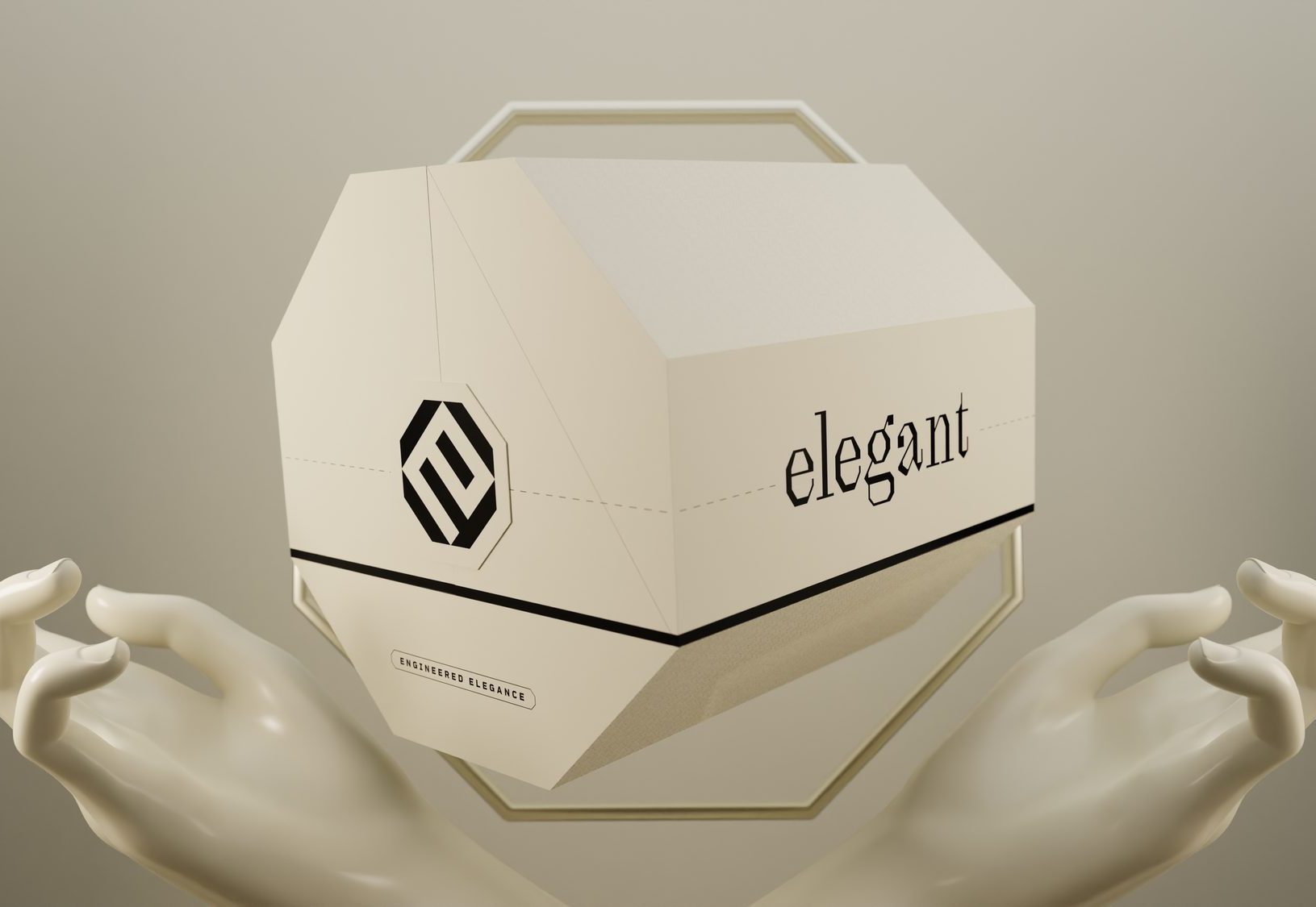
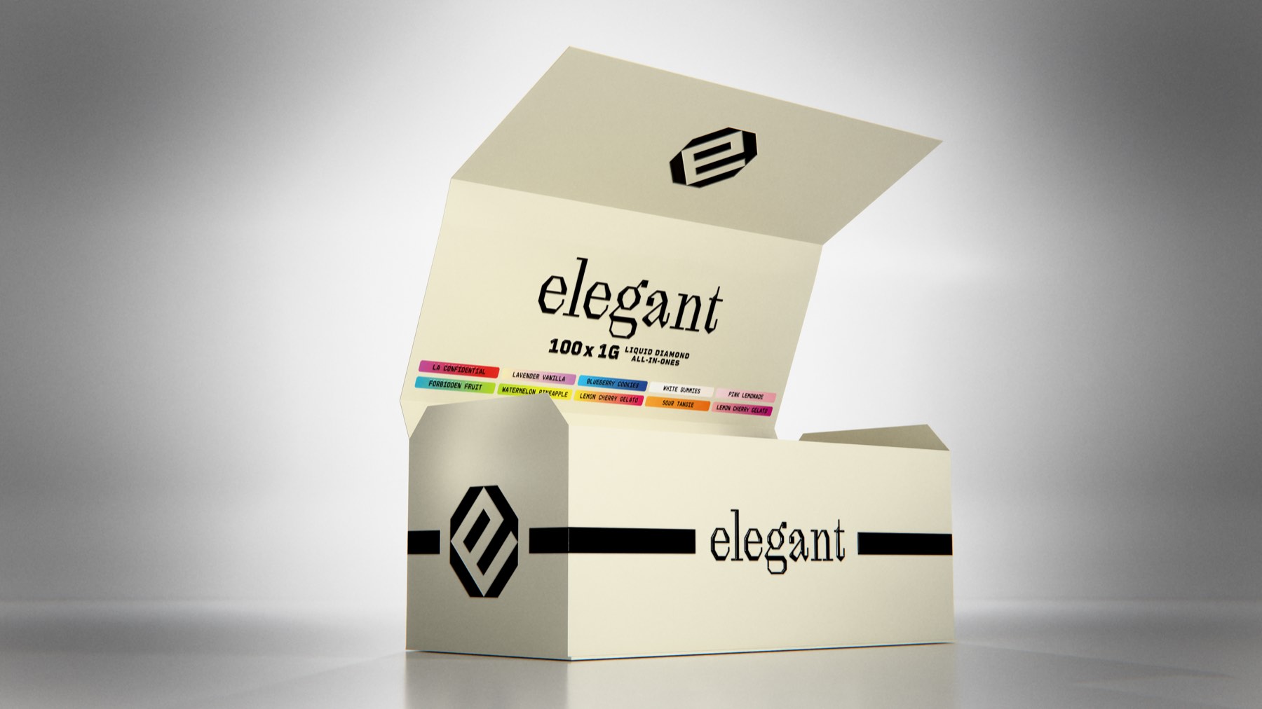
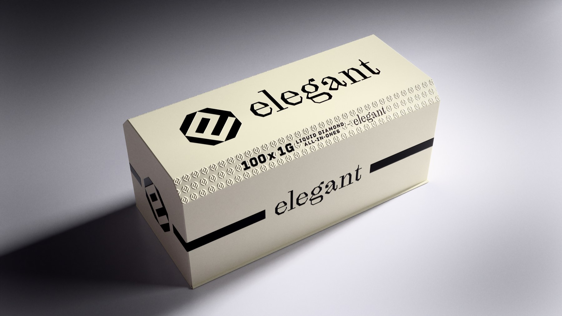
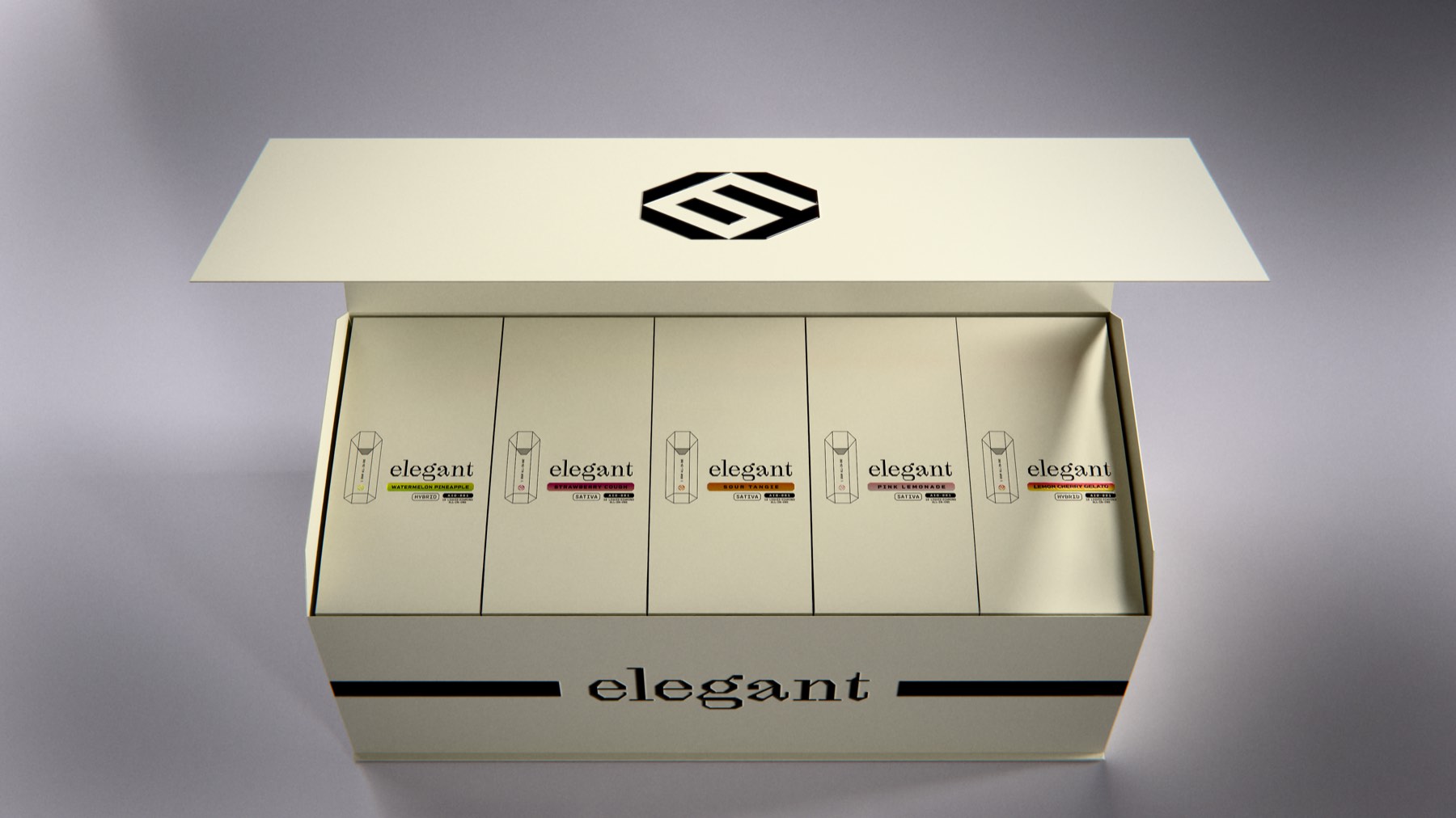
Identity and packaging for a cannabis brand built on a single shape. An octagon grid generates the E-and-G monogram, the serif wordmark and the die lines — carried across five SKU families: a 2 g disposable, a 2000 mg gummy pouch, a pre-roll tin, a liquid-diamond all-in-one and a concentrate jar.
Ingenious and simple
Elegant sells into a category that shouts. The brief ran the other way — cannabis hardware and edibles that read as considered rather than loud, held together by a mark disciplined enough to survive a compliance panel.
One shape, two colours, two typefaces, nothing spare.
Octagon first, monogram second
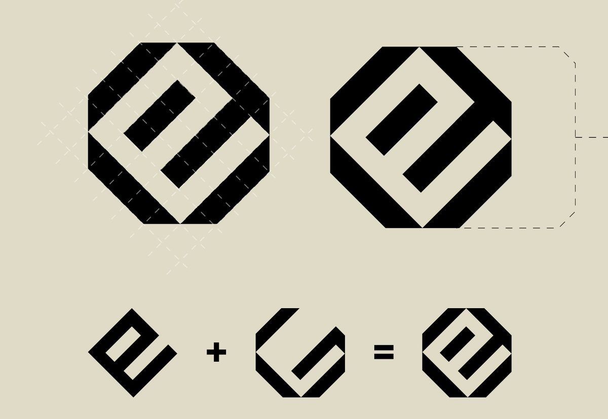
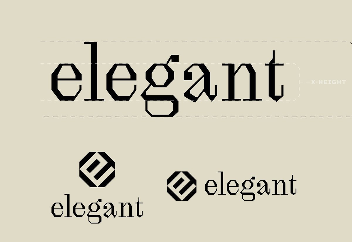
The icon is cut on an octagon grid: an E and a G struck through the governing shape so the two interlock without a seam. The wordmark answers it — angular cuts dropped into simplified serif curves.
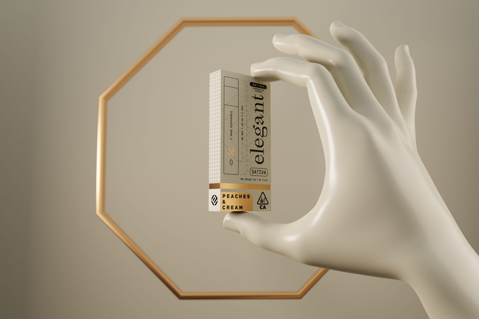
Two grams, one carton
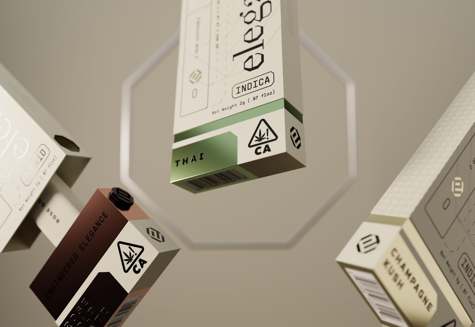
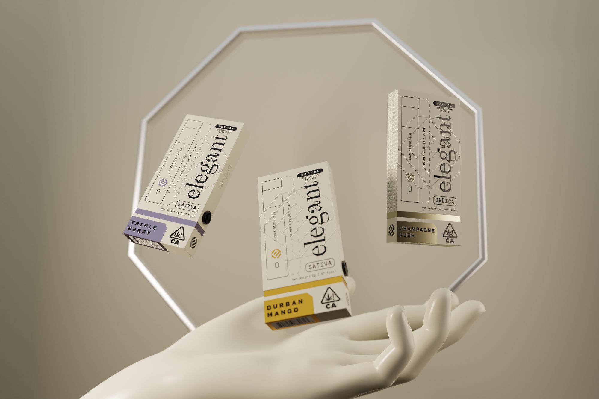
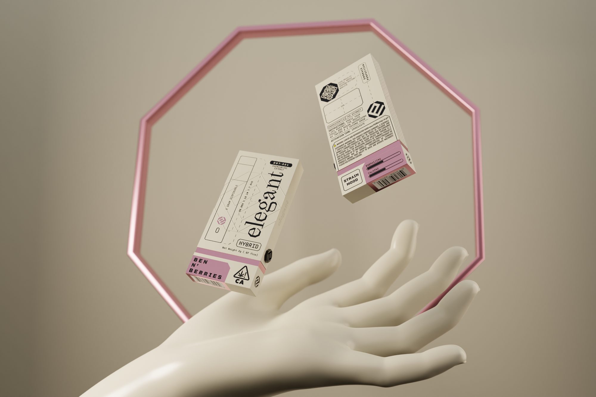
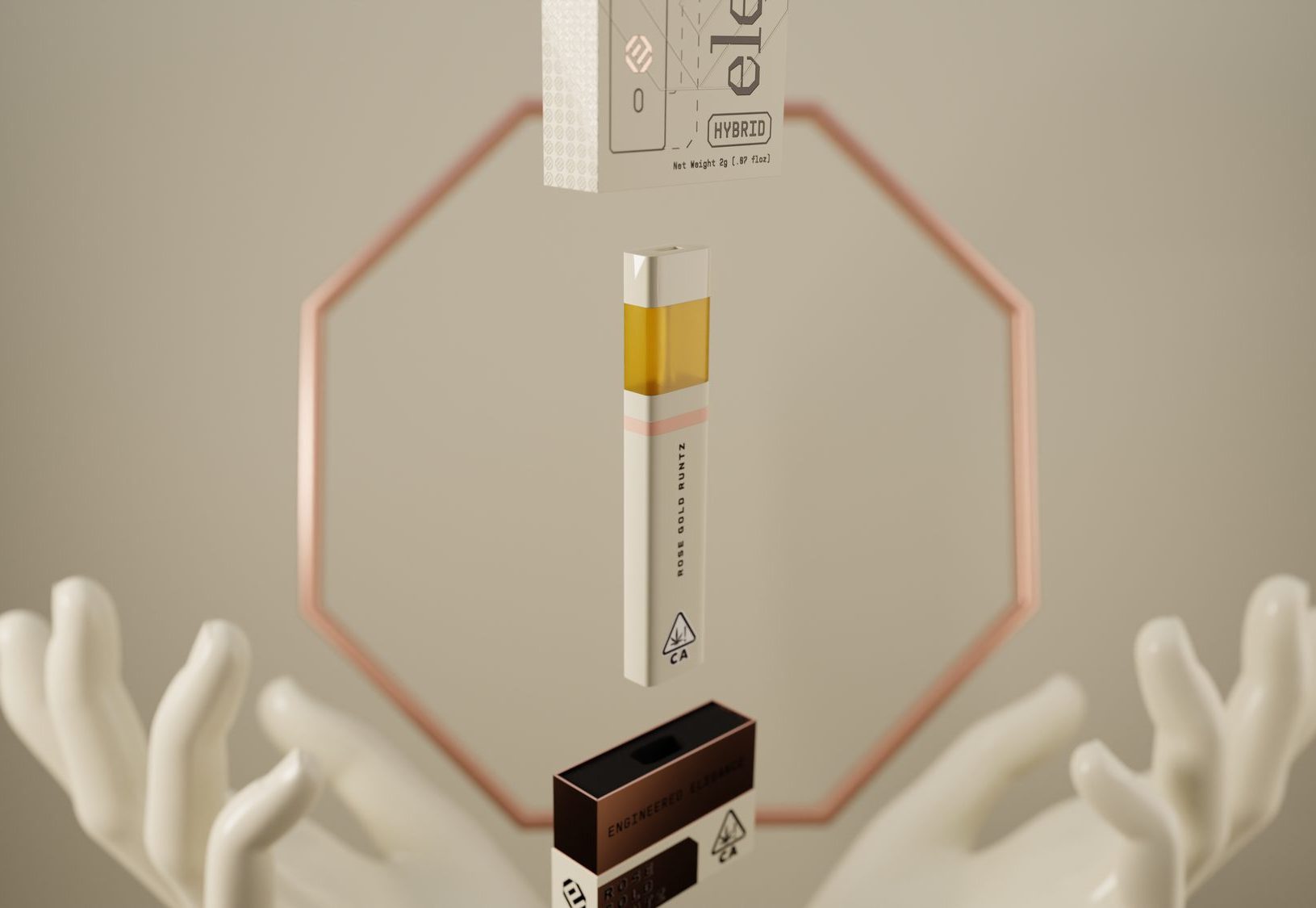
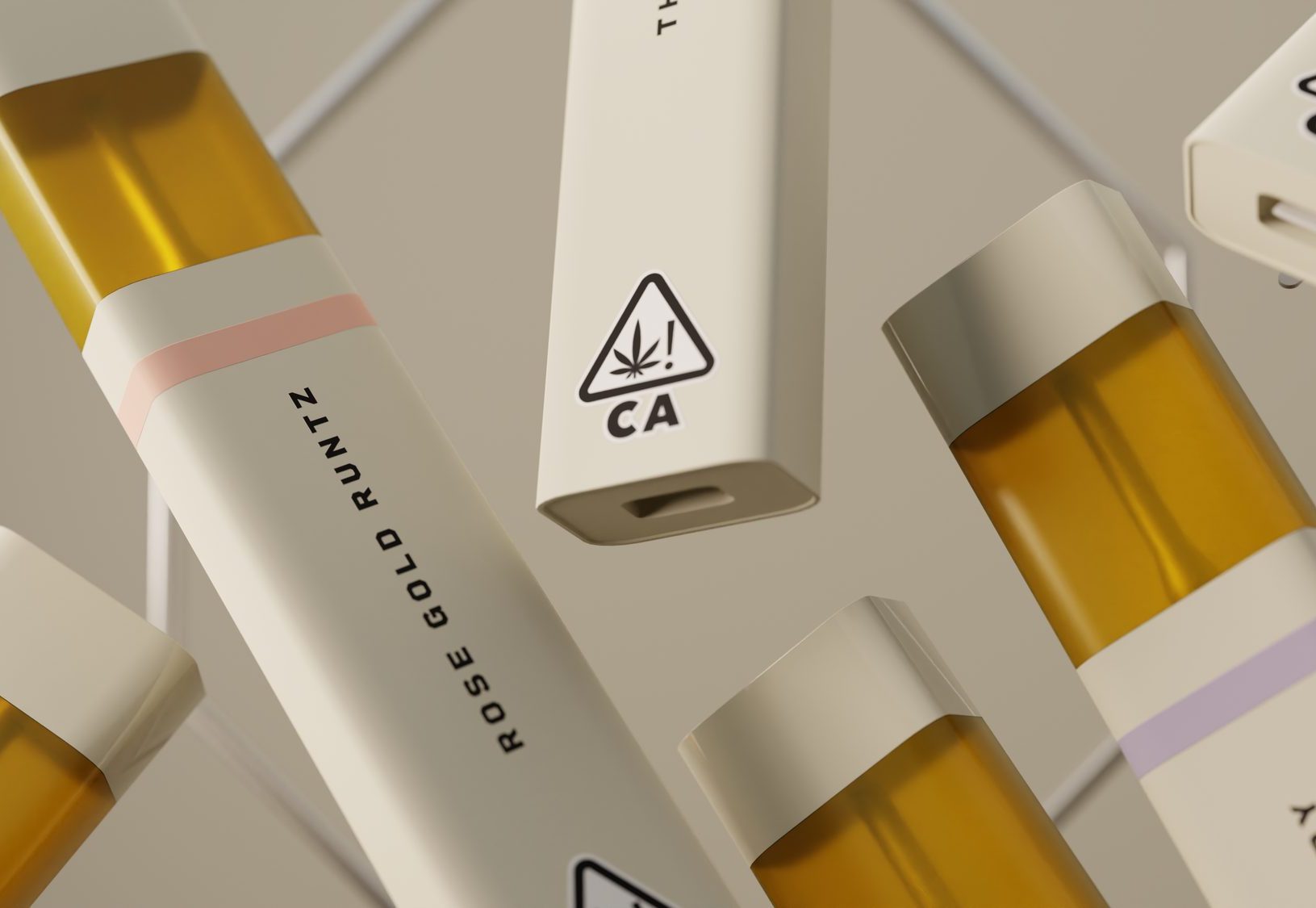
The 2 g disposable ships in a tall bone carton. Strain name sits in a colour band across the foot, the California THC triangle and net weight lock to the same corner on every SKU.
Pouch and tin
Gummies ship in a bone pouch with a clear window patterned on the octagon tile, each cell printed 200 MG. Pre-rolls slide out of a tin drawn to the same shape, five to a pack.
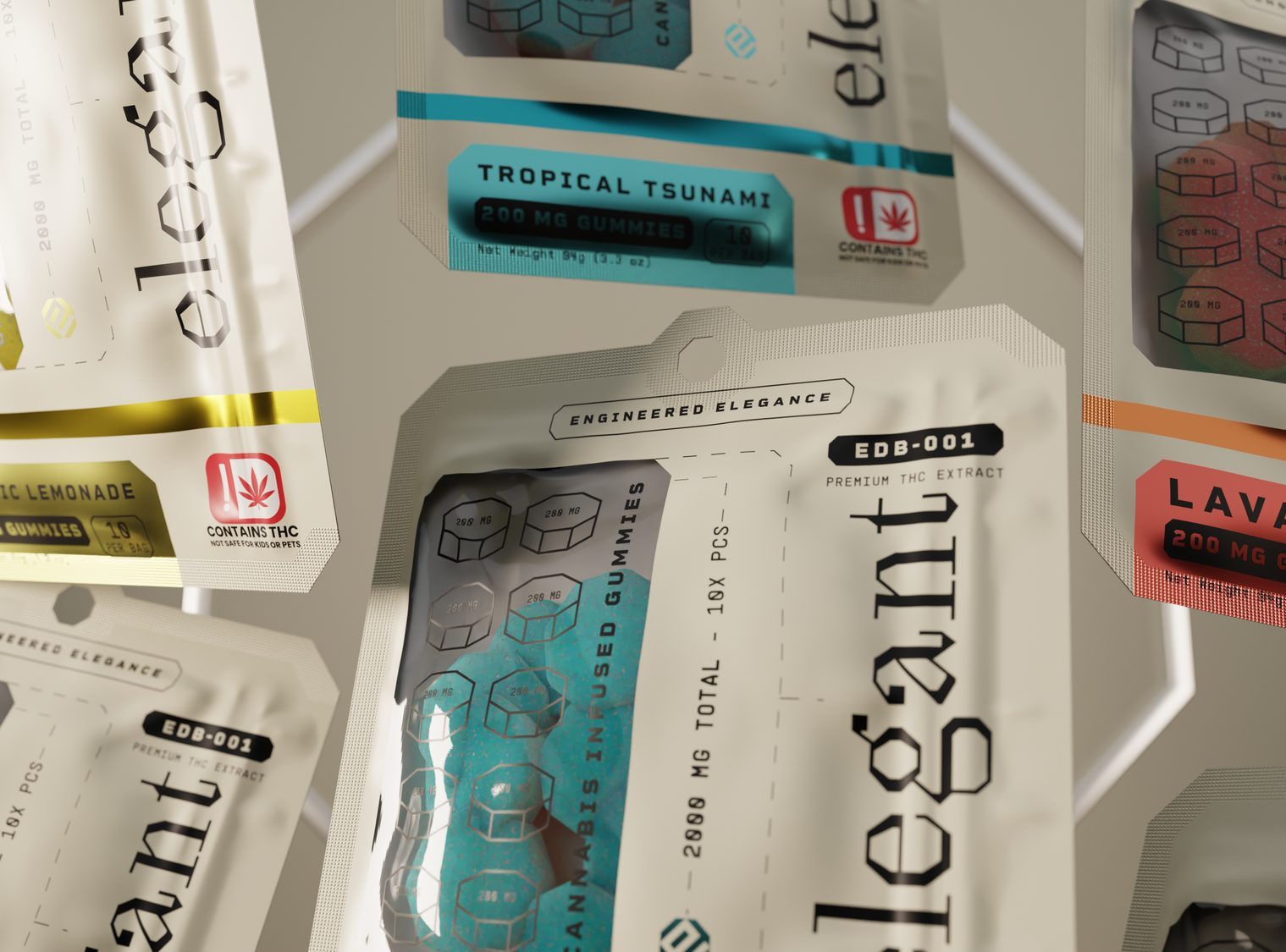
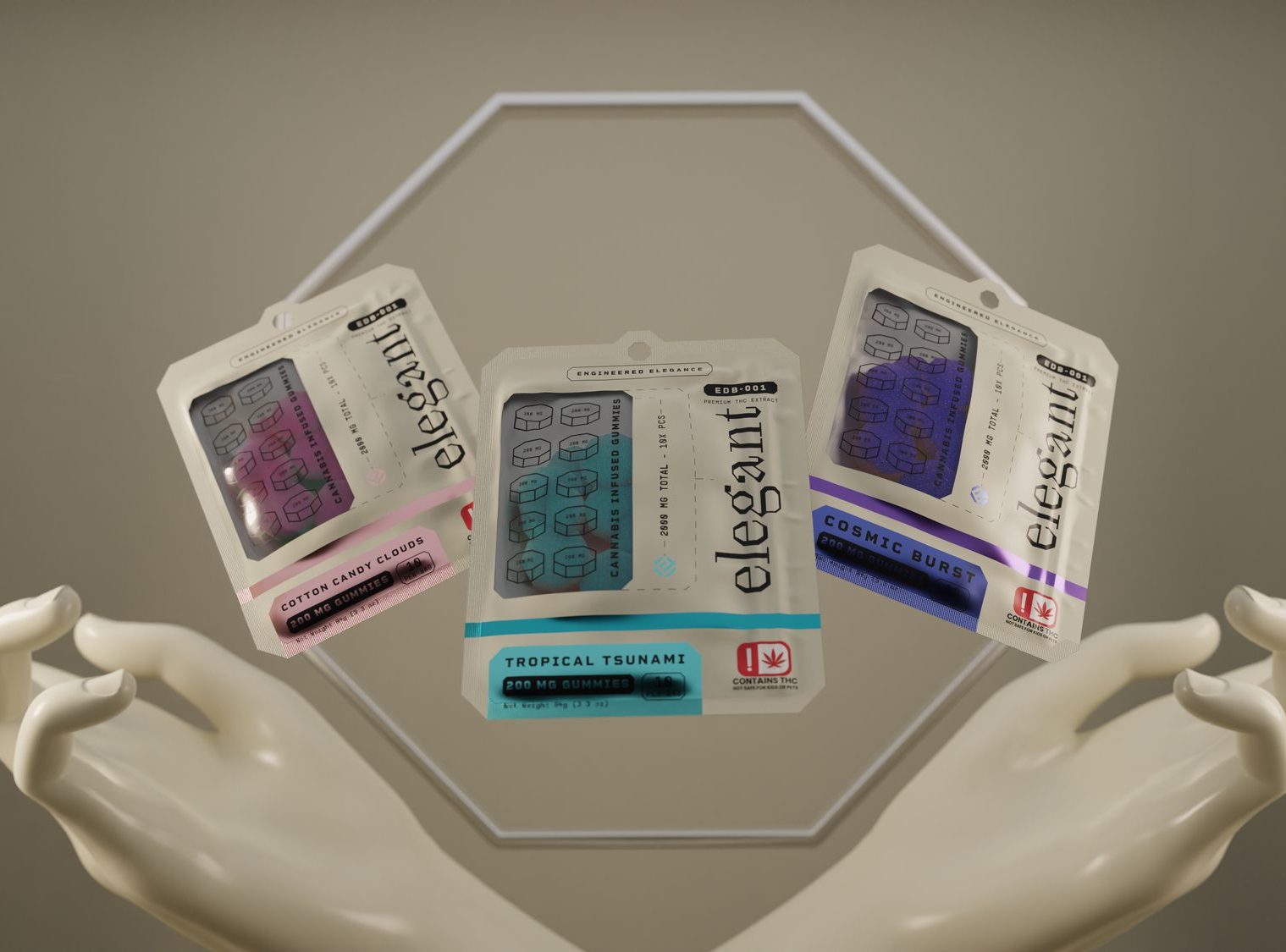
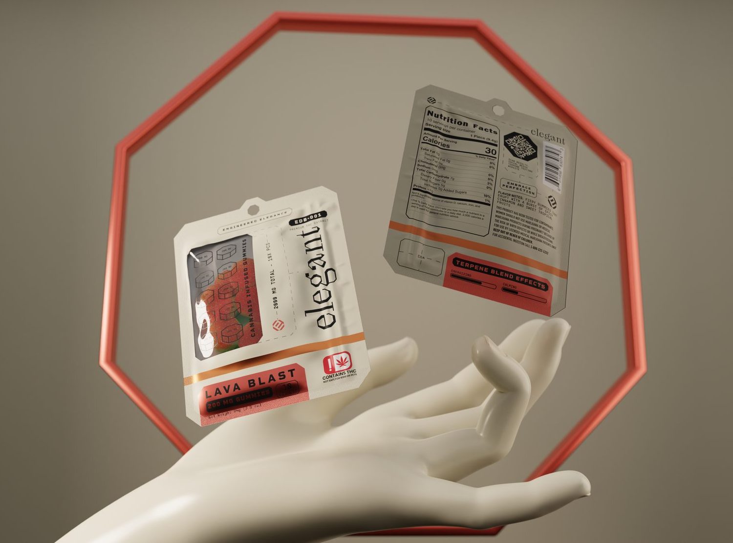
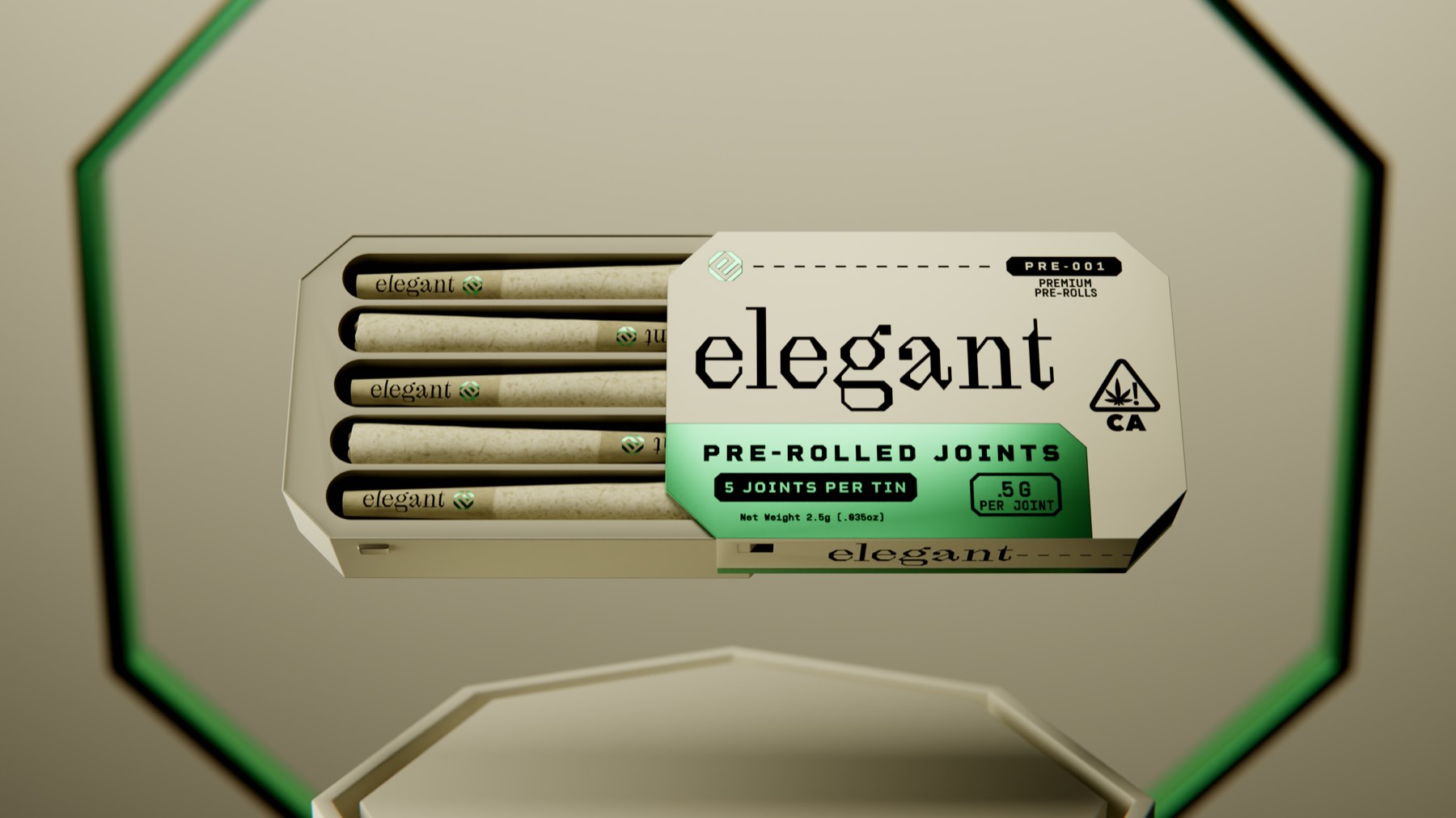
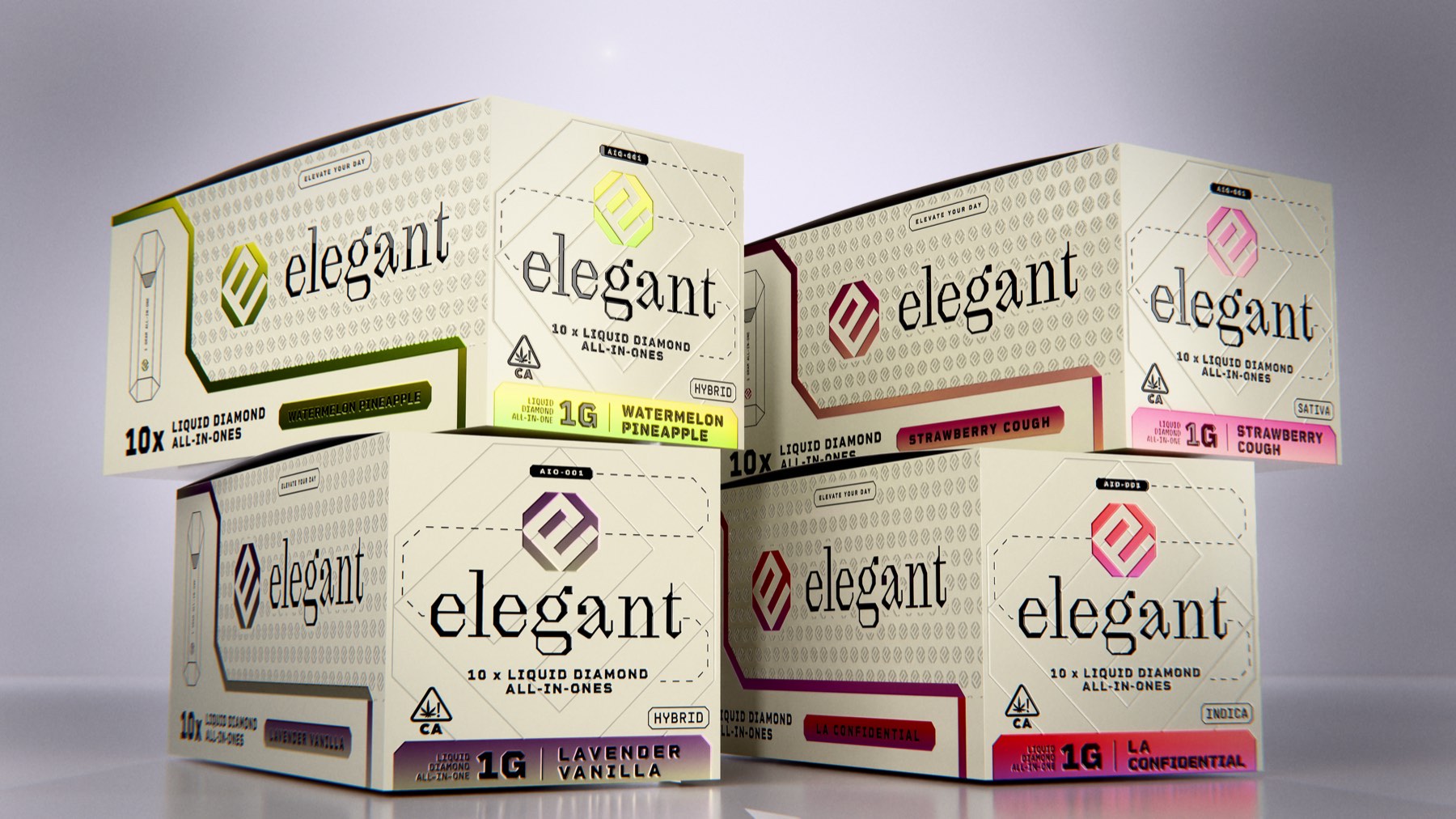
Colour arrives with the strain
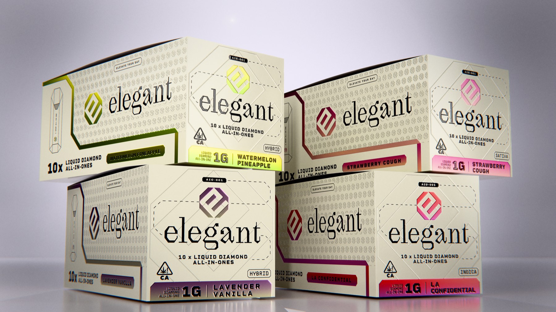
The octagon, cut in glass
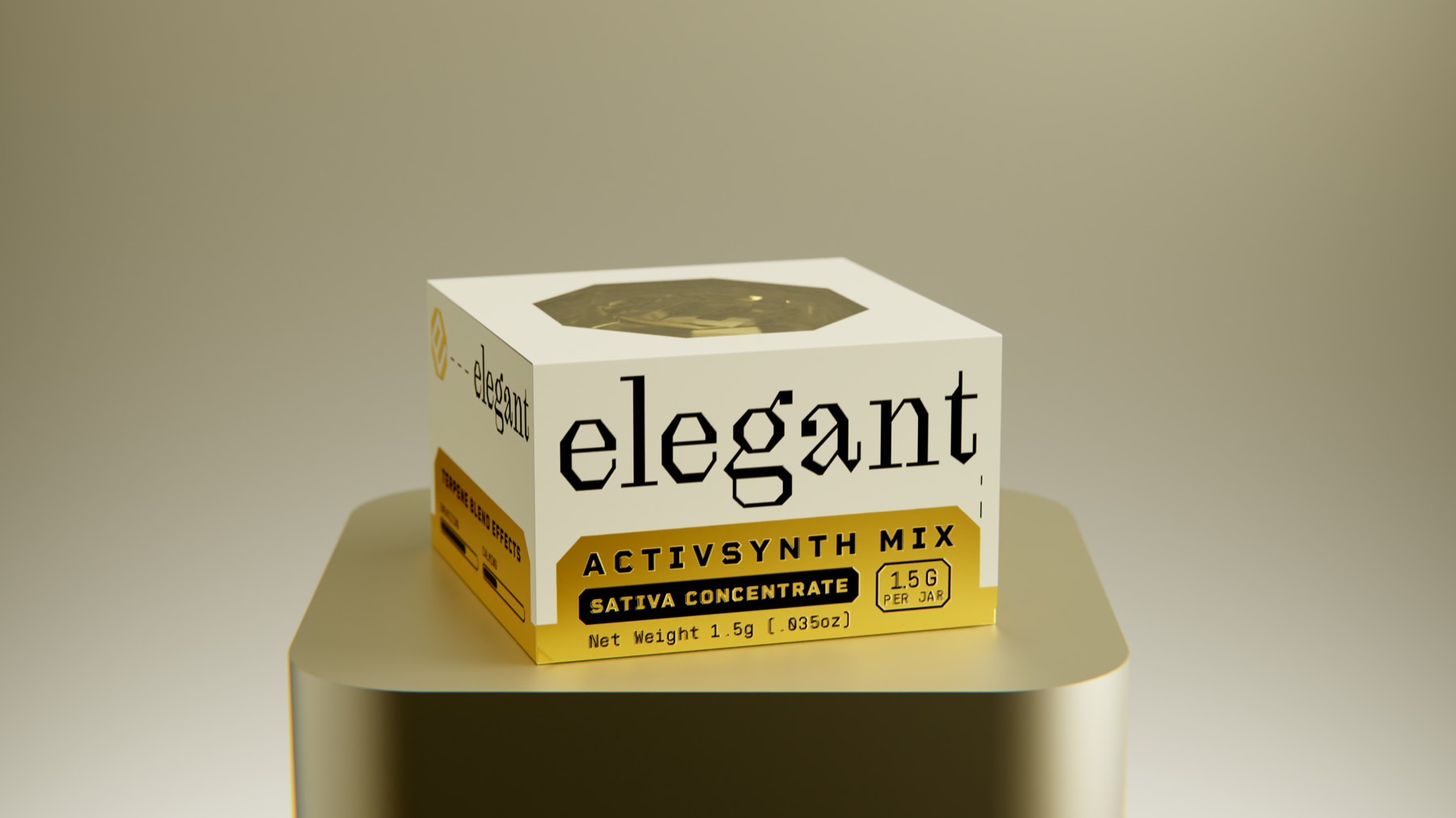
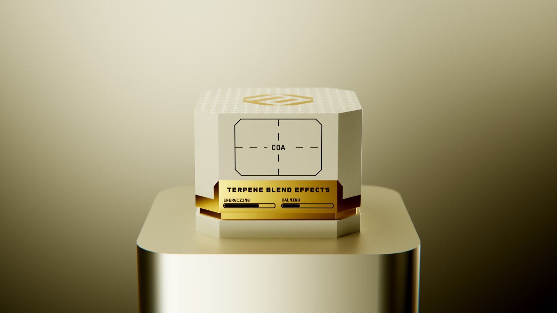
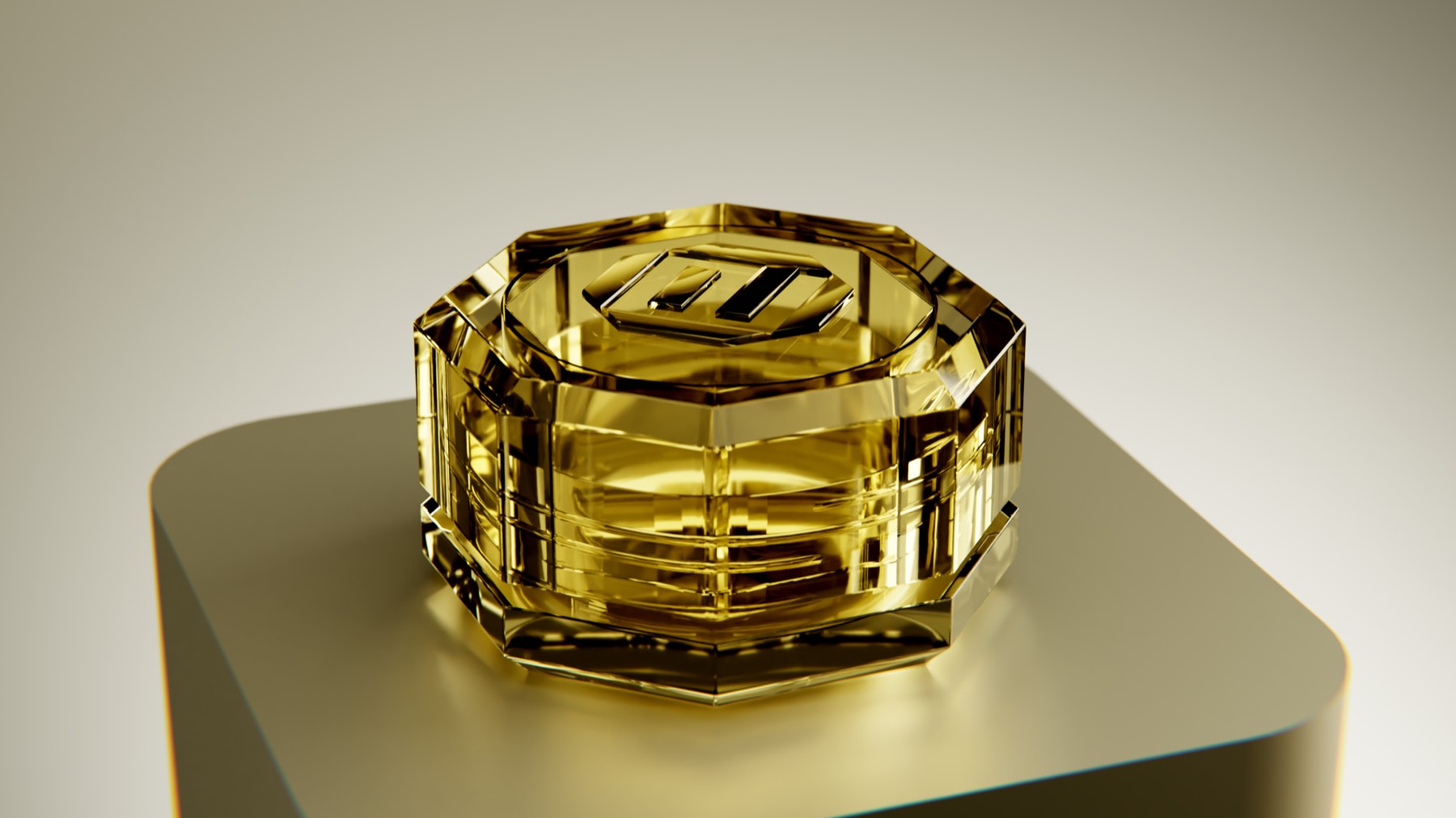
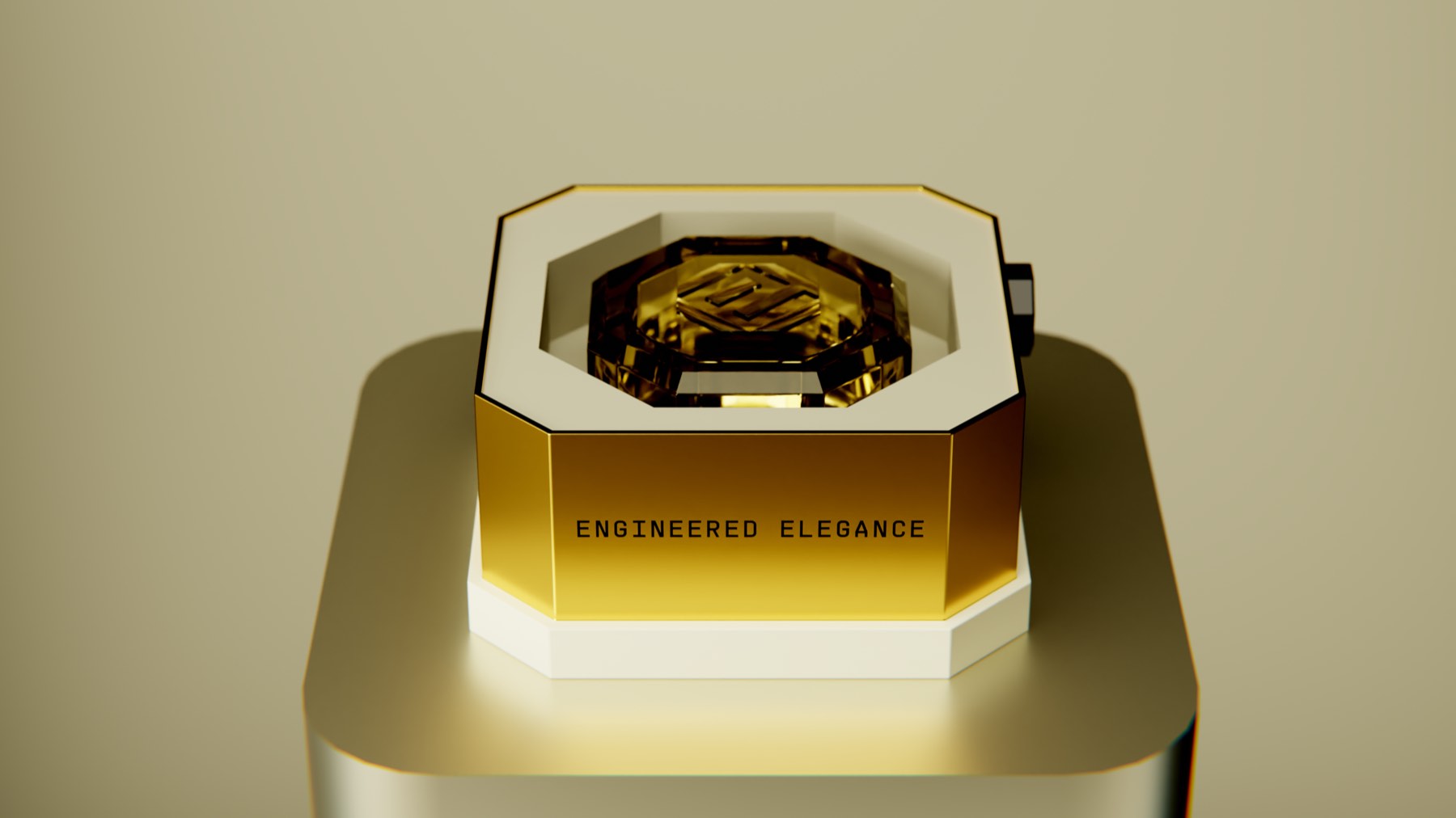
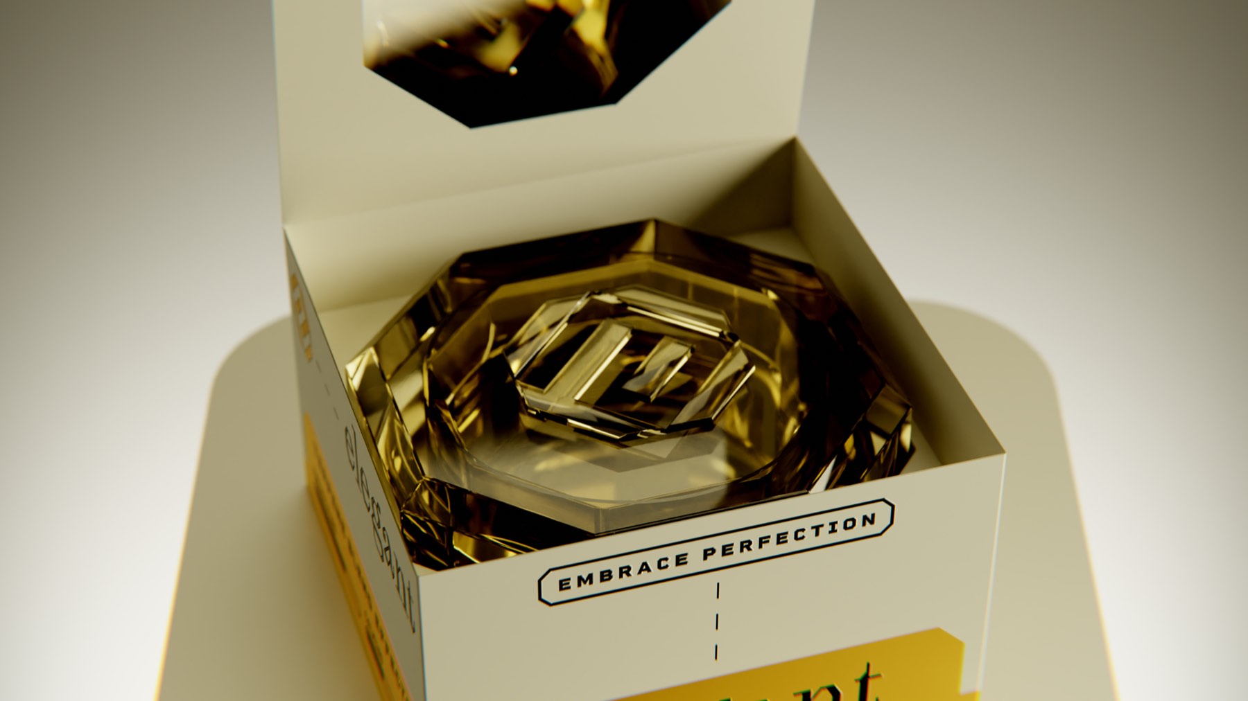
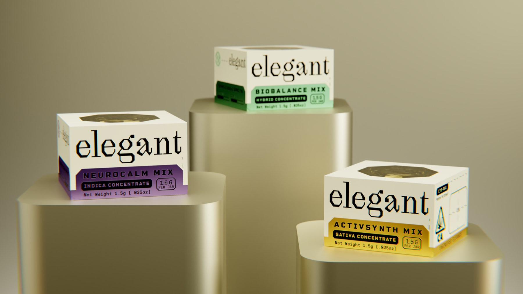
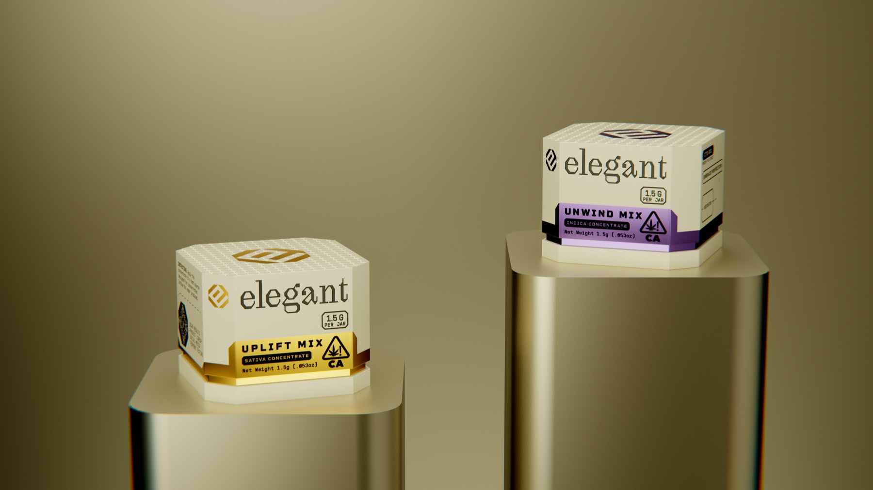
Concentrates are where the shape stops being printed and becomes the object: a faceted amber jar with the monogram cut into the lid. The carton around it takes one metallic band per mix.