
FREEO
Cold as a method.
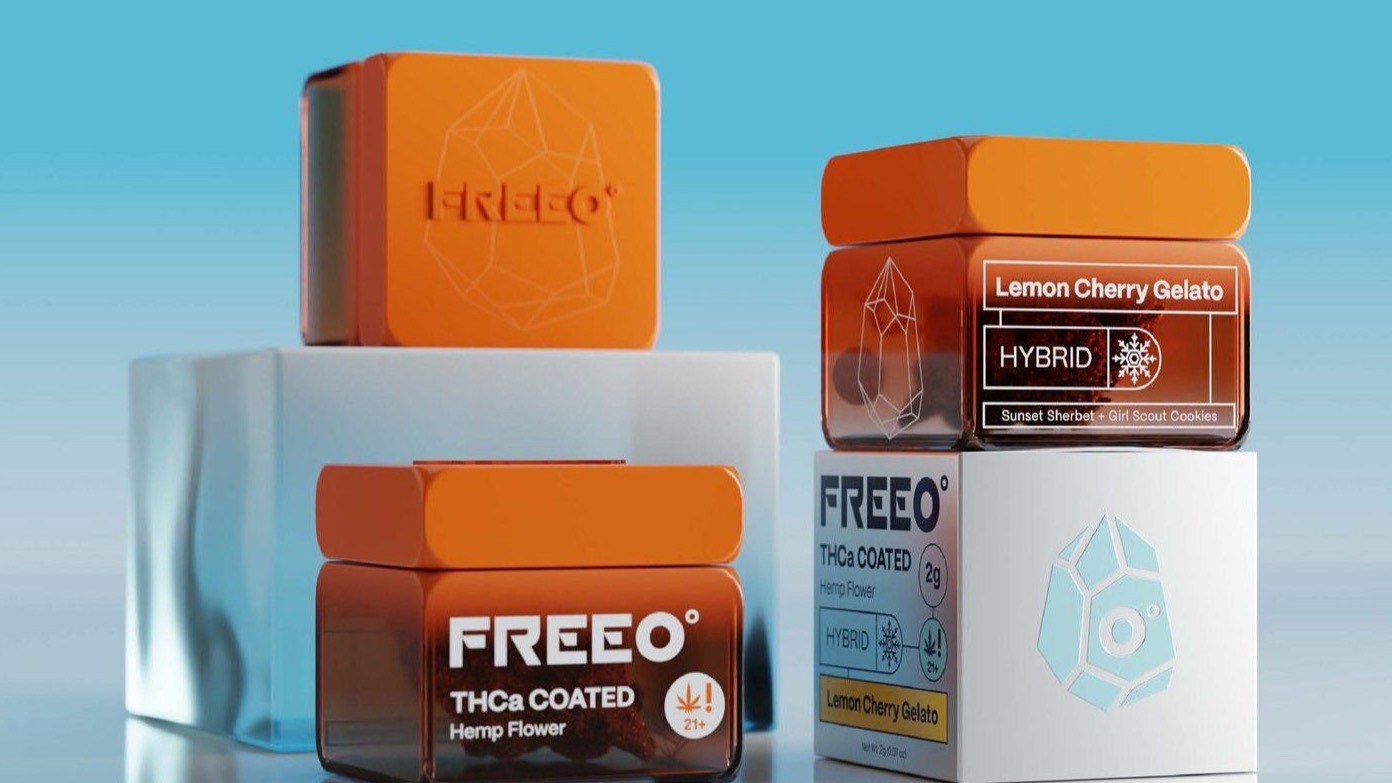
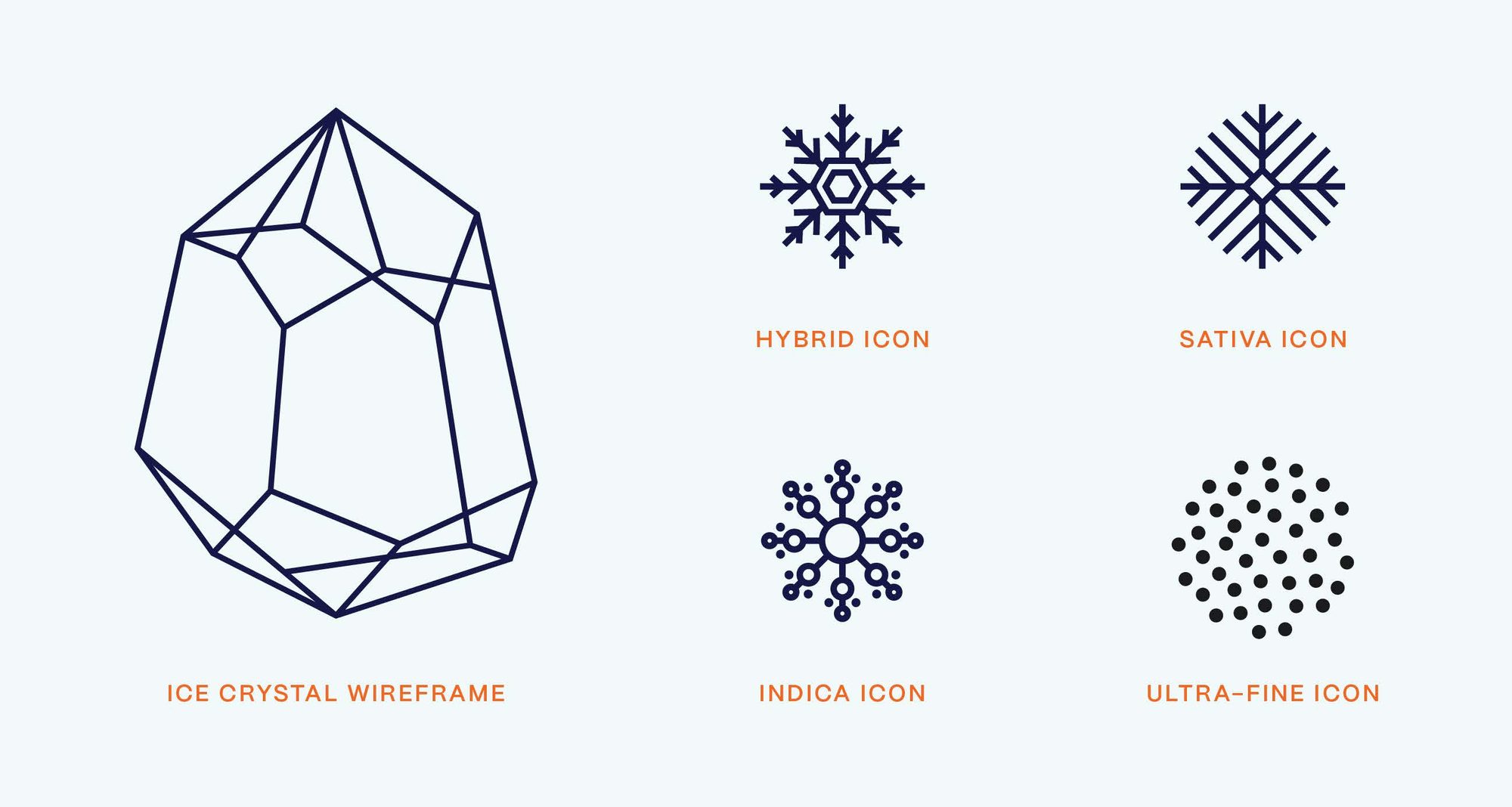
THCa research and development styled like an Arctic field station. A wordmark cut down from frío to 0°, an ice-crystal system that doubles as strain coding, and three formats — 2 g coated flower, five-pack mini pre-rolls, 1 g diamond sachets — held together by one orange.
A research station, not a smoke shop
FREEO sells THCa into a category that mostly competes by shouting. The brief ran the other way — a science-led brand drawn from the sleek, functional design of Arctic research stations.
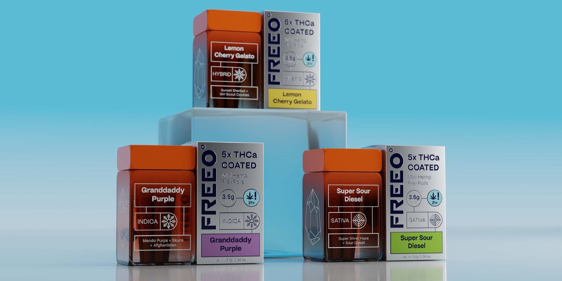
Which is why the palette is cold. Ice white and navy carry the structure, pale ice blue the diagrams, and a single high-visibility orange does the job it does on polar gear.
Frío, resolved to zero degrees
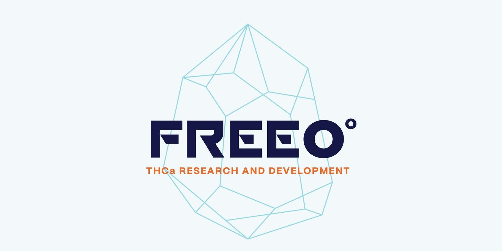
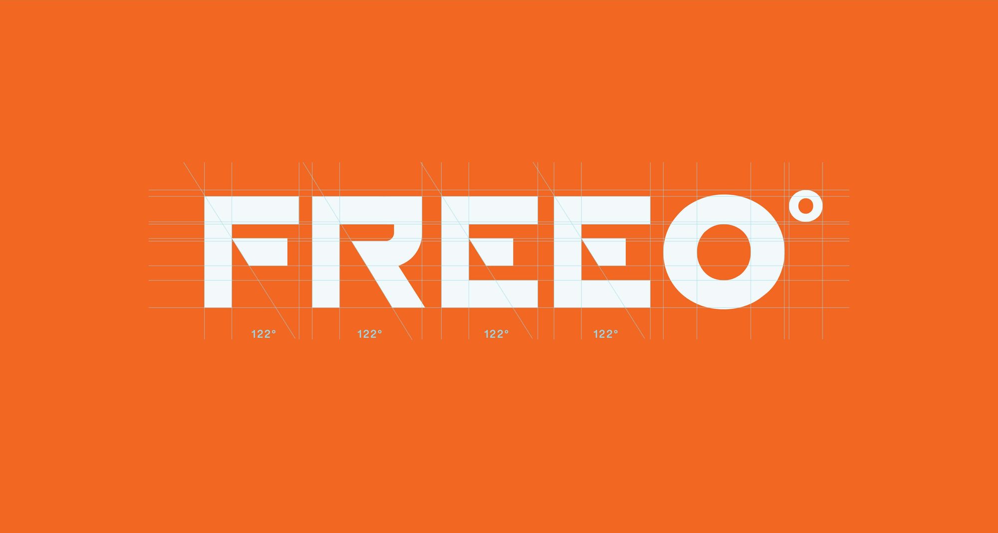
The wordmark takes its cue from frío, the Spanish for cold, with a degree symbol on the O so the name lands on 0°. The crystal wireframe reads two ways at once: the Arctic, and crystallised THCa.
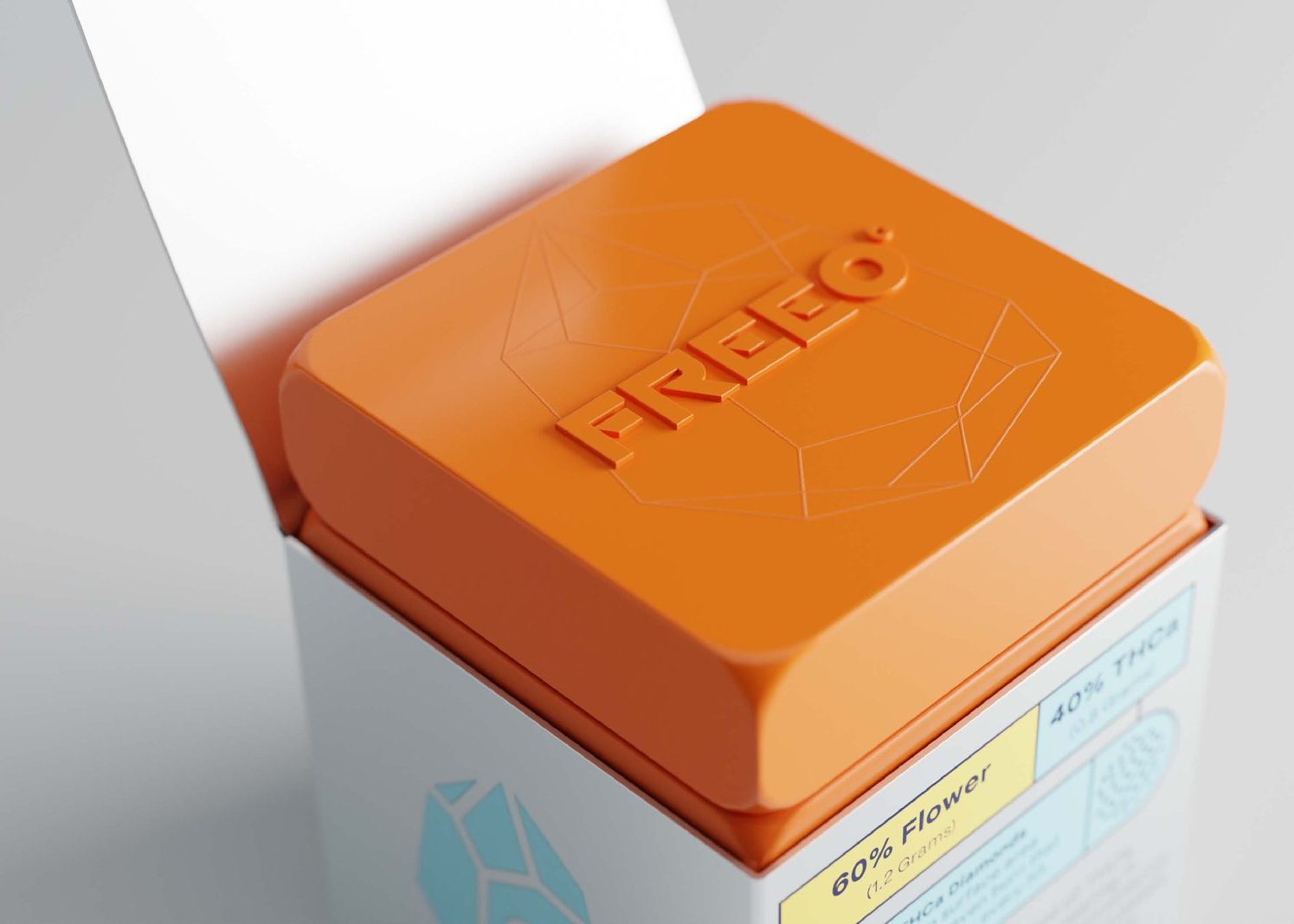
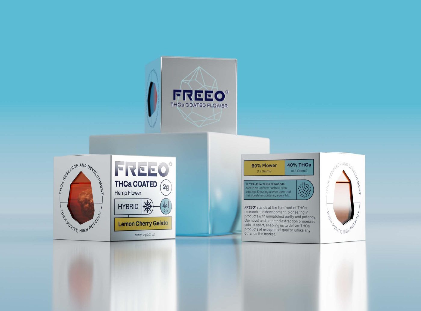
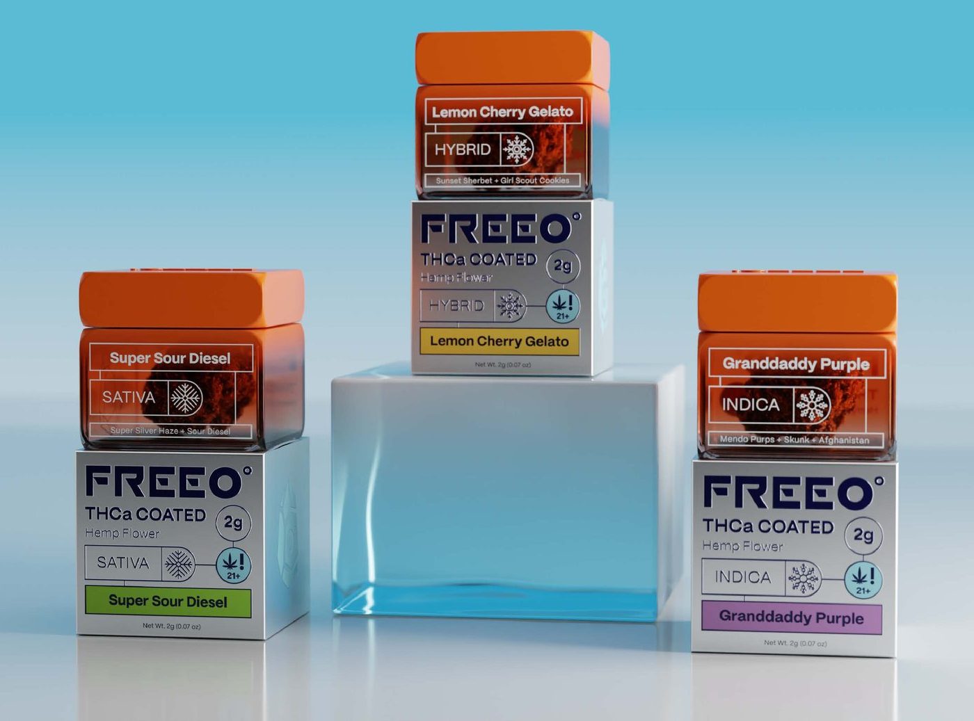
Two packs, one panel system
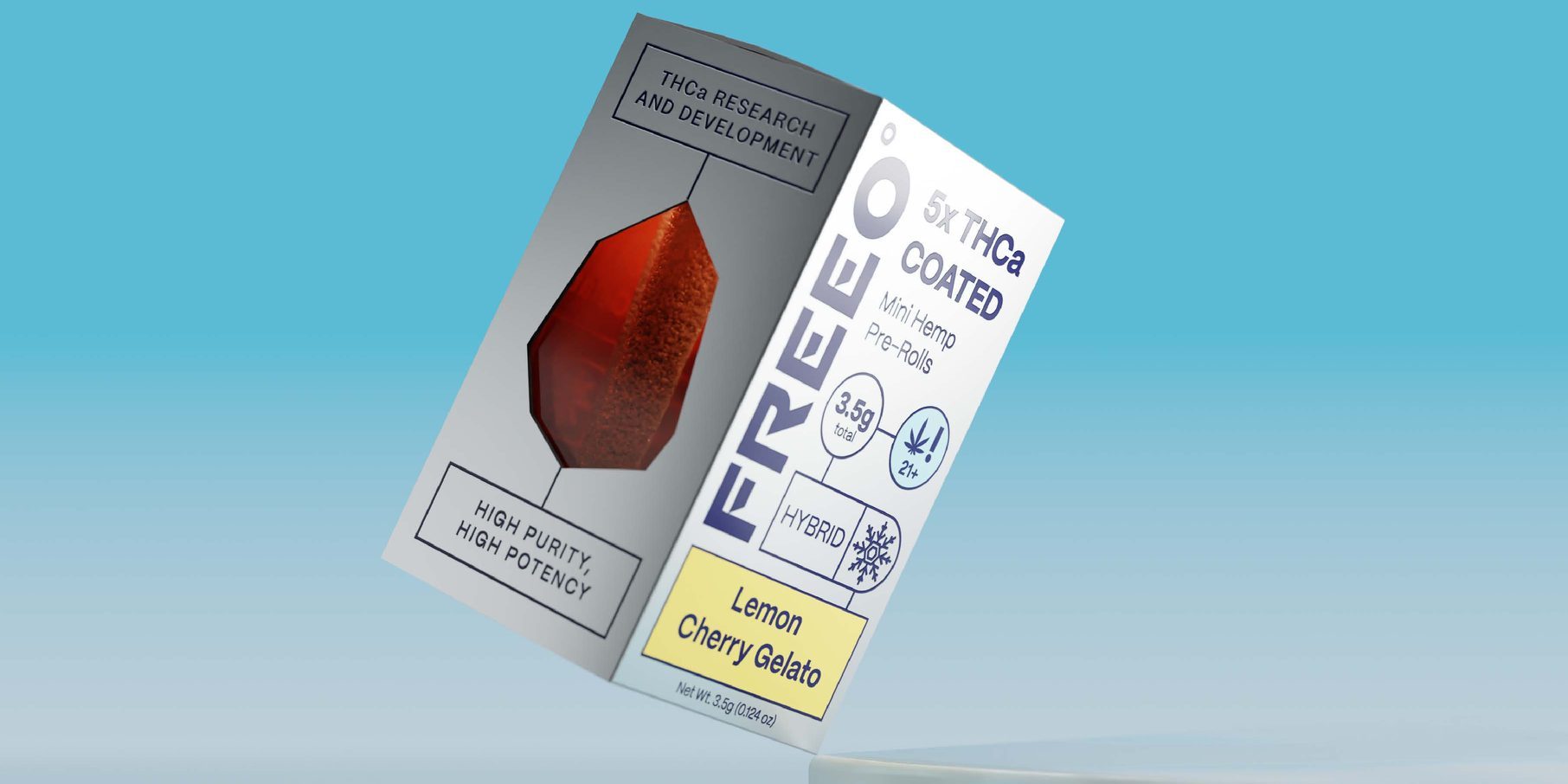
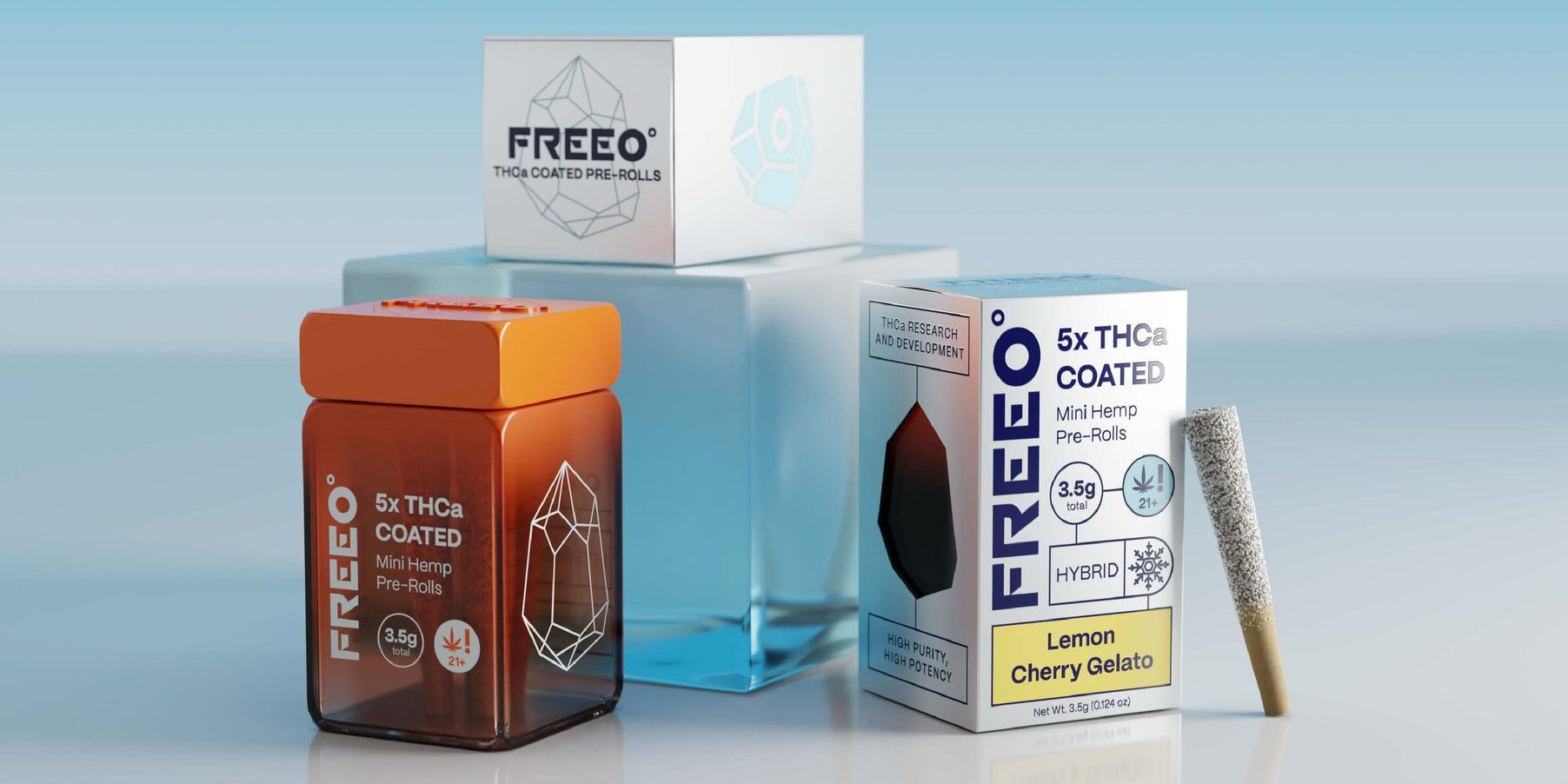
The flower is coated, not infused: 2 g in the pack, 1.2 g of hemp carrying 0.8 g of THCa, stated as a split bar on the back panel. The pre-roll carton runs the same furniture over five minis, 3.5 g total.
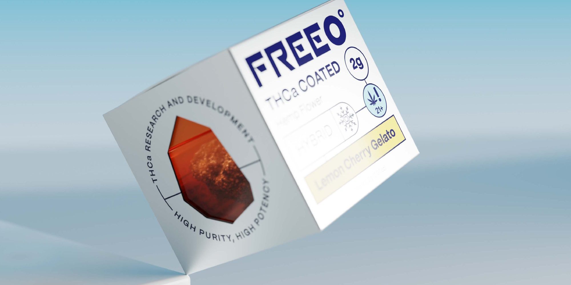
One gram, tear from here
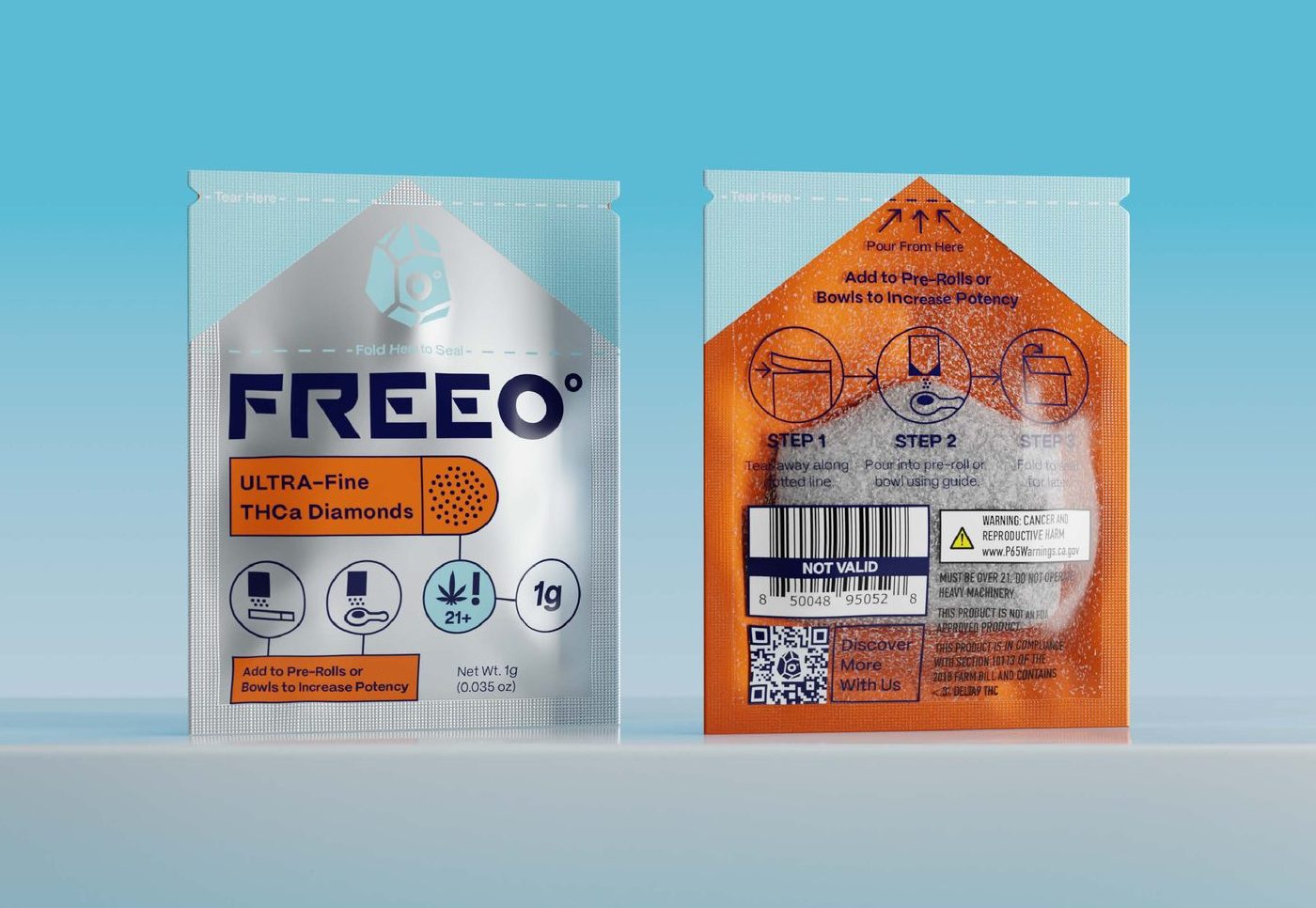
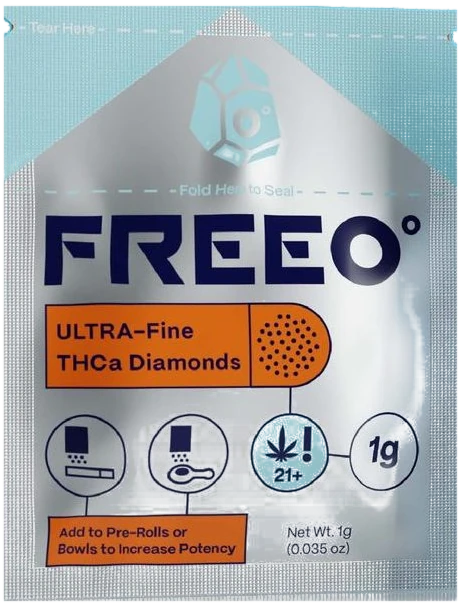
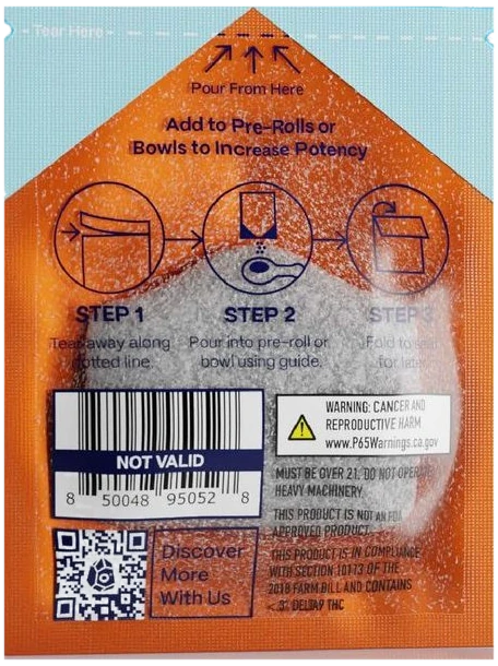
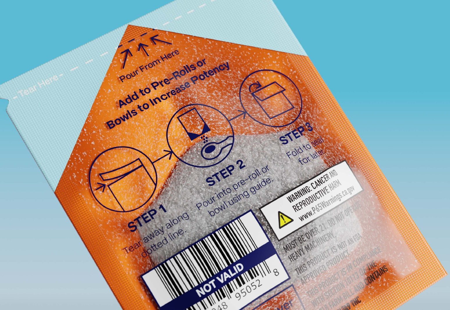
The concentrate on its own: ULTRA-Fine THCa diamonds, 1 g, in a sachet rather than a jar. Silver metallised front, solid orange back — and the instruction is drawn rather than written, tear notch to pour point to fold.