
Fresh Bros
What’s your fresh?
Fresh Bros sells exotic flower to people who don’t settle — and sells it like produce. We built the identity, a slanted wordmark with an arrow-tagged BROS and a neon palette coded by strain type, and a grocery-aisle packaging system of 3.5 g pouches, 1.5 g pre-roll tubes, quarter-pound bags and 10-count counter boxes, then shot it in the aisle, the greenhouse and the sky.
Fresh isn’t the name. It’s the promise.
Fresh Bros is for people who live unapologetically and don’t settle — real, fresh and premium, 100 percent of the time. The pitch is freshness, not price.
We gave the name something to live up to: a hard-cut wordmark, a neon palette coded by strain type, and a produce-aisle packaging system that treats flower like something you pick up fresh — pouch, pre-roll tube, quarter-pound bag and counter box.
Built to move.
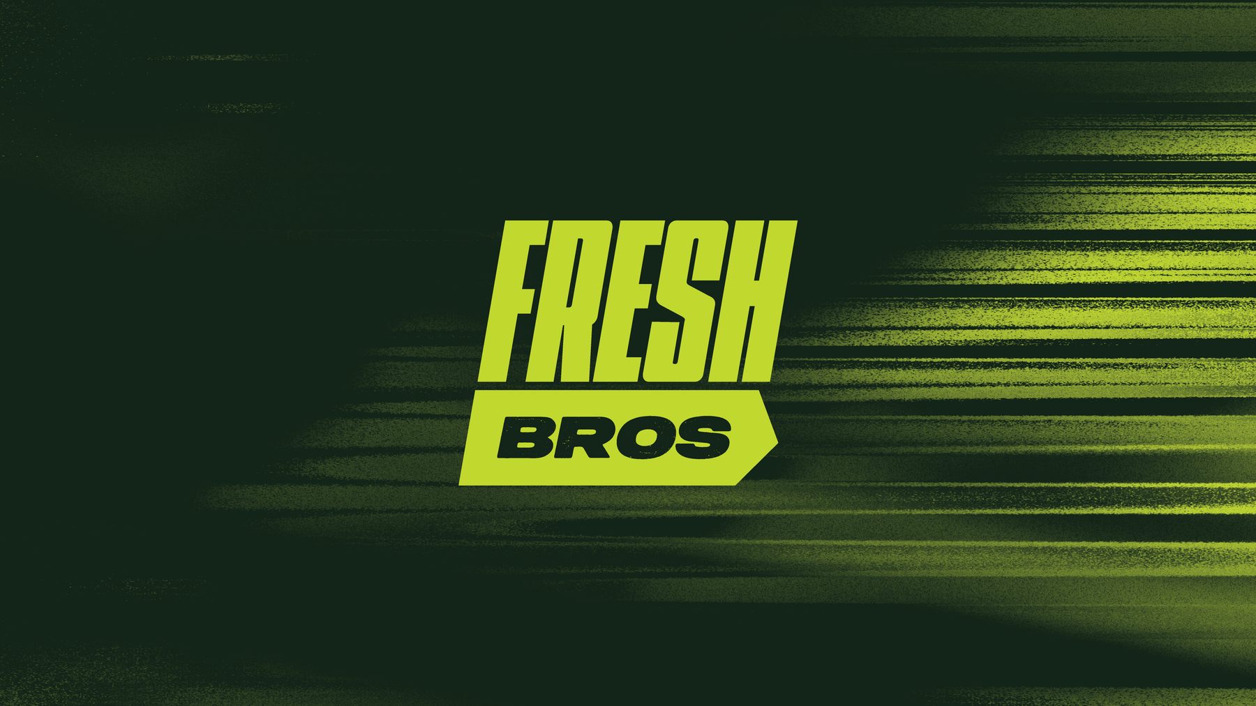
Bold, angular type on a slant carries the energy of sportswear, and BROS sits in an arrow-shaped tag that gives the mark direction. A clean FB monogram and a hang-tag shape — a nod to fashion — take the identity onto smaller surfaces.
The look blends a hype-fashion edge with minimal, modern design: neon tones and motion blur on Grit Green, and a custom icon for each type — a globular indica, a bursting hybrid, a radiating sativa.
Broccoli where the bud goes.
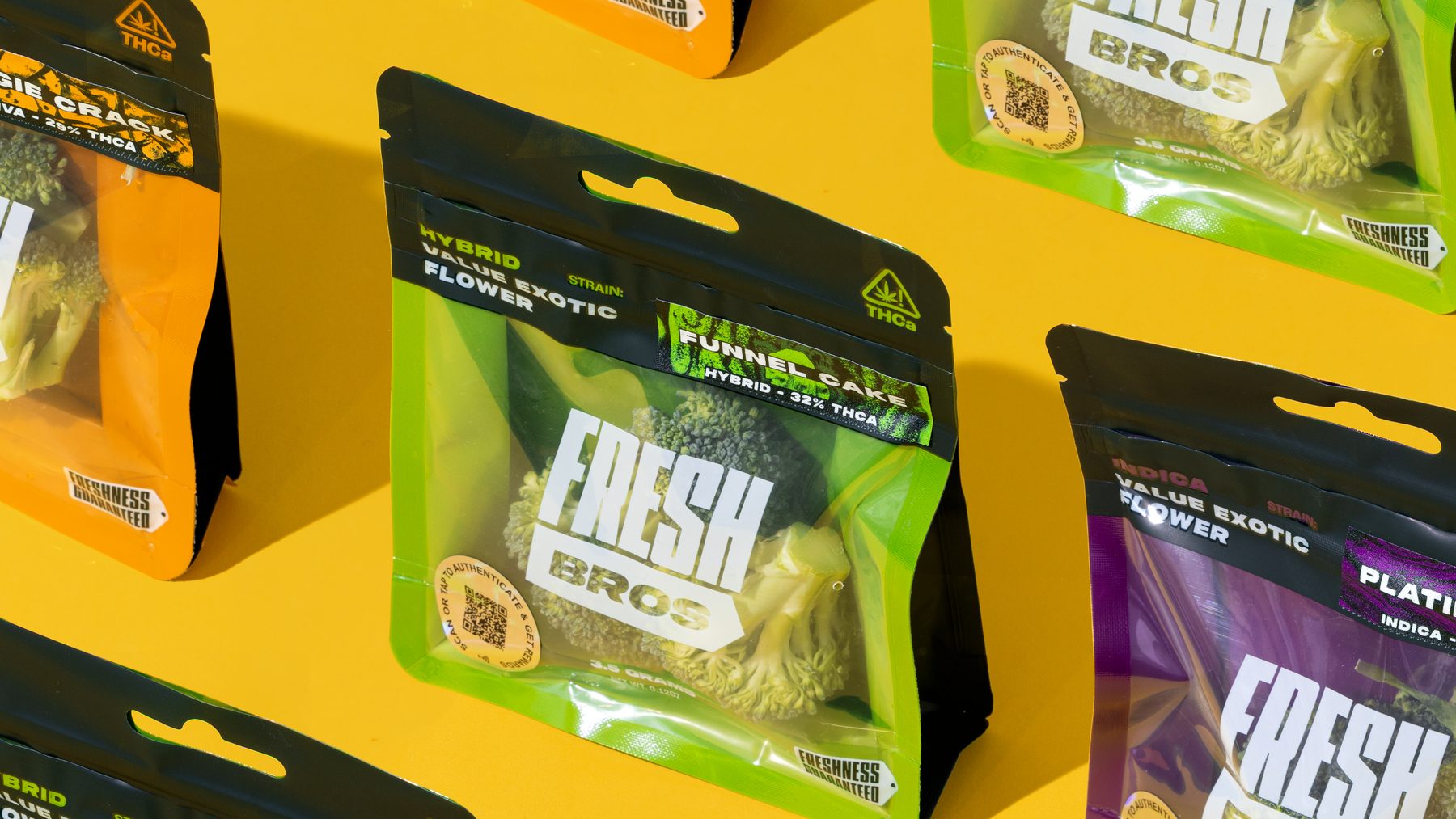
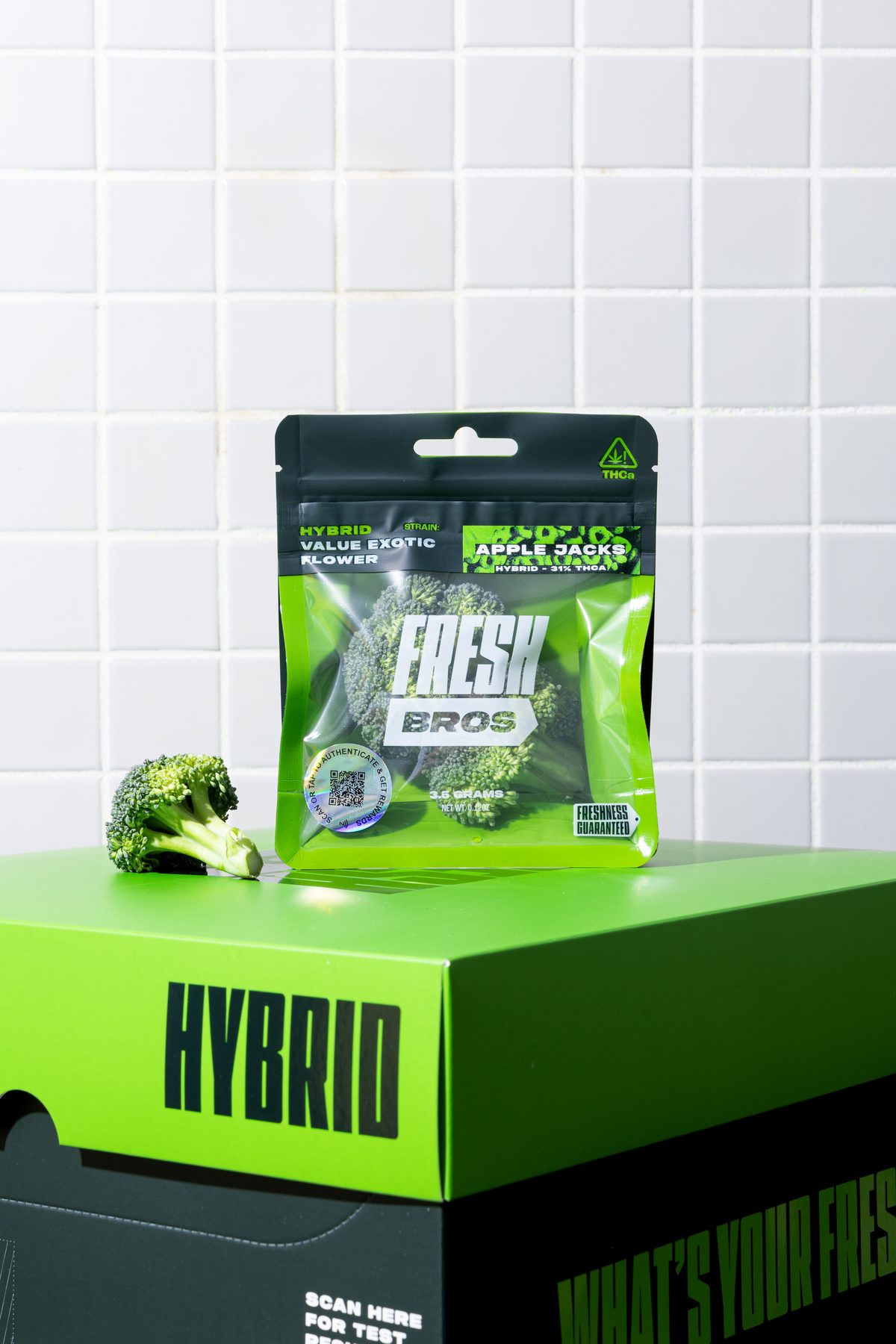
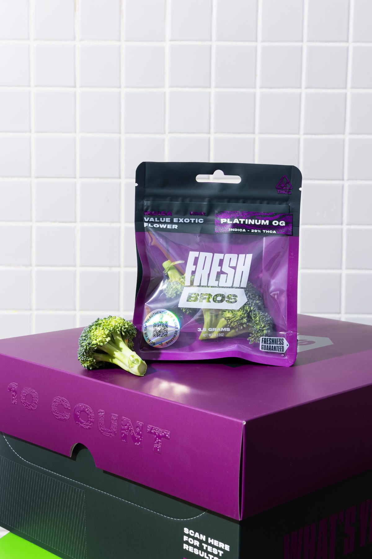
A black hood over a colour body, and a head of broccoli in the window where the flower would sit. Hang hole, a Freshness Guaranteed tag, a scan-to-authenticate rewards seal, and the strain and THCa figure in a fixed slot — Apple Jacks at 31 percent, Platinum OG at 29. The matching 10-count counter box carries the type across its front and the lab results behind a scan code.
Same face, four sizes.
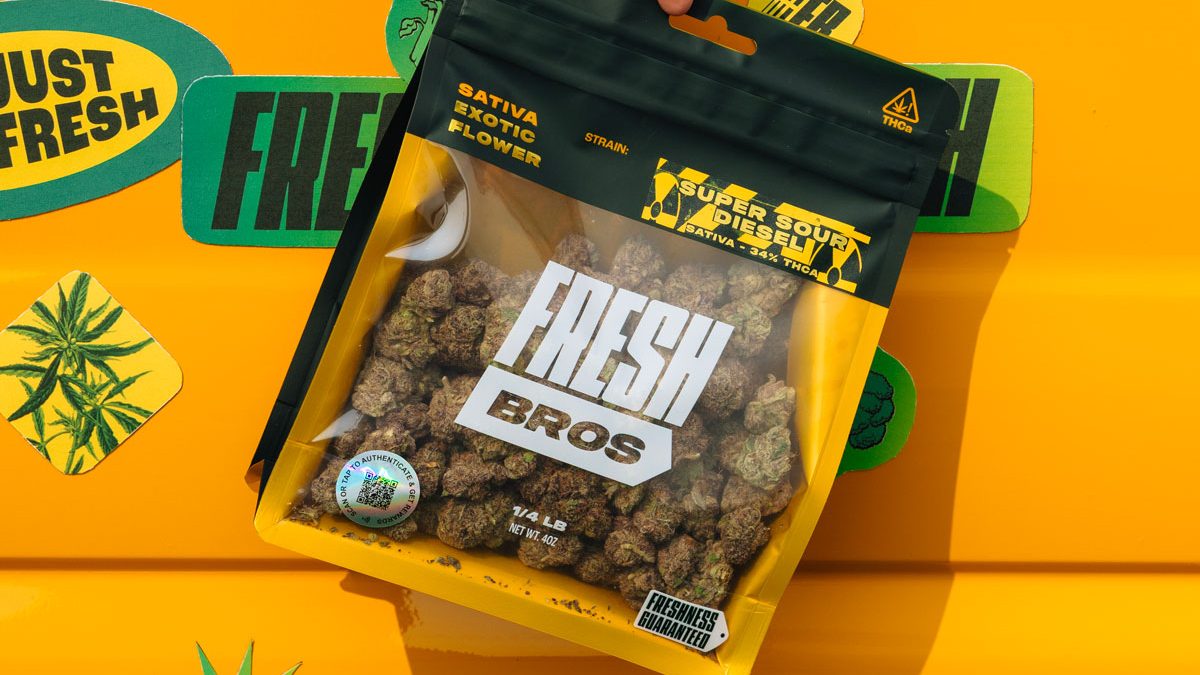
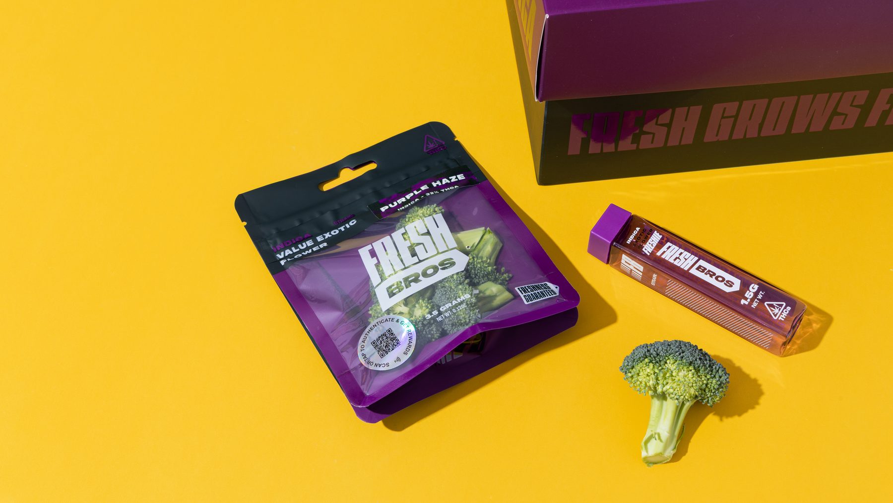
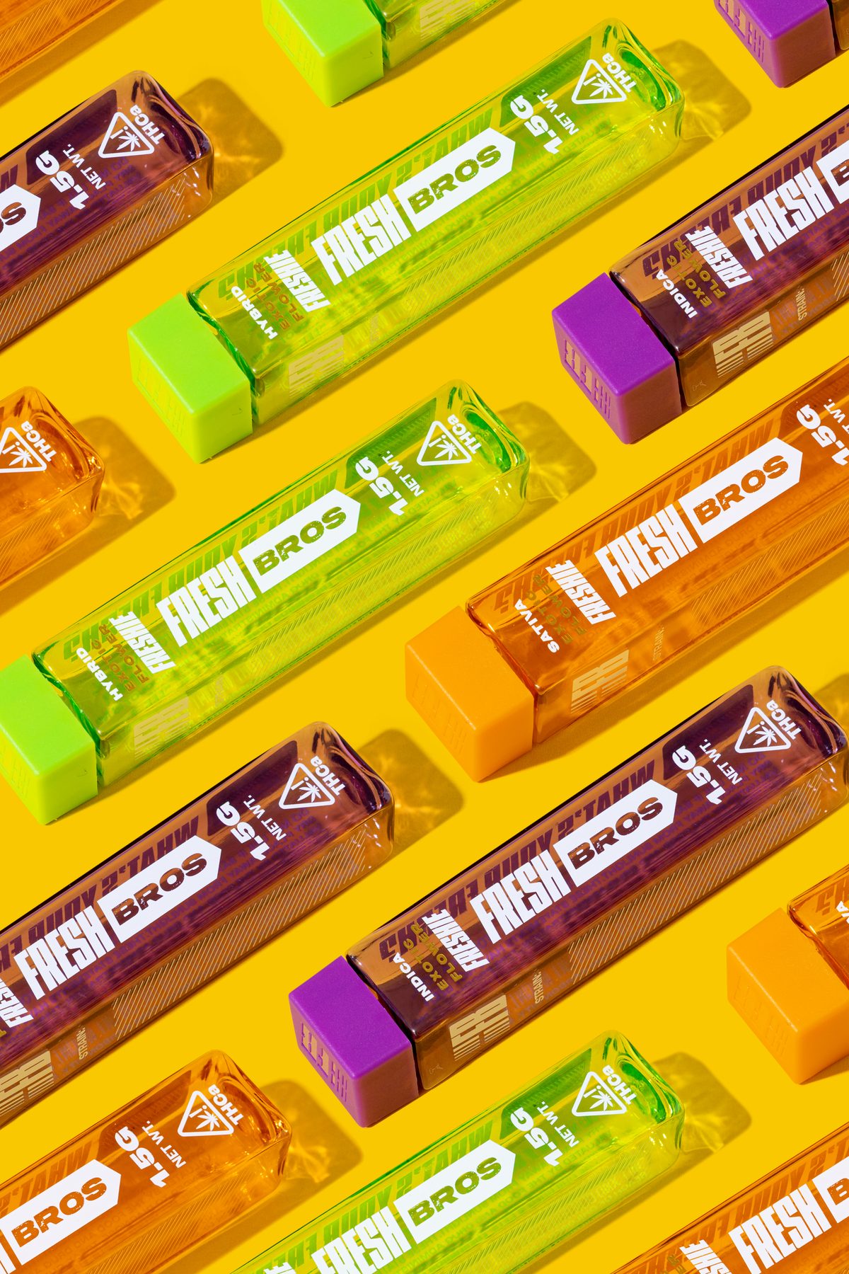
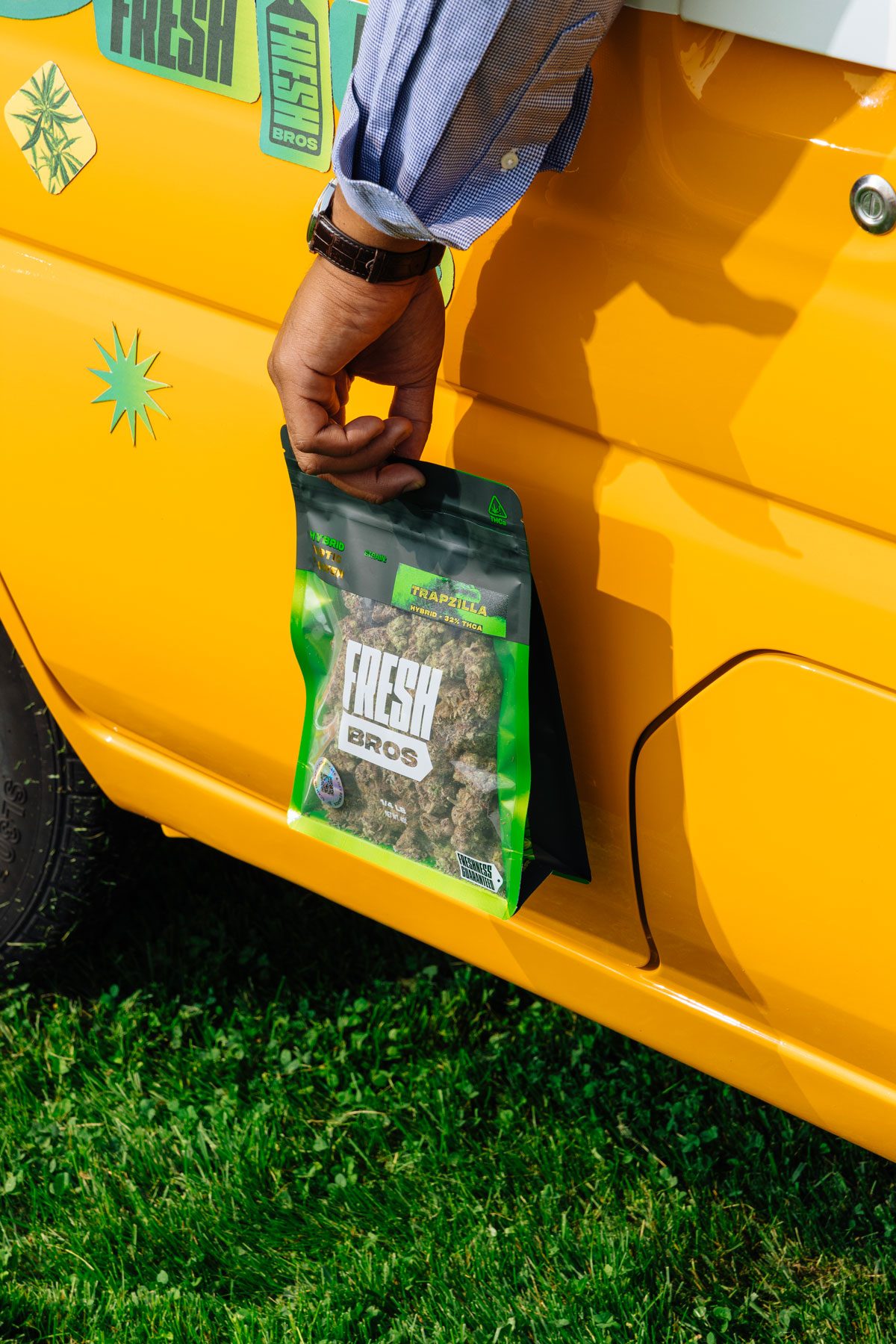
Pre-rolls ship in clear 1.5 g tubes with a colour-matched cap and the wordmark running the length. Bulk buyers get the quarter-pound bag — the same black hood and window with four ounces behind it, Trapzilla at 32 percent THCa.
Sold like produce.
Value-exotic flower usually competes on price. Fresh Bros competes on freshness, so the campaign puts the pack where fresh things live — a crate of oranges, a greenhouse, an open sky.
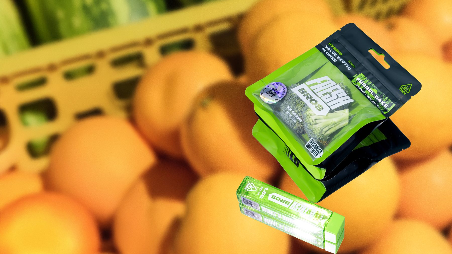
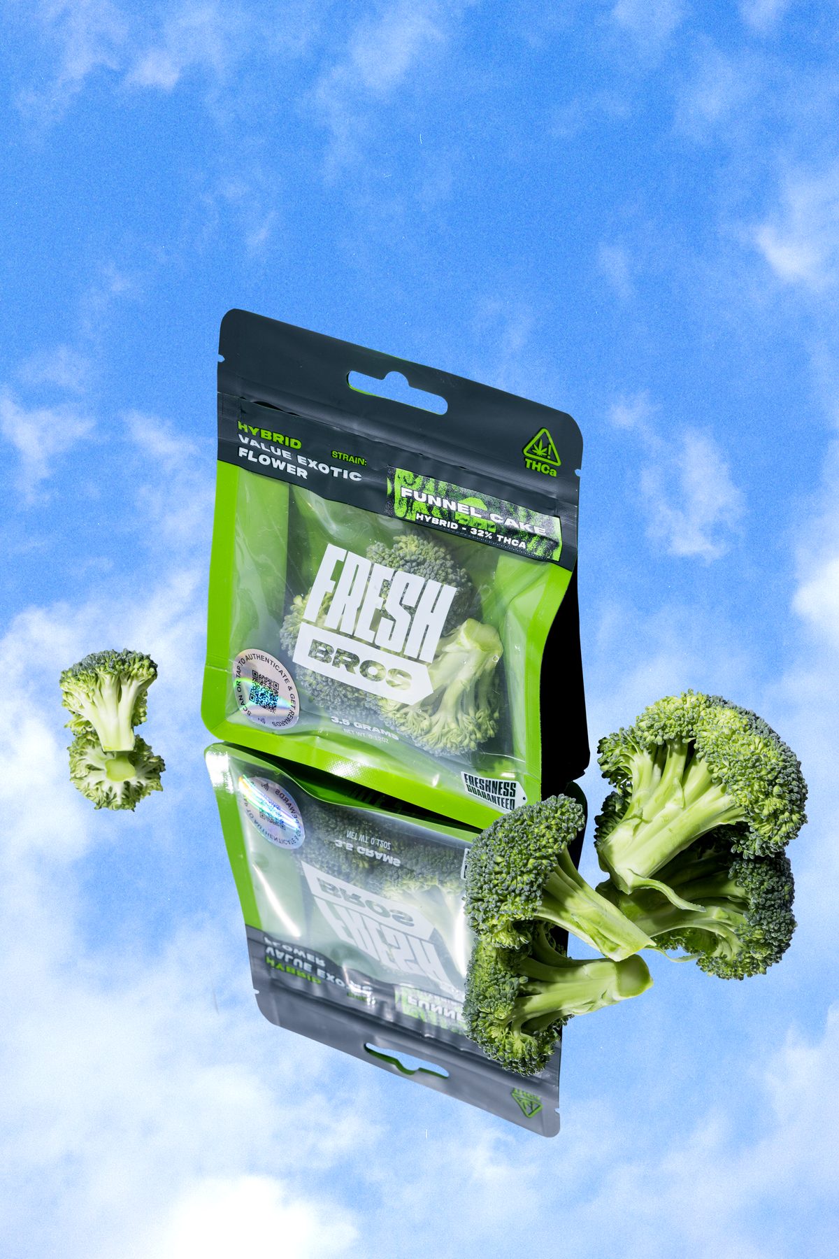
Neon against nature.
Hybrid pouches float with broccoli florets in a blue sky; a pouch and tube hang among the tomato vines.
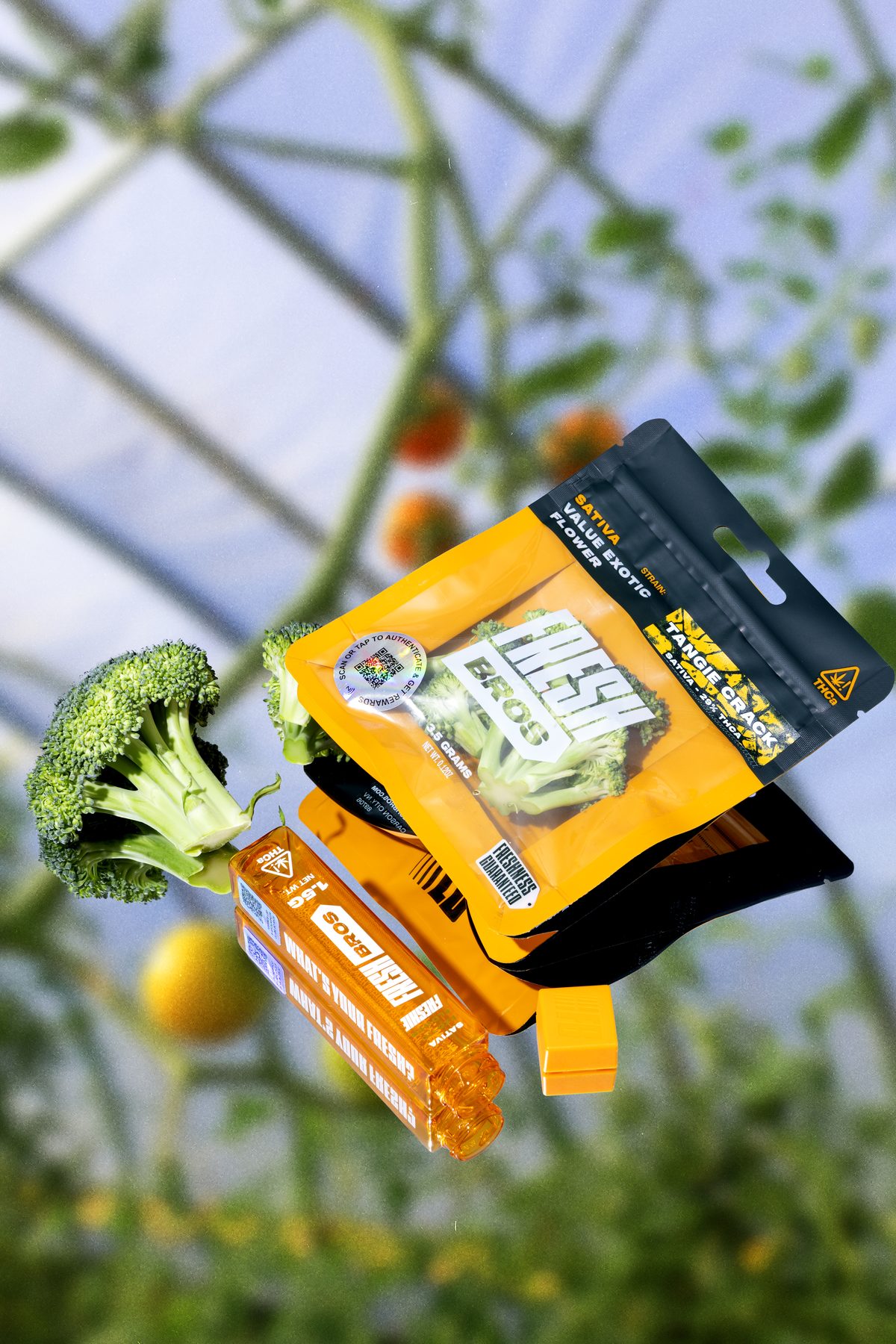
Your grocer has it.
A grocer in a Fresh Bros apron, a basket of oranges and pouches. We shot the system in the aisle, in the greenhouse and on the truck, so the brand arrives with its own imagery.
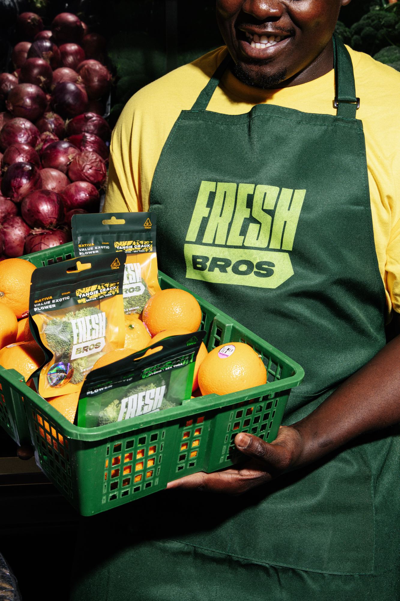
One face, every strain.
Lime for hybrid, orange for sativa, purple for indica — pouch, tube cap and counter box shift together, and the wordmark never moves.