


Pure Amino
Purity simplified.
Pure Amino is a peptide house built on purity, consistency and clarity — compounds you can rely on, without unnecessary complexity, held to the same standard batch to batch. We drew the wordmark and the dosing-rhythm dot rule beneath it, set a lines-and-dots identity around them, and ran one label architecture across GHK-Cu, NAD+ and GLP-3RT in two vial sizes, plus the bacteriostatic water that goes with them.
The new science standard
Pure Amino enters the wellness landscape with a focus on purity, consistency and clarity — peptide compounds you can rely on, without unnecessary complexity, with standards that stay the same from batch to batch.
In a space that overcomplicates the basics, the brand strips away what isn’t essential. That philosophy shapes everything, from formulation to communication, and it set the brief: let the compound, the dose and the purity figure carry the pack.
A dot rule that keeps time
A bold, highly legible grotesque wordmark, refined with custom modifications until soft curves sit against precise edges — the structure and flow of compounds within the body. The dotted rule beneath it references repeated dosing, the rhythm of controlled, consistent application.
A reduced mark built from the core letterforms covers the small scales, and a secondary logo drops the supporting elements for digital and minimal environments.
Lines and dots
The identity runs on a system of lines and dots for structure, rhythm and consistency — precision with clarity, and less visual noise. In imagery that means clean compositions and controlled overlays: sharp, minimal and hard to scroll past.

One label, three compounds
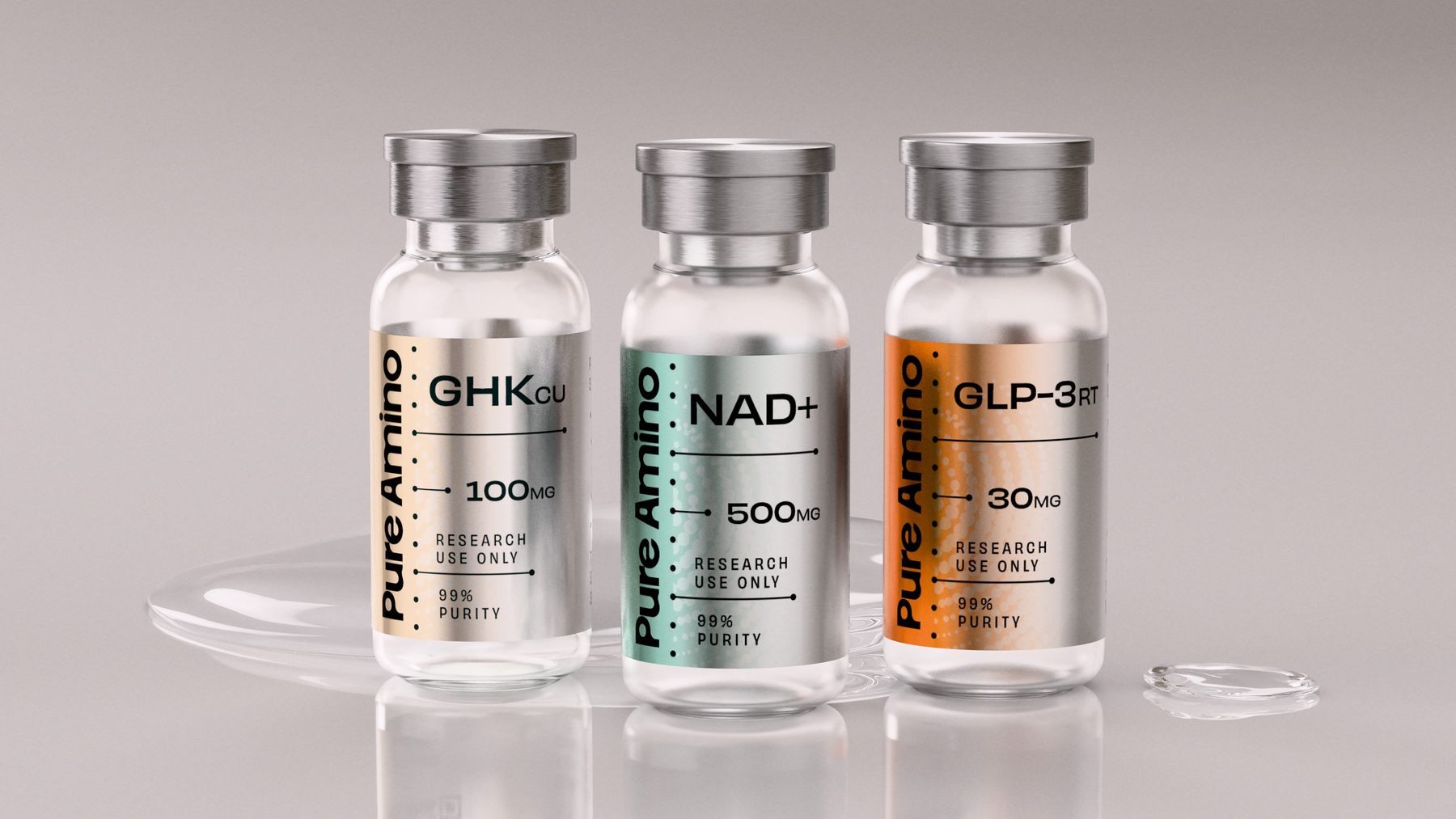
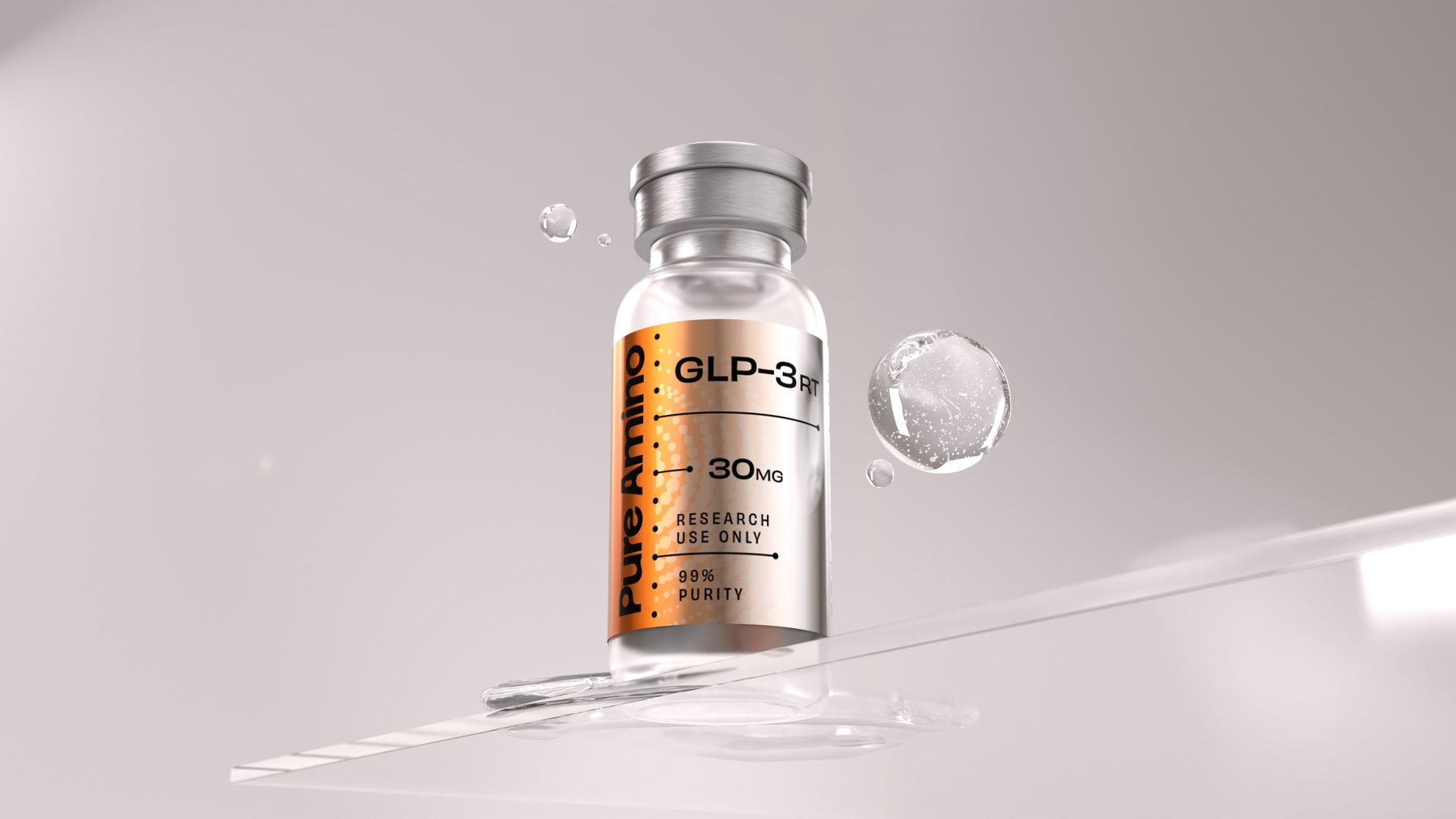
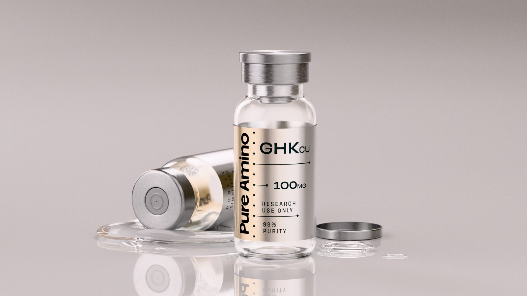
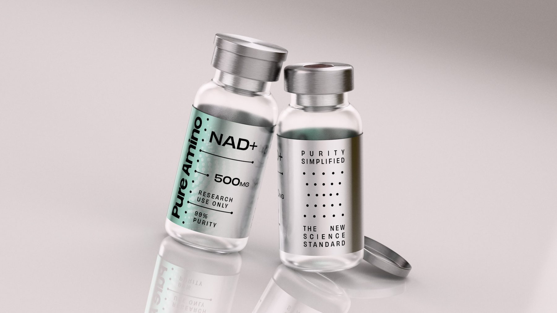
Every SKU runs the same architecture: the wordmark up the spine on its dot rule, then compound, dose, the research-use line and 99% purity stepped down on leader lines. Only the metallic gradient changes — copper for GHK-Cu 100 mg, mint for NAD+ 500 mg, orange for GLP-3RT 30 mg.
The back of the vial carries the two lines the brand stands on, set in the same dot matrix: Purity simplified. The new science standard.
The companion, shot on black
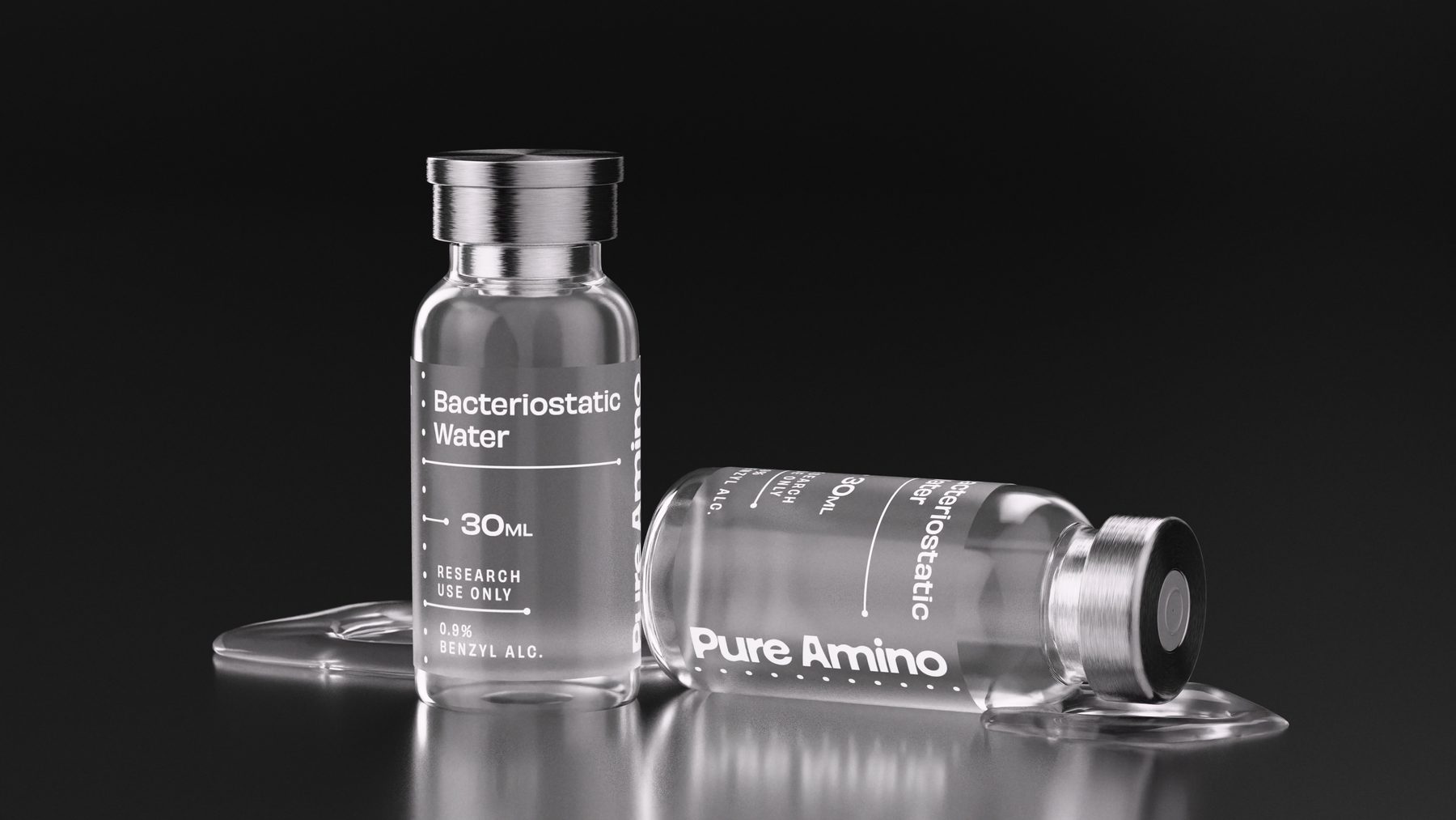
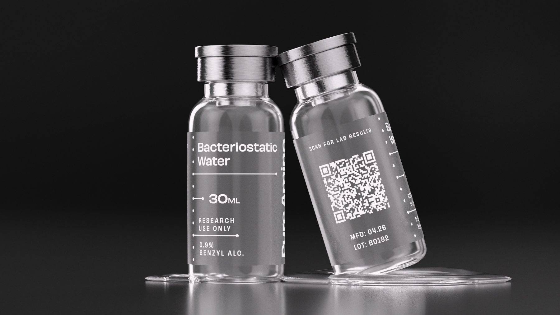
A 30 mL vial of bacteriostatic water at 0.9% benzyl alcohol, research use only, on the same ladder as the peptides. The back trades the purity figure for a QR code — scan for lab results — with the manufacture date and lot number beneath it.
Sock cuff, beanie, steel bottle
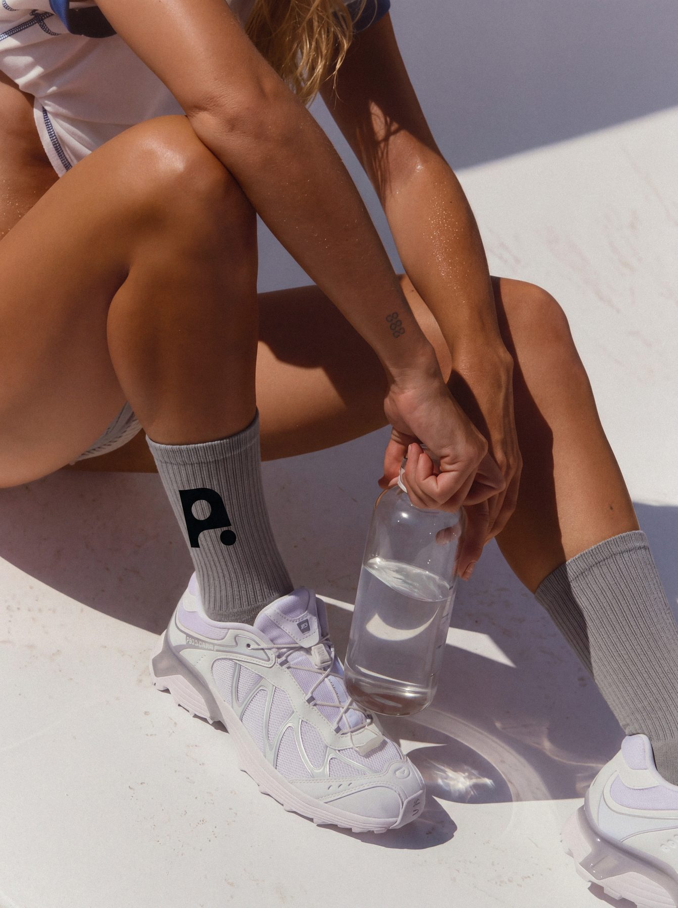
The monogram travels. It sits on a sock cuff and a beanie, the wordmark runs up a brushed-steel bottle, and the lifestyle stays in sun and white cotton — with the dot grid drifting over the frame.



Six categories, two sizes
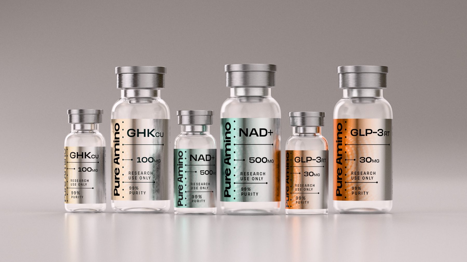
The peptide range is organised into six categories — Pure Performance, Recovery, Physique, Aesthetics, Neuro and Intimacy — each with its own colour, so the catalogue stays quick to read as it grows. Every compound ships in a small and a standard vial, and the label ladder compresses onto the small one without redrawing.