

That Smash Stack
Knockout flavor.
That Smash Stack is a smash-burger food truck that treats every bite as a flavor brawl. We built the brand as a fight — a fist crushes the logotype flat, the graphic set punches through the ingredients, and seven colors pulled off the burger itself run the wrap, the menu boards, the uniforms and the feed. The truck is wrapped as one continuous illustration, four sides and a serving window.
A punch above the rest
That Smash Stack steps into the ring with bold, fierce, unapologetically flavorful smash burgers — a food truck built to tussle and prove it is a punch above the rest.
The pitch is a flavor brawl in every bite: burgers made with precision, force and a bit of rebellious flair. The brand is built the same way, as a fight.
Smash, taken literally
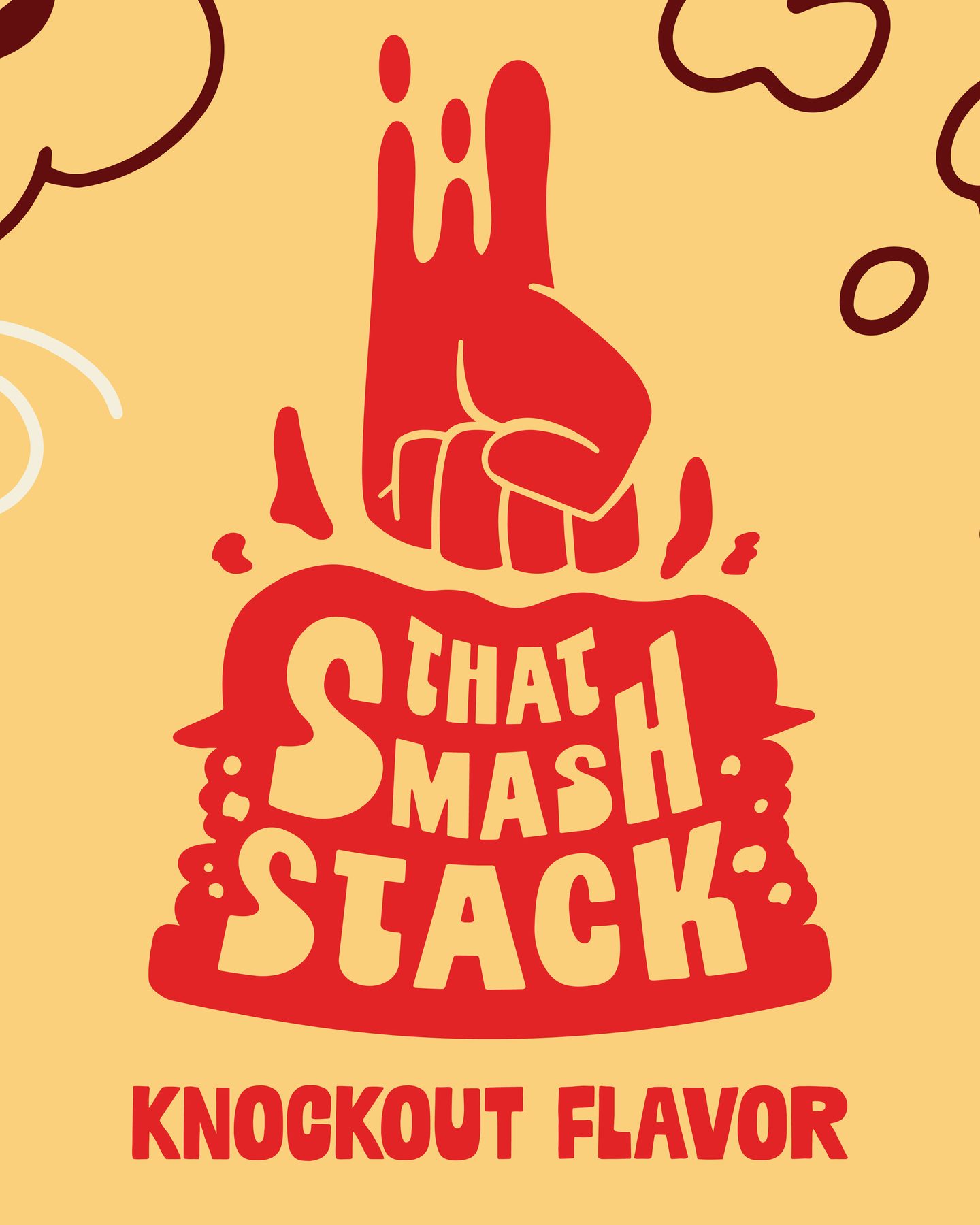
An aggressive brand demands an equally aggressive logo. The mark takes smash at its word — a fist drives down and crushes THAT SMASH STACK beneath it, the three words stacked and flattened under the weight.
Fist, type block and tagline are drawn as interchangeable parts, so the lock-up adapts to a truck panel, a digital board or an apron without losing its identity. Mudstone Sans Black brings the scrap with its bold, undulating letters; Interstate Condensed keeps everything else clean and legible.

Fists through the ingredients
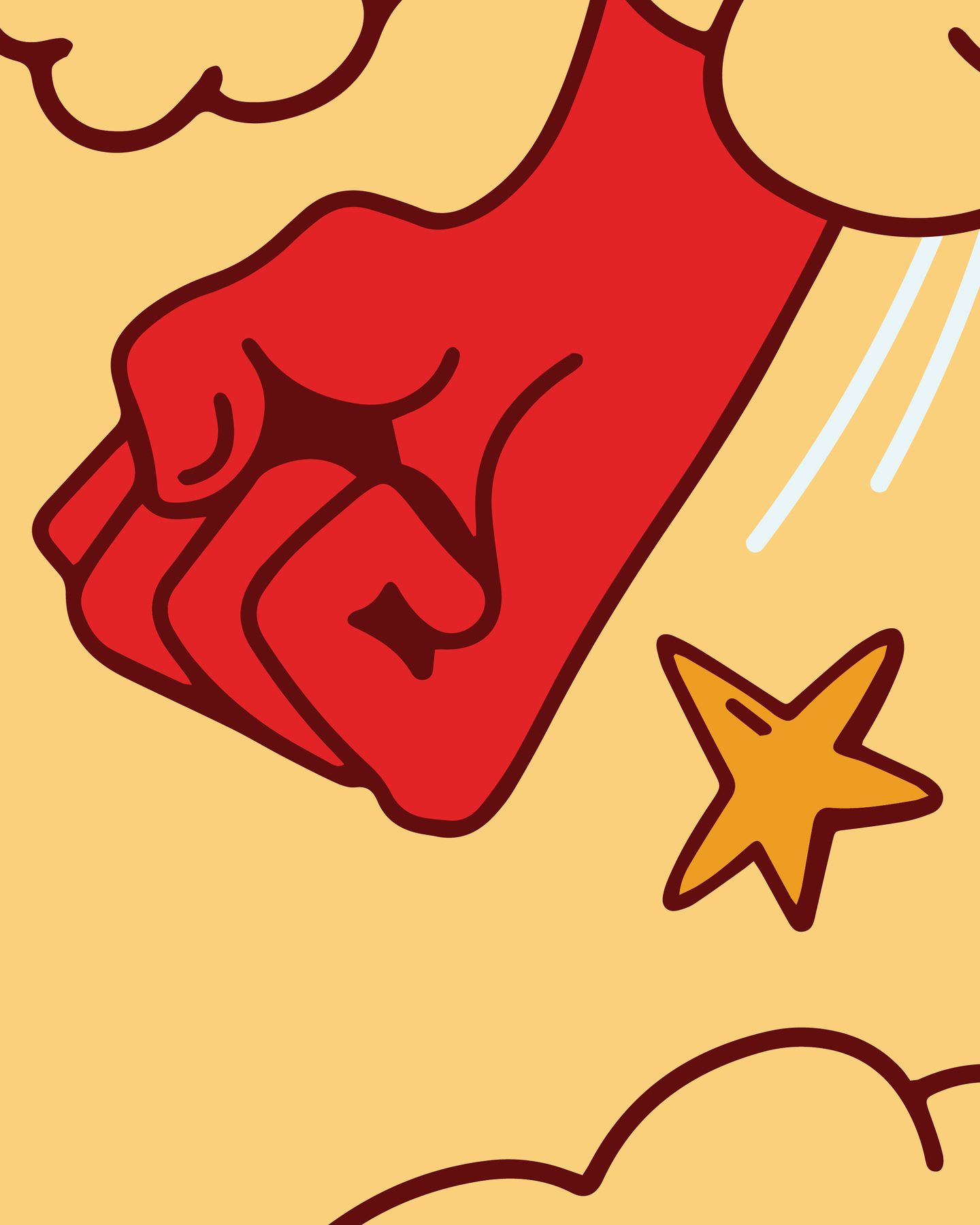
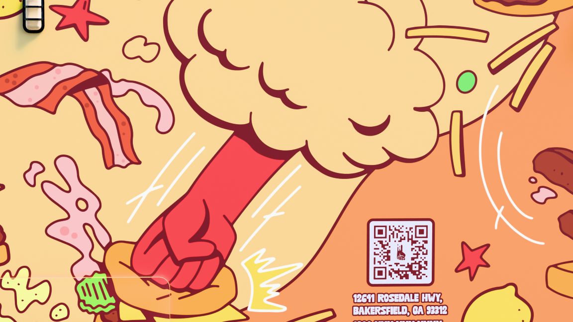
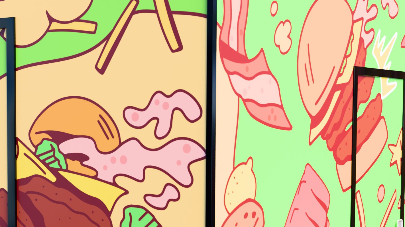
The graphic set extends the logo: brutal fists punch through the buns, patties, bacon and fries at the heart of the menu, wreaking havoc across every surface and turning the wrap into one long food fight.
The palette comes straight from the source — the smash burger itself. Seven rich, appetizing hues, each named for the fight.
Four sides, one drawing
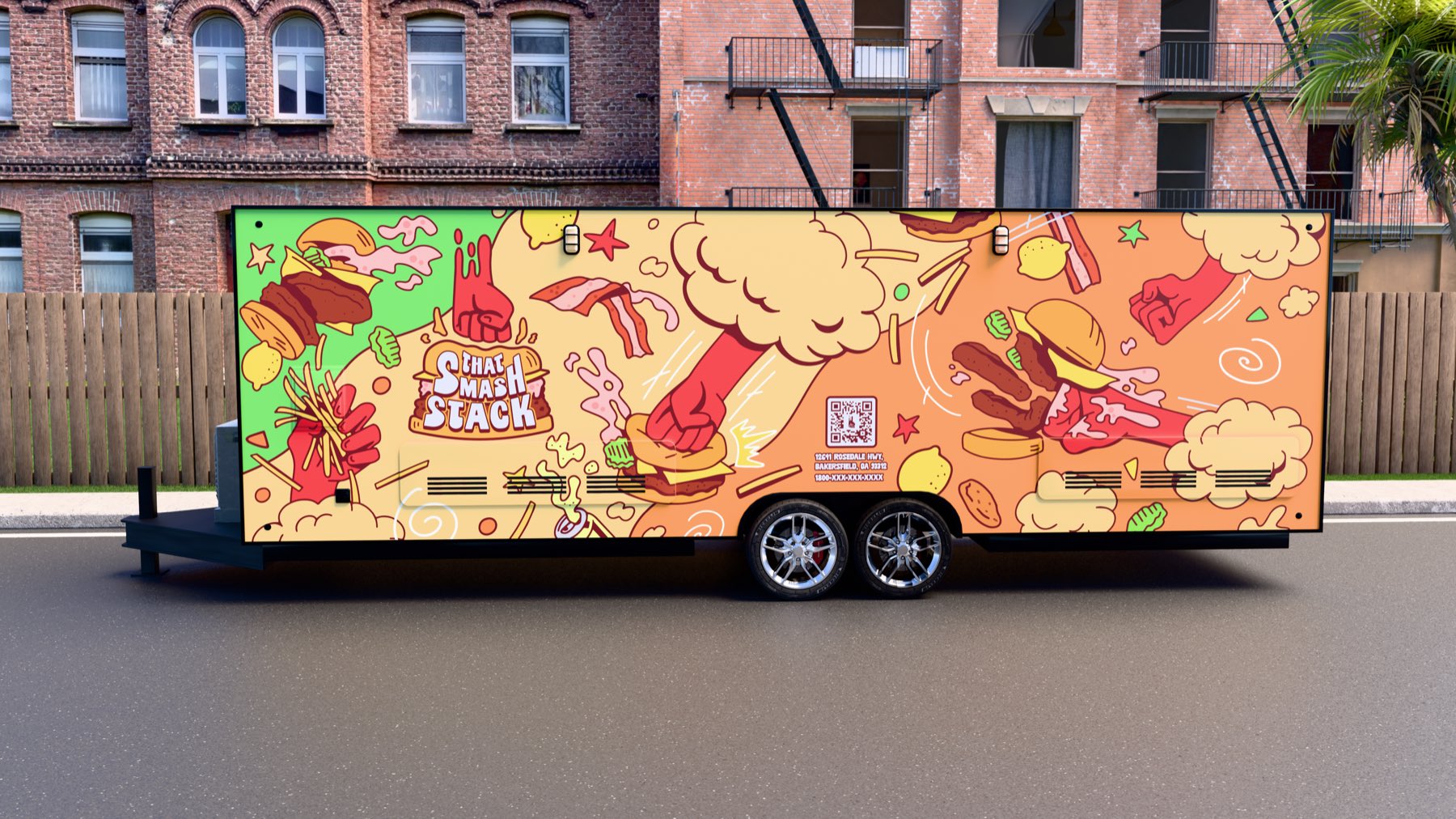
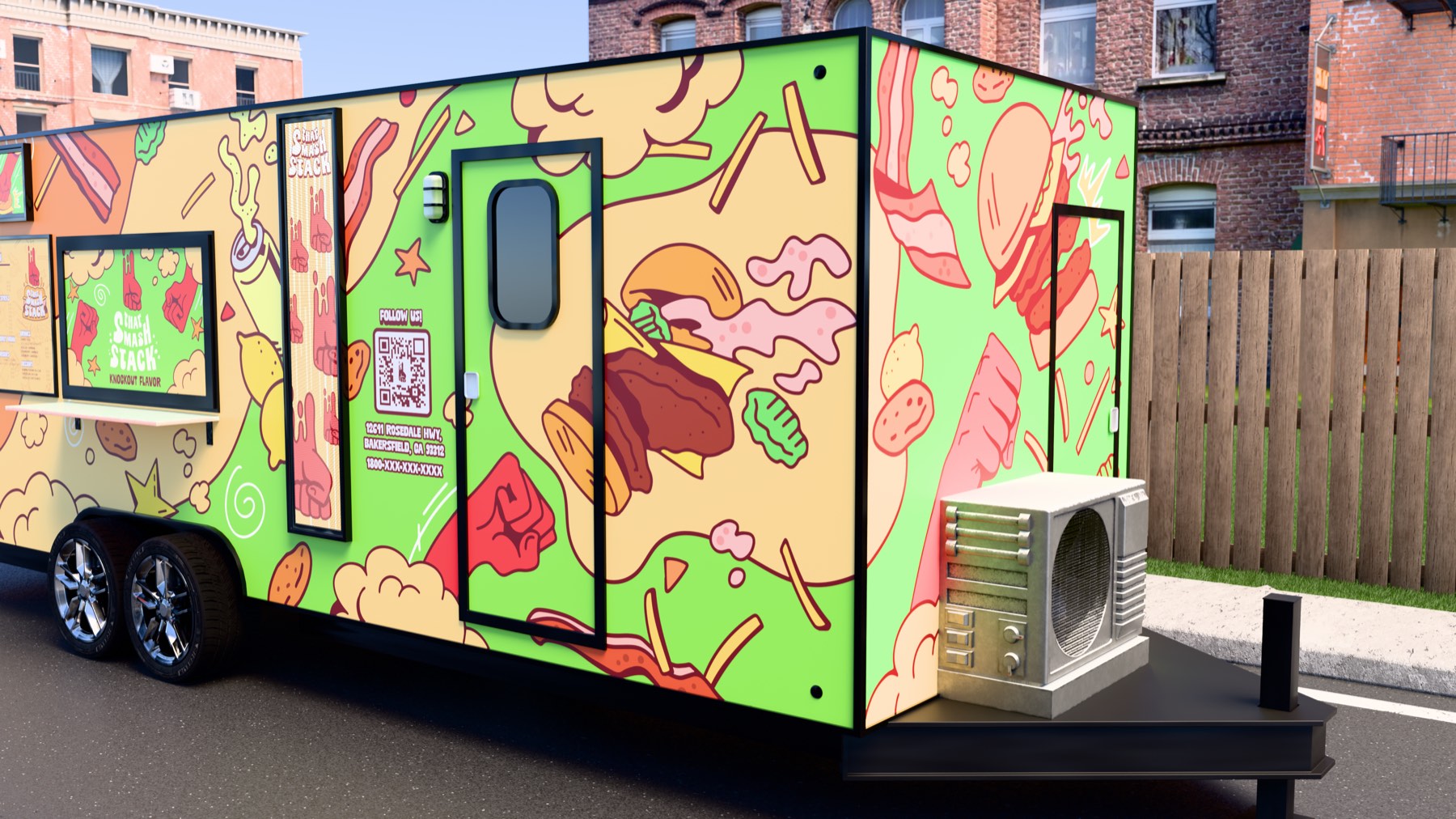
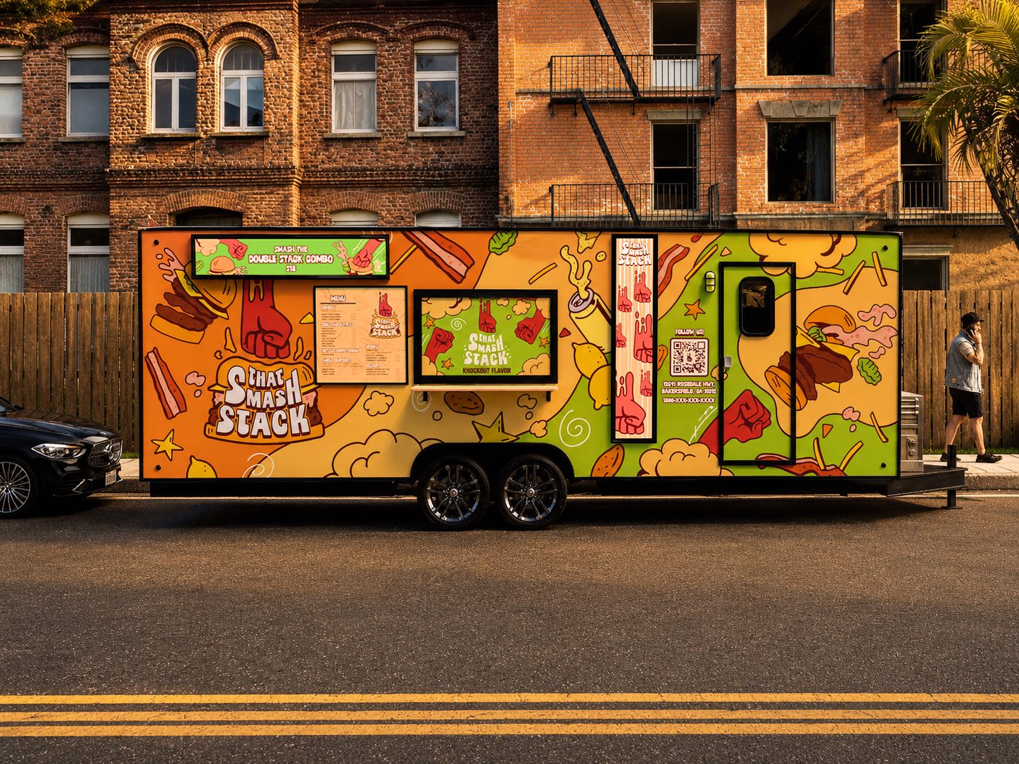
The wrap is treated as one continuous illustration rather than four panels with a logo on each. Color blocks shift from Melee Green at the nose to Dust-Up Orange along the service side, fists keep swinging round the corners, and the lock-up lands on every side — with a Follow Us panel and QR code beside the door.
Smash the Double Stack Combo
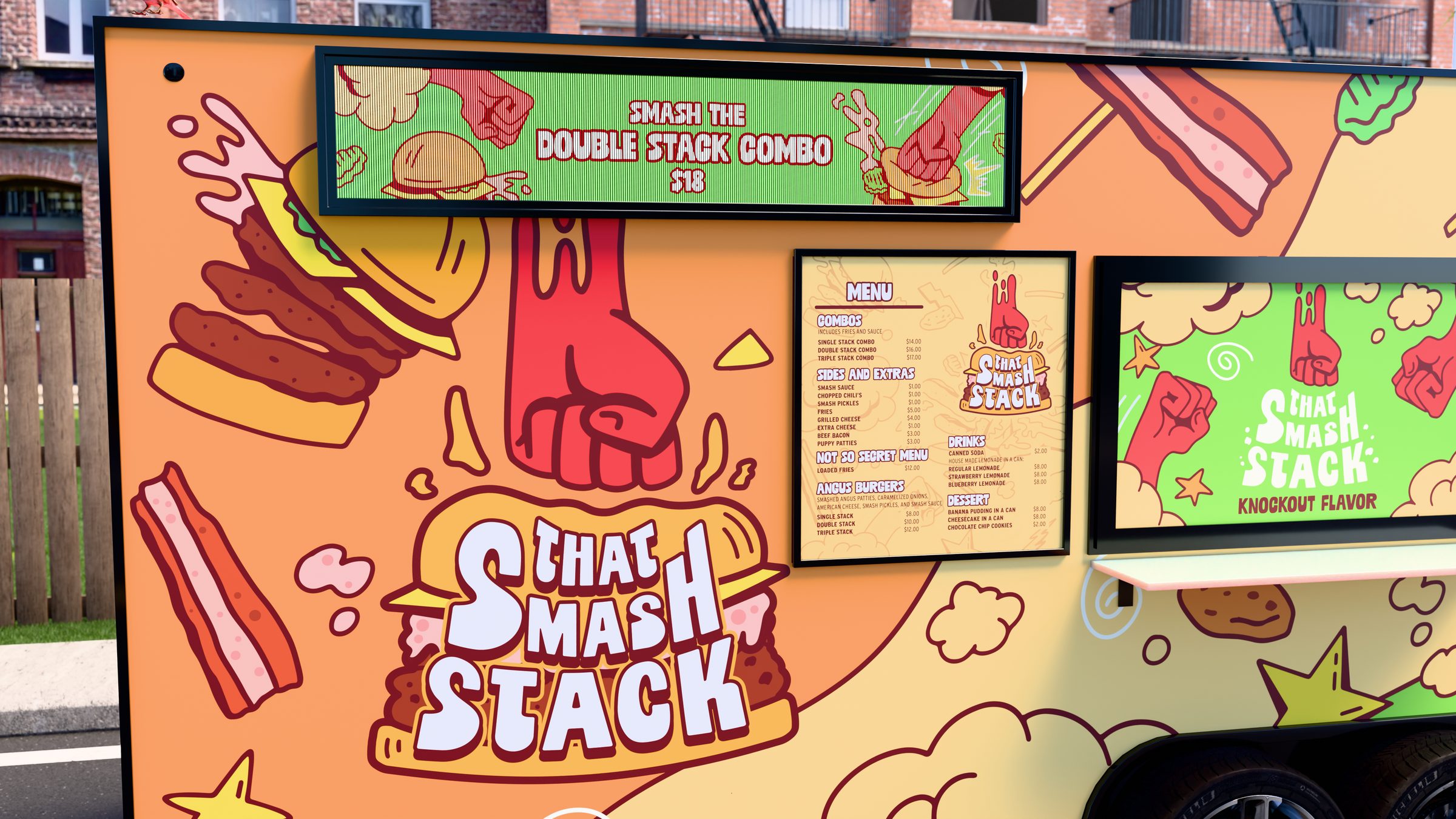
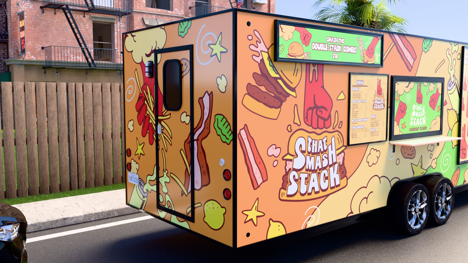
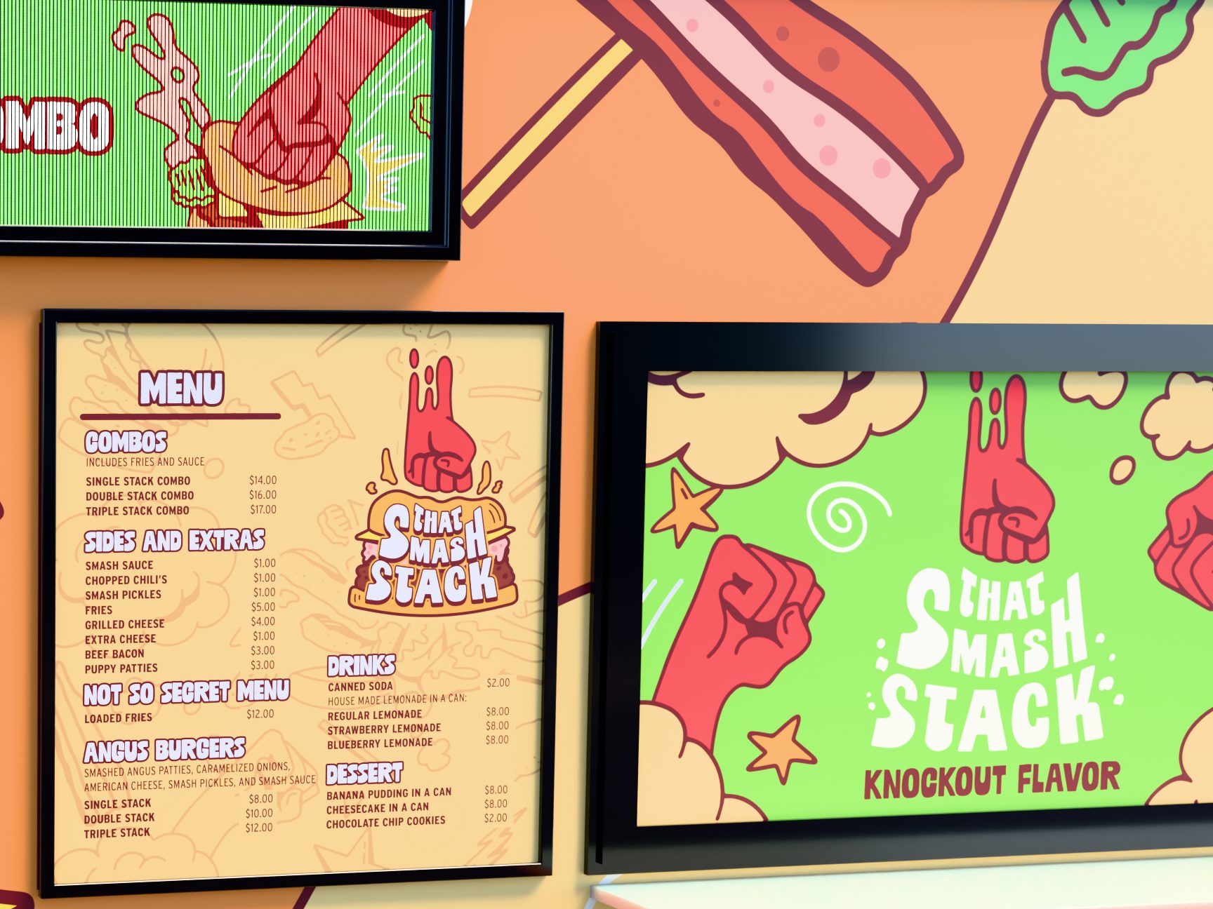
The service side carries the whole offer: a digital header pushing the Double Stack Combo, the printed menu board next to the serving window and a second screen running the lock-up and tagline. Dropped onto a real block, the wrap does the rest — the fist and the logotype carry from across the street, and the ingredients pull the eye down the truck to the window.
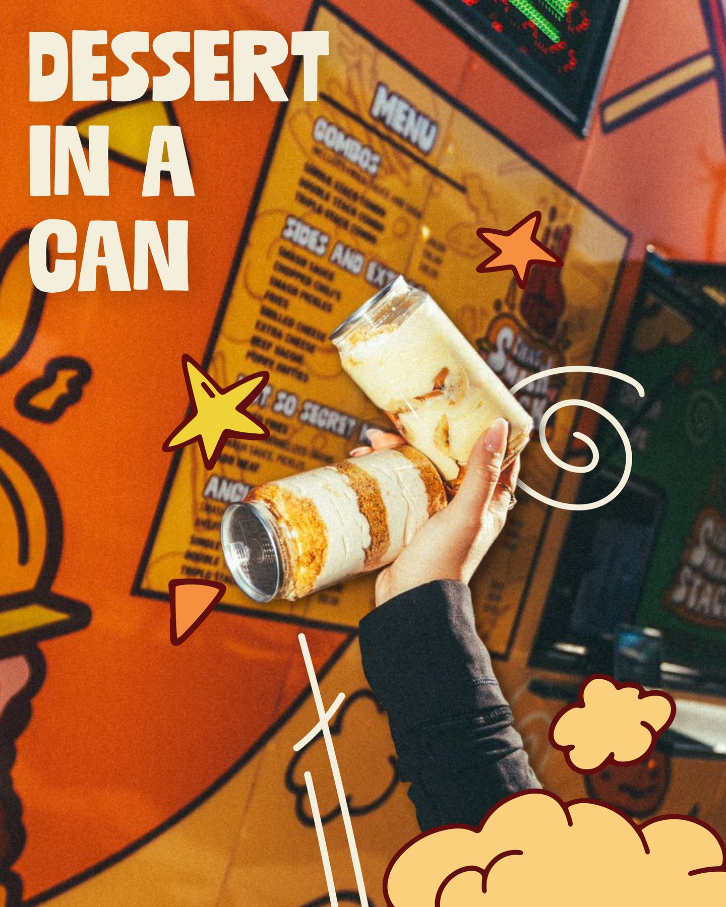
Combos come as Single, Double or Triple Stack with fries and sauce, and the Angus burgers take American cheese, smash pickles and smash sauce. House-made lemonade comes in a can — regular, strawberry or blueberry — and so does the banana pudding. Loaded fries hide on the not-so-secret menu.
Shot hot, marked up after
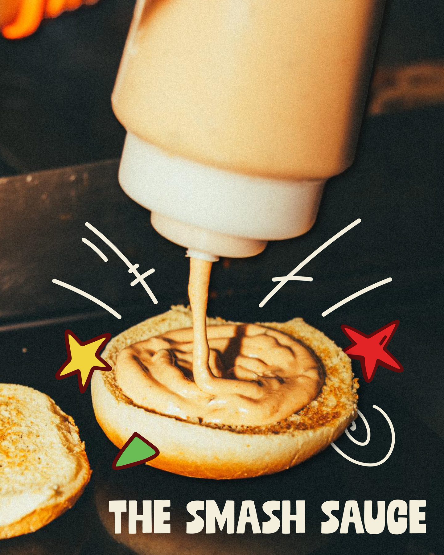
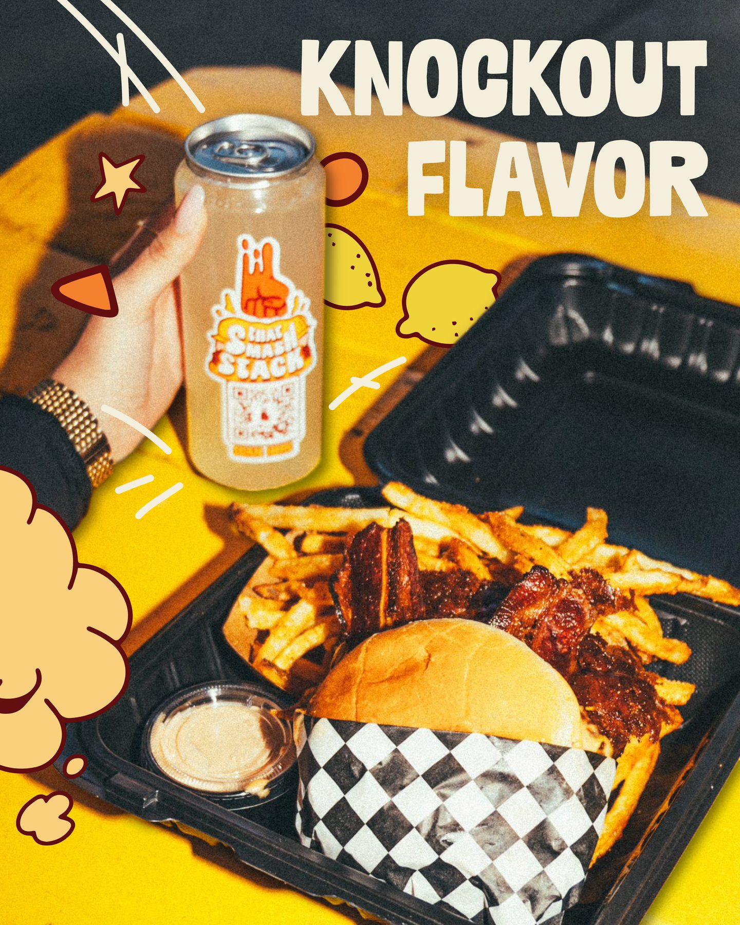
The feed runs on service photography — smash sauce hitting the bun, a tray of burger, fries and a can, dessert in a can held up against the menu — with the brand’s stars, swirls and headlines drawn straight onto the frame in the same hand as the wrap.
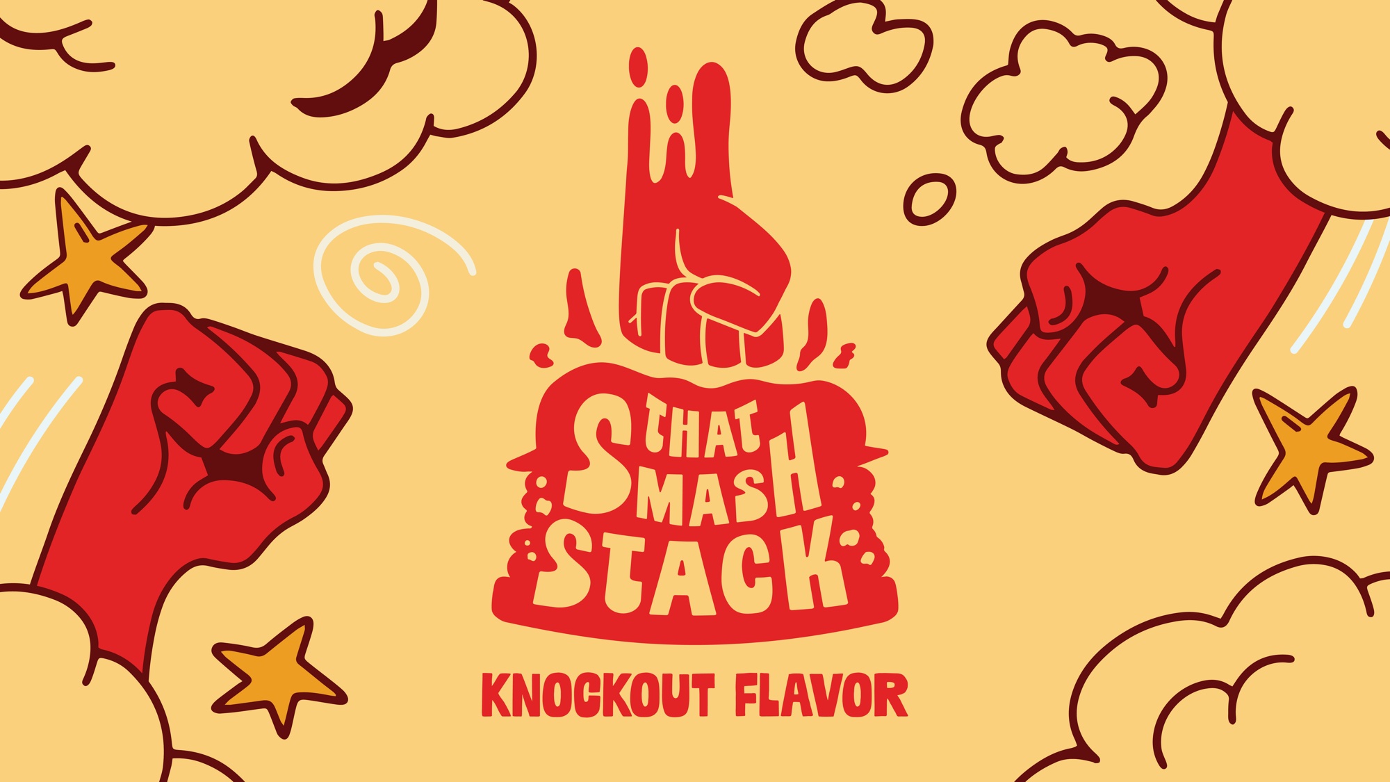
The fist, the stack and the tagline on Tan Tussle — the lock-up that signs off the truck, the boards and the feed.