
Volt Energy
Made for momentum.
Identity and packaging for Volt, a caffeine-free energy tablet sold on a die-cut hanging blister card. A slanted wordmark with heavy black outlines, a horned yellow mascot drawn flat and built again in 3D, and a highlighter-yellow, black and white system loud enough to read from across the shelf — carried through to racer jackets, silkscreened denim and social.
Made for momentum
Volt is a caffeine-free energy tablet for people already in motion — the ones who need to hold focus and finish strong when the day starts to fade. The promise is plain: you can keep up, push forward and finish what you started.
Grab and go. Energetic. Amplified. High-contrast yellow, black and white, bold slanted forms and a little glow — built to be understood in the second it takes to lift a pack off the hook.
Slanted, outlined, circled
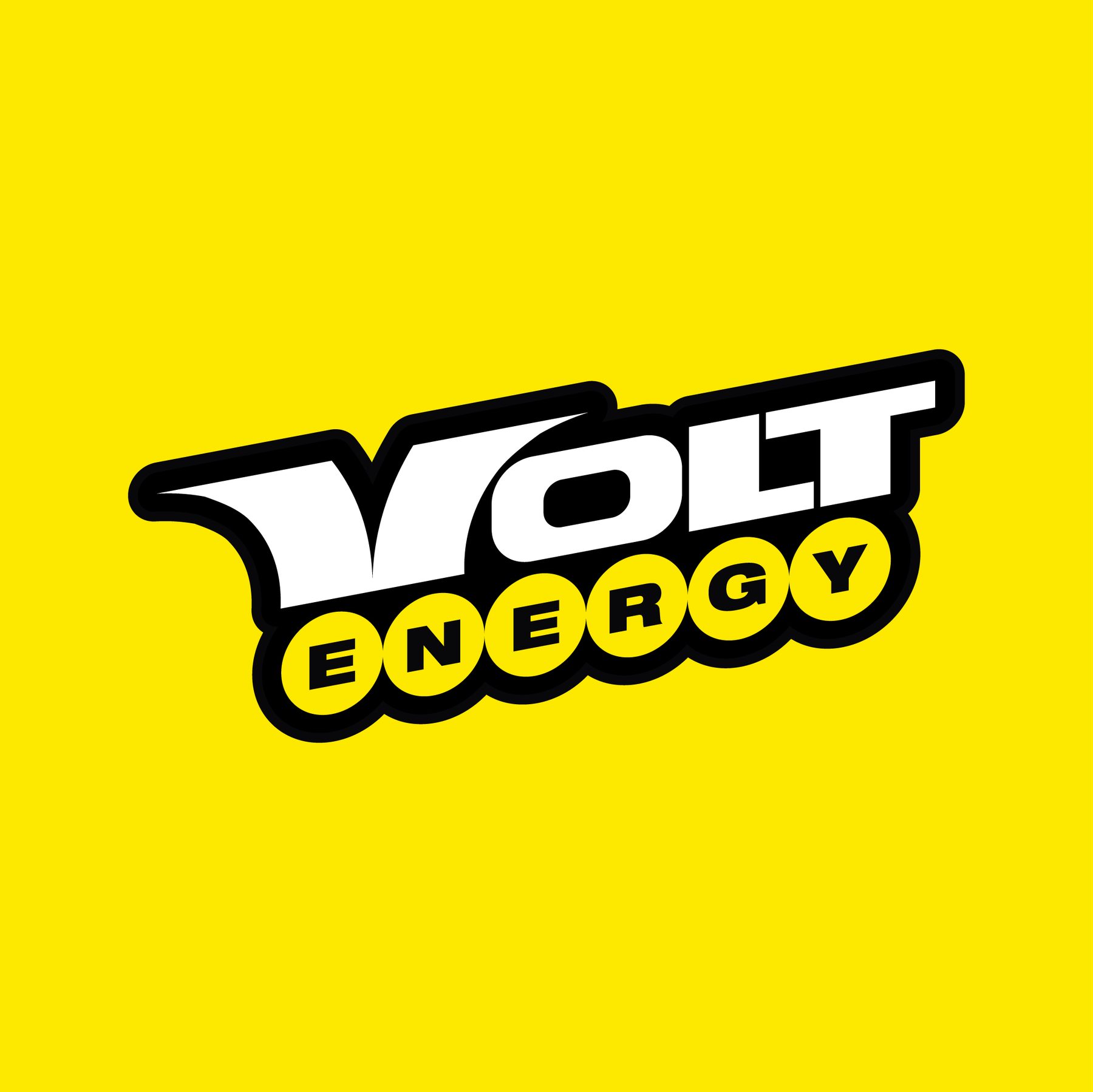
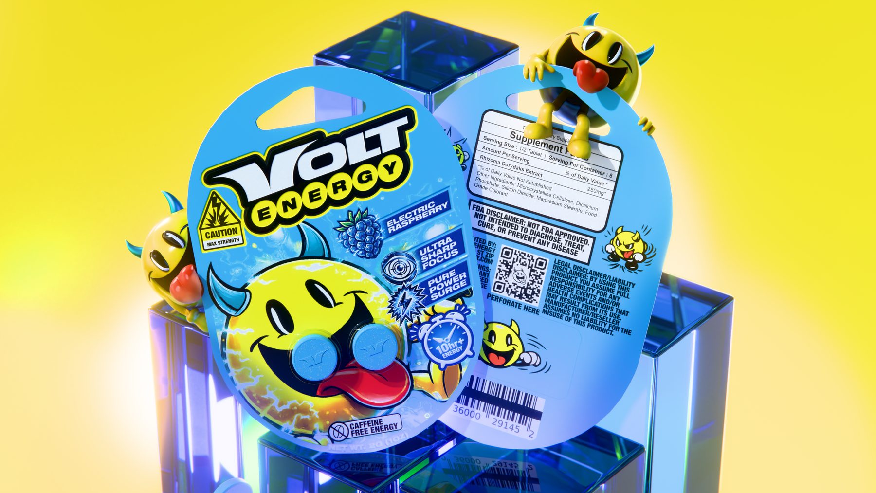
The wordmark leans forward to carry motion. VOLT is a custom geometric cut with heavy black outlines; ENERGY runs beneath it in a row of yellow circles, a small retro nod. The character brandmark is the mascot at its simplest — tablet on the tongue — and a clean, unsheared VOLT covers the tight spots.
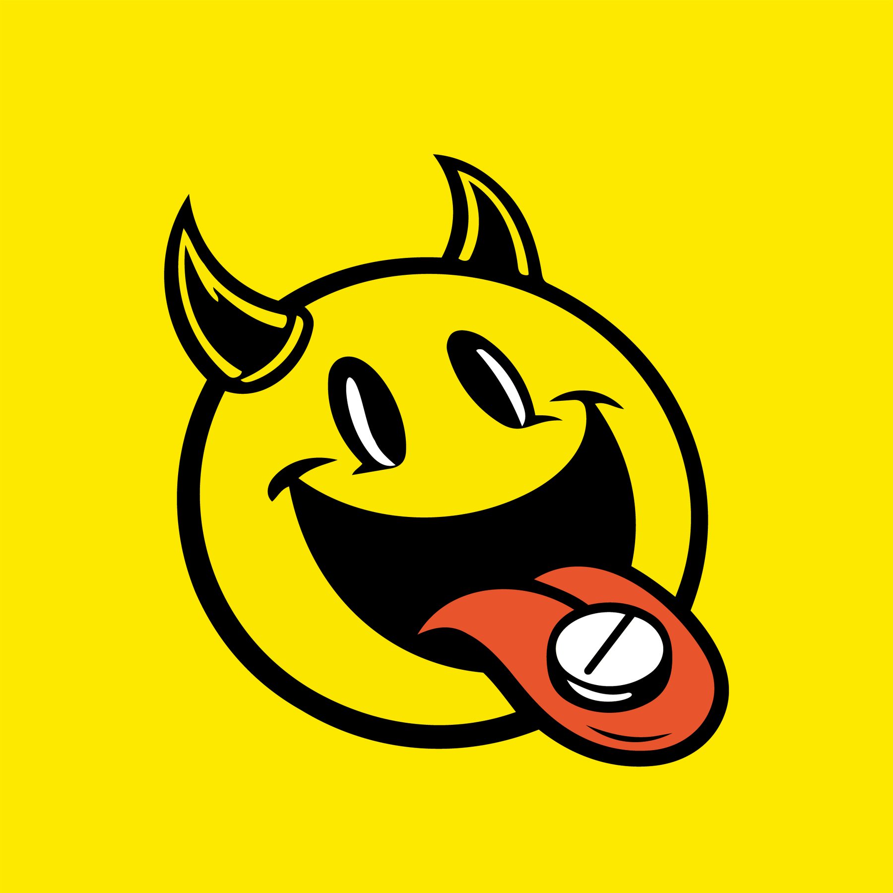
Meet Volt
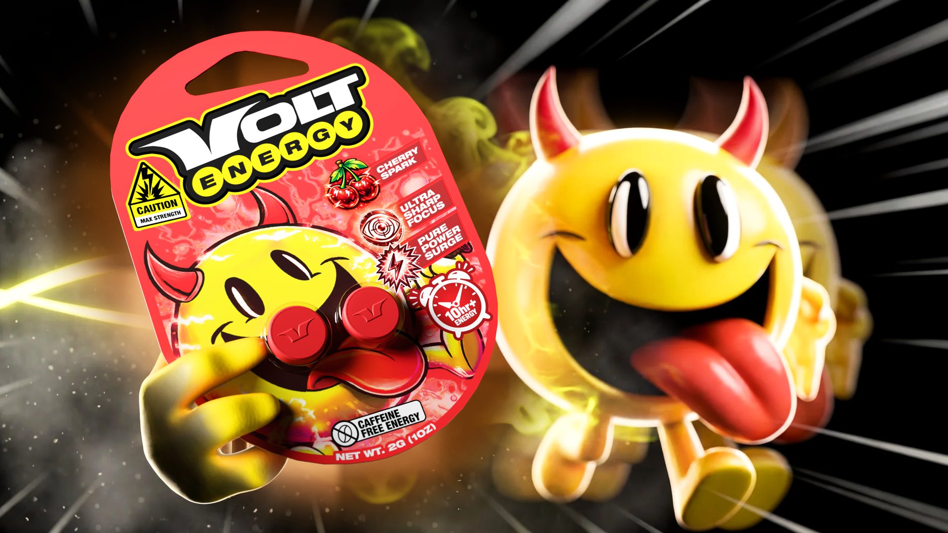
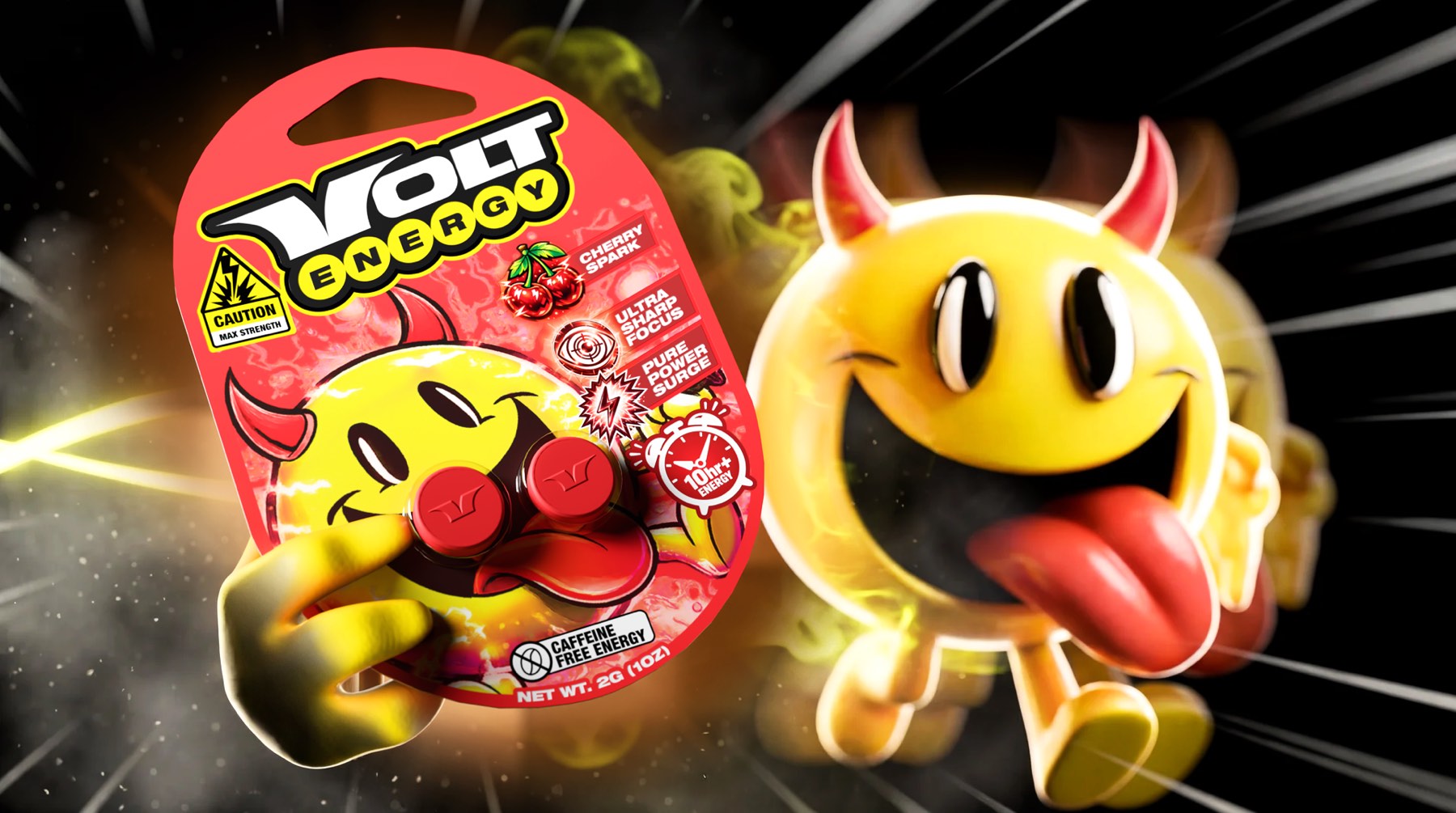
A horned yellow smiler with its tongue out. It exists as electrified hero art on the pack and as flat, simplified line versions — peeking, bracing, mid-leap — that run across displays, socials and the small print on the back of the card.
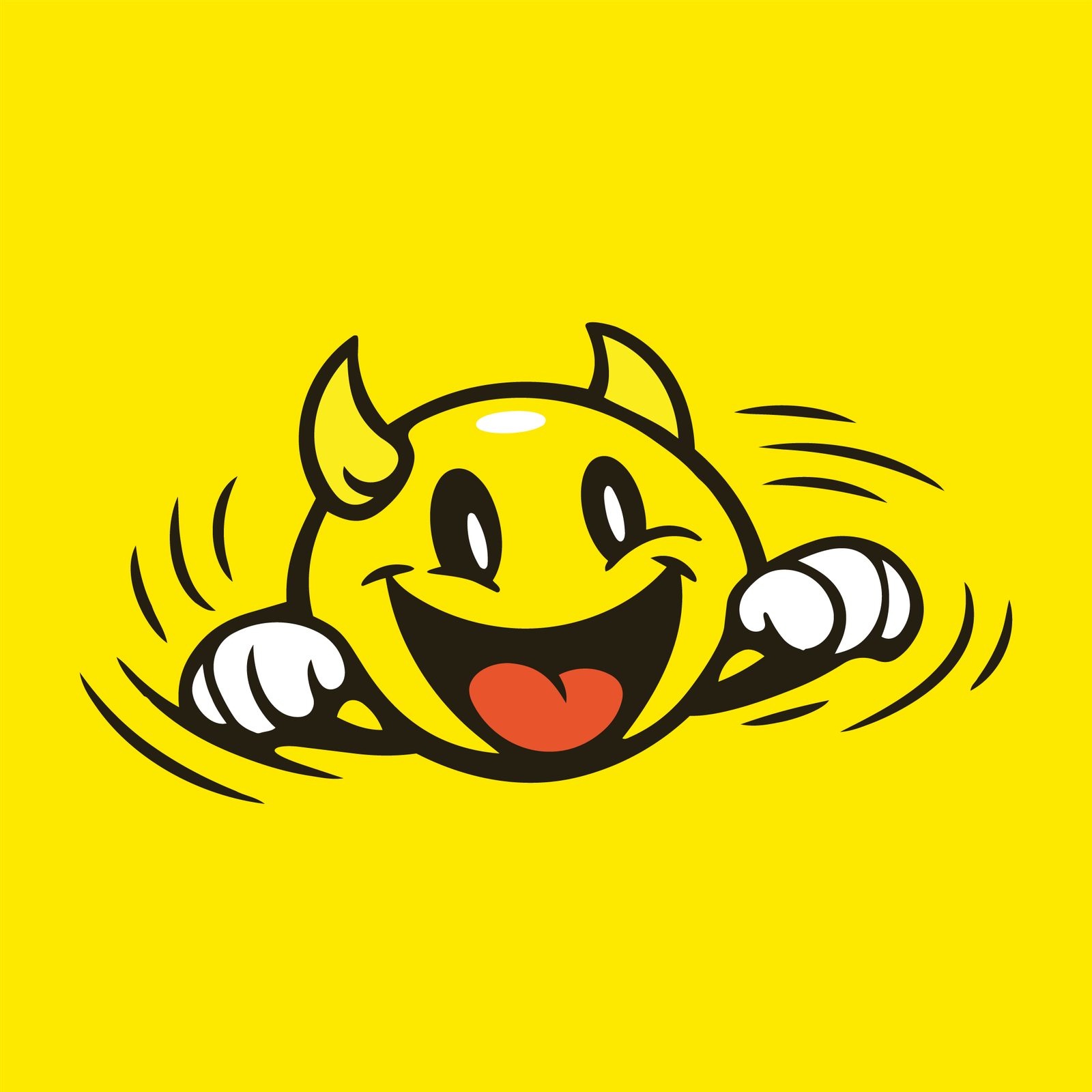
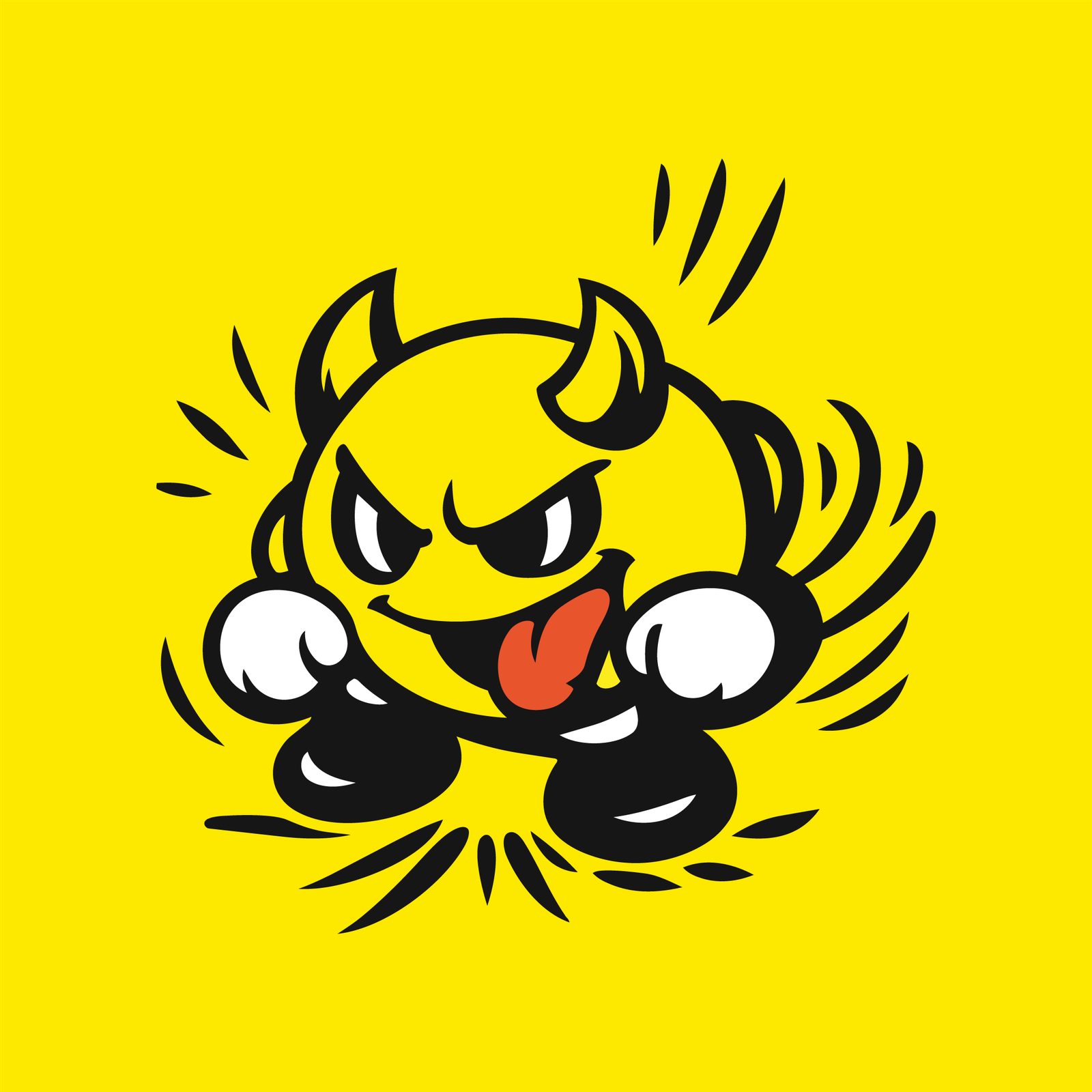

A card that reads as a face
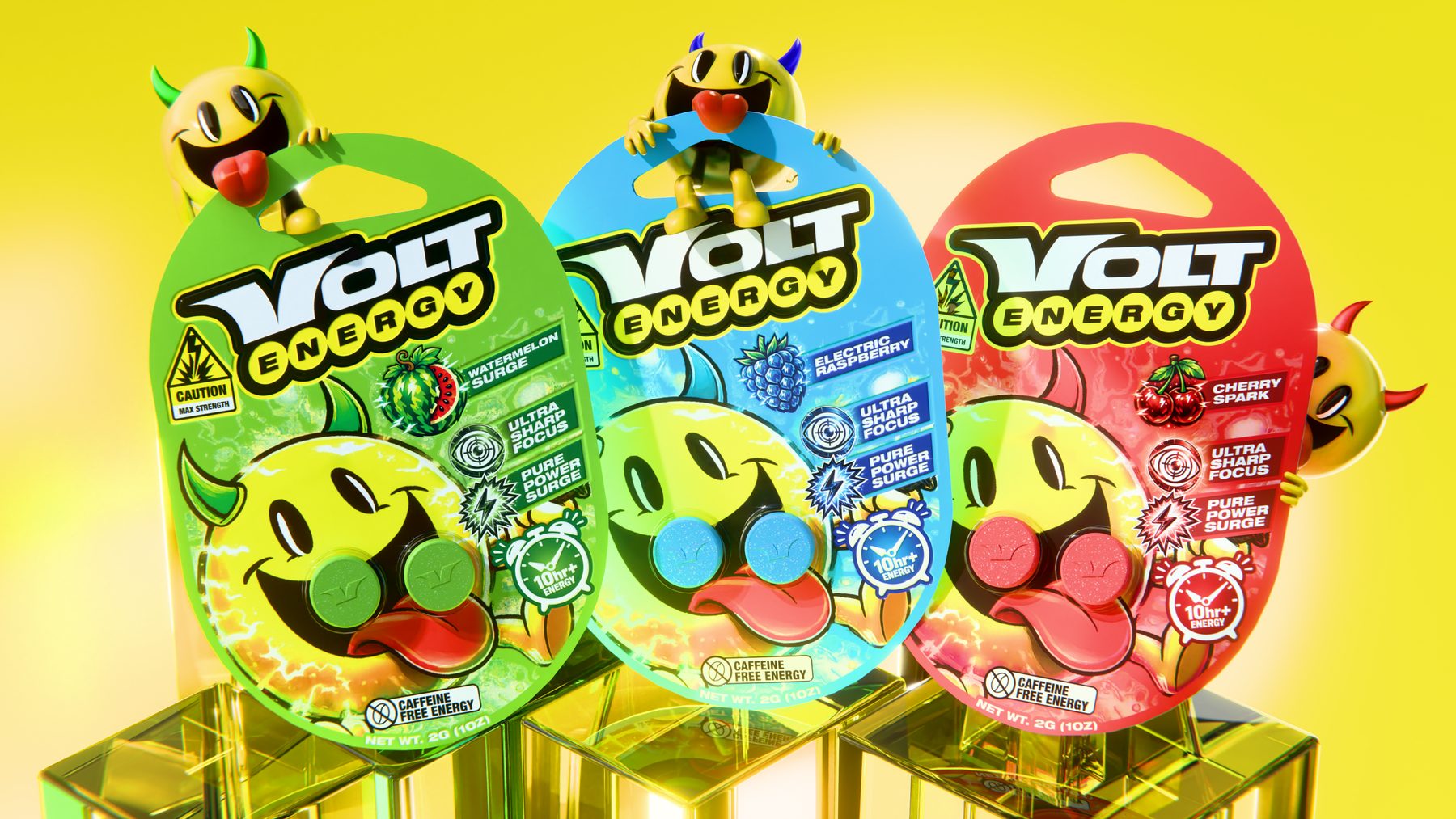
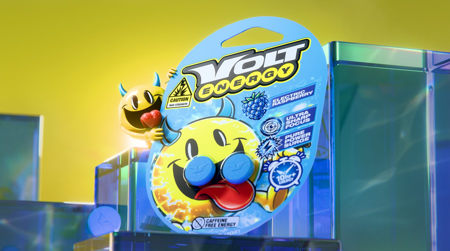
Each flavour is a die-cut hanging blister card. The mascot fills the front and the two tablets sit in the blister exactly where its eyes go, so the card reads as a face before it reads as a product. Around it: the caution triangle marked MAX STRENGTH, a glossy flavour icon, ULTRA SHARP FOCUS, PURE POWER SURGE, a 10hr+ alarm-clock badge and CAFFEINE FREE ENERGY at the foot.
Panel, code, tear line
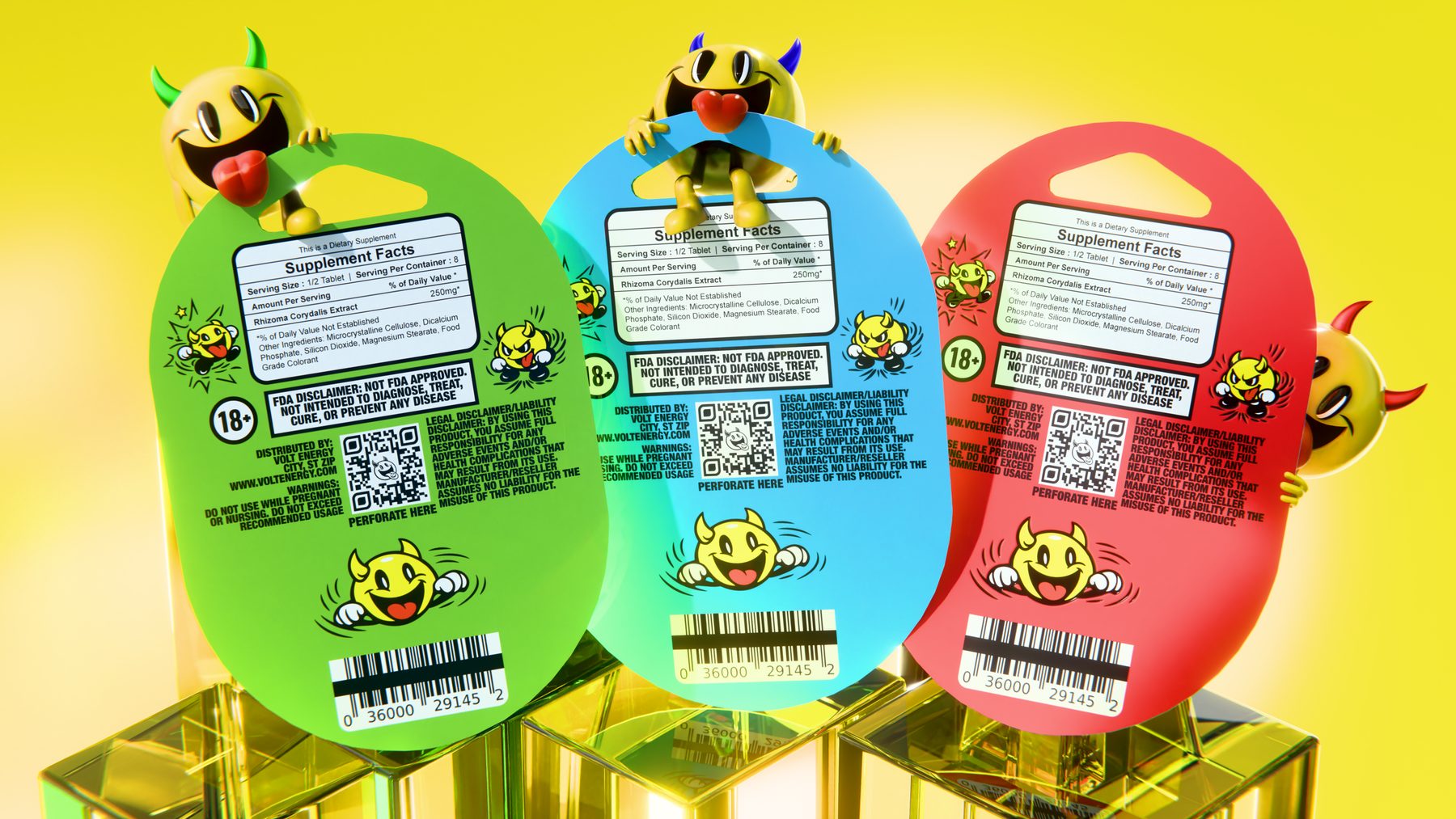
The reverse carries the Supplement Facts panel, an 18+ mark, the FDA disclaimer, a QR code and a PERFORATE HERE line — dropped straight onto the flavour colour with the mascot still tumbling through the small print.
Racing colours
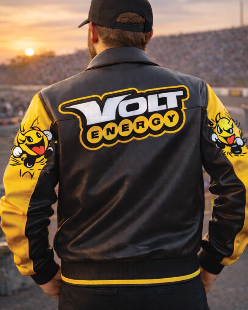
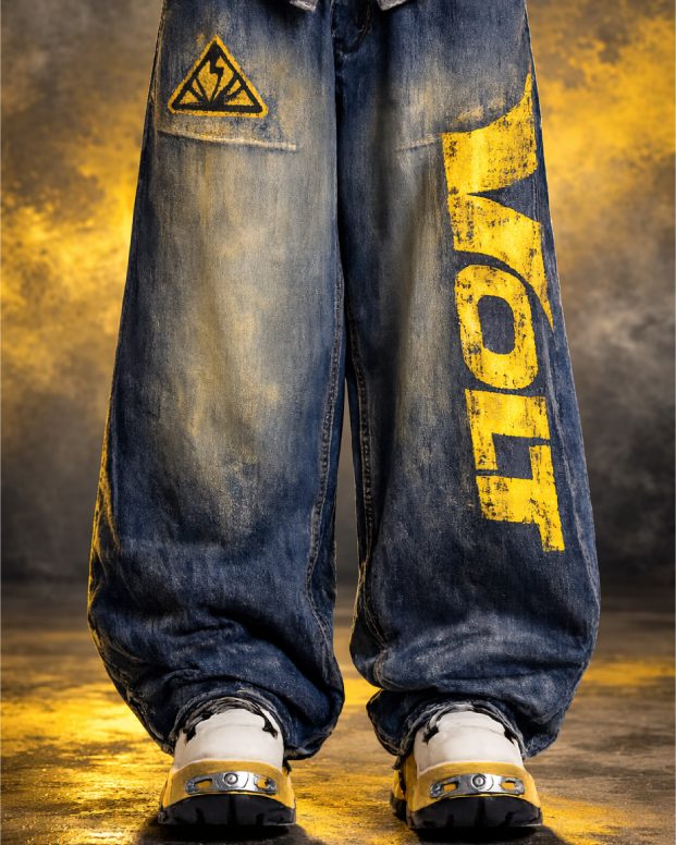
Apparel that stays close to what the customer already wears: a black-and-yellow racer jacket with the wordmark across the back, silkscreened denim with VOLT down the leg and a caution patch on the pocket, embroidered trucker caps.
Three charges
Watermelon Surge, Electric Raspberry, Cherry Spark. Each takes the whole card a different colour — field, badges, horns and the tablets themselves shifting together — while the wordmark, the yellow and the face hold the same place on every pack.