

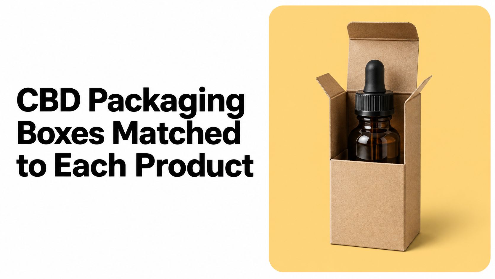
The most repeated advice about CBD packaging boxes is to design the artwork first, then pick a carton that makes the brand look premium. That order is backwards. The box is decided by what sits inside it, and a carton that photographs beautifully can still crush a dropper bulb, bury a lot code under a tuck flap, or fail a child-resistance test it was never submitted to.
Start with the primary container. Measure it with the cap on, weigh it filled, then work outward: closure, insert, carton structure, panel copy, and only then the finish. Certify the assembled pack before a single style is approved for the range.
Do it in that order and the handsome version usually survives. Skip a step and you find out at the filler, with the pallets already printed.
Table of Contents
- What the Box Is Really For
- Which Box Fits Each CBD Product
- Pair the Carton with a Real Barrier
- Treat Child Resistance as a Finished Test
- Leave the Panel Readable After the Branding
- Choose Greener Specs That Still Comply
- Prove One Pack Before You Scale the Line
What the Box Is Really For
Shoppers see a printed carton. What keeps a CBD formula intact is almost never the paperboard. Oil oxidizes when air reaches it, gummies pull moisture out of a dry room, and a glass bottle cracks when the master case lands badly. The carton is a jacket, not the skin.
A CBD packaging box does three jobs at once. It names the product and the variant. It cushions whatever primary container holds the formula. It carries the copy a regulator, a buyer, or a store clerk needs to read without hunting. None of those jobs gets easier when the style is chosen before the bottle.
Say a brand arrives at a printer with a 30 ml amber dropper bottle and asks for a tall carton with a soft-touch laminate. The sample is gorgeous. Then the dropper bulb rests against the top panel, the induction seal takes the load in the mailer, and the lot code ends up behind the flap. Nothing about the printing was wrong. The structure was never matched to the bottle.
The category is large enough that plenty of suppliers will sell that carton without asking a question about what goes inside. Dataintelo estimated the global cannabis-CBD packaging market at $1.51 billion in 2025 and projected it to reach $4.36 billion by 2034, a 12.5% compound annual growth rate from 2026 to 2034. Growth like that buys a lot of attractive boxes, and attractive boxes were never the bottleneck. Filled, certified, readable ones are.
The order that works: inner pack, structural spec, certification file, panel copy, decoration.
Size does not make a tuck carton legal, and a laminate does not make it protective. Both claims get settled by the assembly, not by the style name on the quote.
Which Box Fits Each CBD Product
A carton spec starts with a measurement, not a mood board. For structural design we work from product dimensions, filled weight, and a sample of the actual container where one is available, because a bottle that measures 32 mm at the shoulder and 28 mm at the base needs a different box than the one in the catalogue photo.
Oils and tinctures are the most forgiving format and still the one most often boxed wrong. A 15 ml, 30 ml, or 60 ml amber dropper bottle sits inside a reverse-tuck carton or a printed sleeve, and the failure is nearly always at the top. Measure the height with the bulb relaxed, not squeezed, leave a couple of millimetres of clearance, and add a neck insert or a die-cut card so the glass never leans against a wall. Narrow glass formats live or die on that insert, which is the same principle behind vial box packaging for small bottles.
The Gummy Row Carries the Most Risk
Gummies are the trap, and they're where the packaging gets decided by arithmetic rather than design. For gummy packaging, a brief needs to answer the practical questions before visual design begins, because product dimensions, pack quantity, and the filling method determine much of the package structure. A hand-filled 10-count pouch and a machine-filled 30-count jar are two different boxes, two different inserts, and two different label panels.
The format also has a perception problem that shows up in the evidence. A study of 114 cannabis packages collected in New York City found that 103 packages, or 85%, contained features considered appealing to children. A gummy carton shaped, coloured, and finished like confectionery walks straight into that finding. Auto-lock cartons and lidded trays with a plain matte face cost no more than a punchy candy parody and cause far fewer conversations with a buyer.
Softgels rattle in a bottle with a child-resistant cap, so the outer is usually a straight tuck or two-piece setup and the risk is a label hidden under a flap. Topicals leak and stain uncoated board, which means the jar or tube gets specified before the carton. Flower and prerolls need odor control plus crush resistance, usually a barrier pouch or tube inside a rigid box or drawer. Beverages sweat, so a carrier, sleeve, or neck tag does a job a folding box around a wet can cannot.
| Product | Primary container | Outer box | Child resistance | Main structural risk |
|---|---|---|---|---|
| Tincture or oil | Amber glass dropper bottle | Reverse-tuck carton or sleeve | Usually the bottle cap; carton is secondary | Crushed dropper or seal |
| Softgels or capsules | Bottle with CR cap | Straight tuck or two-piece setup | On the bottle cap | Rattle and a hidden label |
| Gummies | Pouch, jar, or tin | Auto-lock carton or lidded tray | On the inner closure; reseal multi-serve packs | Moisture and a candy-like look |
| Topical balm or cream | Jar or tube | Folding carton without a window | Only if the formula and state require it | Leak staining the board |
| Flower or prerolls | Barrier pouch or tube | Rigid box or slide drawer | Often the pouch plus the outer | Odor leak and crush |
| Beverage or shot | Bottle or can | Carrier, sleeve, or neck tag | Rarely a CR carton | Condensation and claim copy |
Read the row for the SKU in hand, then change only the inner pack when the formula or the state rule changes. Before any of it goes out for quotation, it's worth understanding getting concepts ready for factory quotes, because a spec that ignores board caliper, tooling, and fill method comes back with a revised price and a redrawn dieline.
Pair the Carton with a Real Barrier
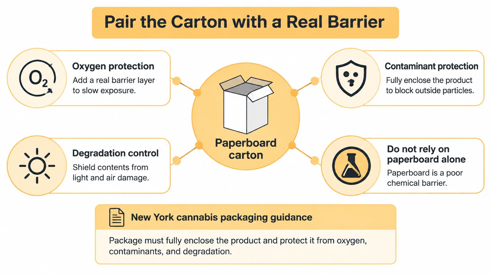
Paperboard is a poor chemical barrier, and no finish changes that. New York cannabis packaging guidance requires the package to fully enclose the product, protect it from oxygen exposure, contaminants, and degradation, avoid imparting toxic or harmful substances, and stay tamper-evident without obscuring required labeling. Uncoated board does none of that for a liquid or a soft gummy, so stop asking one material to do two jobs.
Split the system. The primary container, closure, liner, and seal keep air and moisture out. The carton supplies branding, cushioning, and label area. Specify them together, as one assembly, and a premium presentation survives contact with a parcel carrier.
Four checks before the structure is locked:
- Clearance over the seal. Measure the assembled bottle with the cap torqued and leave room so a tuck flap doesn't press on a dropper bulb or an induction seal.
- Inserts and partitions. Glass shouldn't knock against glass inside the master case. Good structural design considers closures, inserts, assembly steps, and how packs sit in a shipping carton, and a paperboard partition is cheaper than a damage claim.
- Tamper evidence that stays visible. The break should be obvious after the first opening, not tucked inside a flap where a shopper never sees it.
- The shipping test on the actual carton. A closure that survives a bench check can still pop when a case is dropped at 40 degrees.
Review a physical prototype before the structure is committed, because a render will not show a crushed seal or a flap obscuring the lot code. If the inner seal fails, no amount of foil on the carton restores the oil.
Treat Child Resistance as a Finished Test
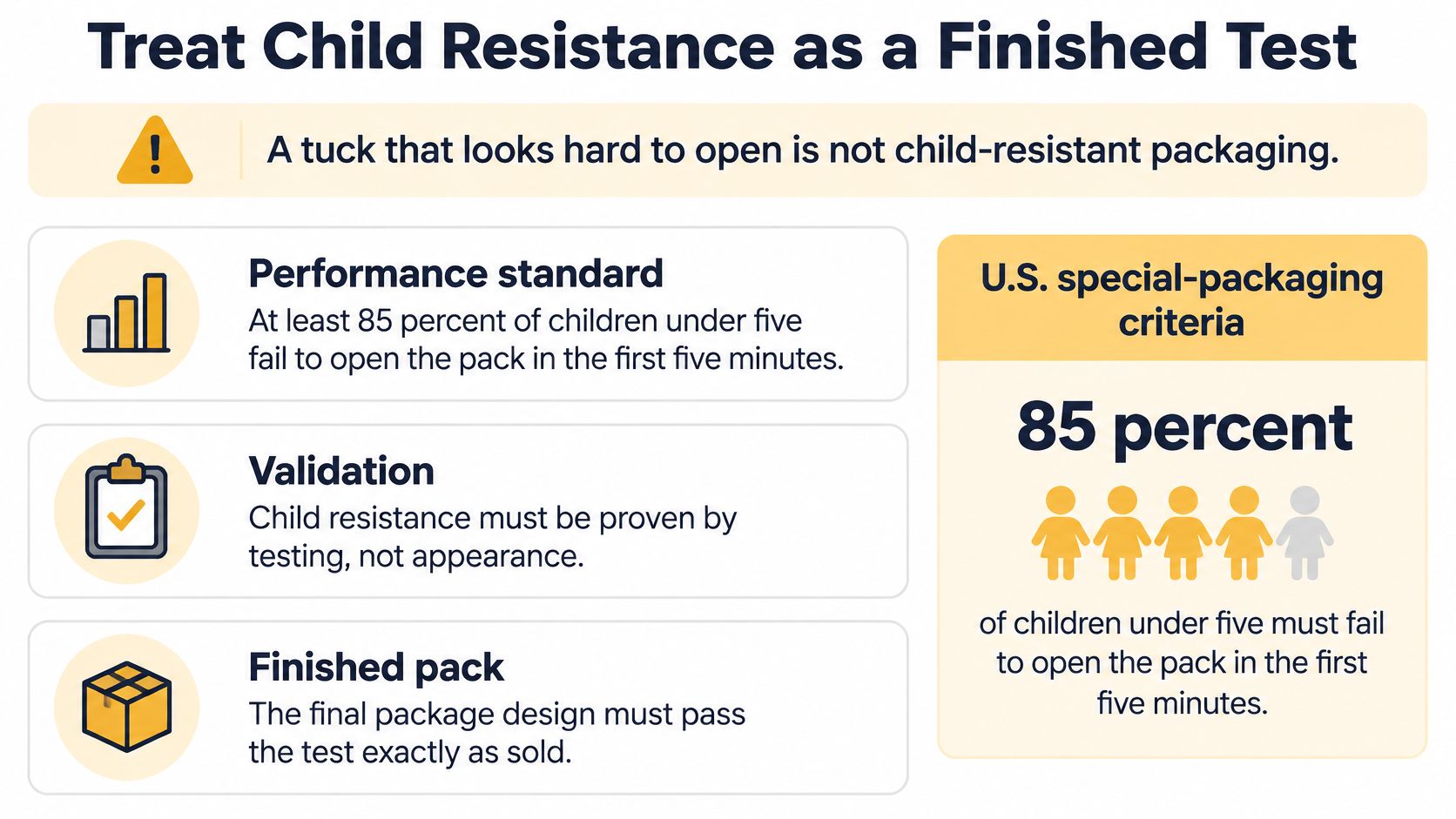
A tuck flap that takes two hands and a thumbnail to open is not child-resistant packaging. It's a tuck flap that takes two hands and a thumbnail to open. The distinction matters because the phrase "child-resistant box" gets used in sales decks for structures nobody has ever tested.
U.S. special-packaging criteria are a performance standard. A package must prevent at least 85% of children under five from opening it during the first five minutes and at least 80% during the full 10-minute test, according to the CPSC special packaging FAQ. It also has to stay effective for the life of the product and must not be defeated by contact with the contents.
For most CBD lines, the folding carton is the outer shell around a certified bottle, jar, or pouch. A carton lock counts only when the finished unit, with the inks, laminate, and board thickness you run, has passed the test.
| Test element | Requirement | Applies to |
|---|---|---|
| First five minutes | At least 85% of children under five fail to open | Finished pack |
| Full ten-minute test | At least 80% fail to open | Finished pack |
| Product life | Child resistance holds through shelf life | Closure, carton, and insert |
| Multi-serve packs | Protection survives repeated opening and resealing | Gummy jars, tins, and pouches |
Why a Passed Component Is Not a Passed Pack
A cap that passed on its own doesn't certify the box it ships in. Heavier stock changes how a lock clicks. A loose insert can prop a flap open just enough. A switch from 18 pt to 20 pt board, a new varnish, or a foil stamp over the tuck is a new configuration, and it needs its own documentation.
That's not an abstract worry. The agency reported issuing 314 warning letters during fiscal year 2025, per the FDA's compliance figures, which tells you the oversight is running rather than theoretical. A brand selling across state lines has to assume someone will ask for the file.
Put this question to the supplier: what evidence proves that this exact box configuration still complies after printing, finishing, filling, and a material substitution?
Multi-serve packs carry the harder test. New York guidance explicitly requires resealability for multi-serving cannabis packages, because a jar that's easy for a child after the fourth opening has failed the point of the design. Build the reseal into the first structural sketch, alongside opaque stock and a tested mechanism.
Leave the Panel Readable After the Branding
Branding loses when it covers the words a reviewer has to see. The U.S. Food and Drug Administration states that it is currently illegal to market CBD by adding it to food or labeling it as a dietary supplement, per the FDA consumer update on cannabis-derived products. Category language on a carton is therefore a legal choice, not a style choice, and no art director gets to overrule it.
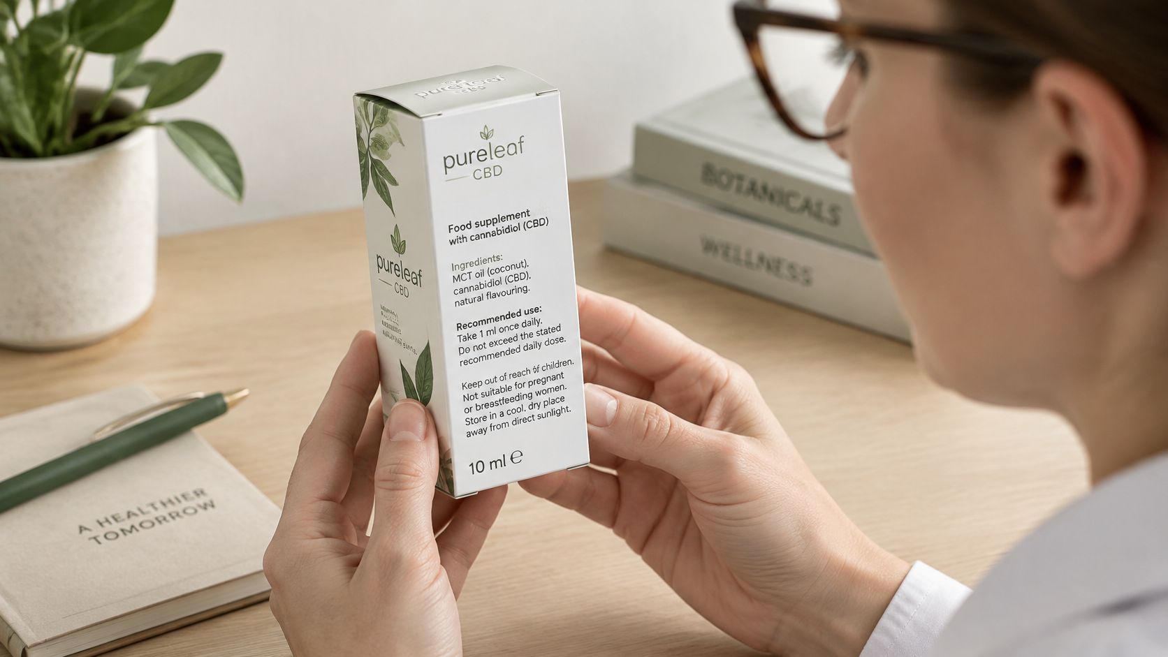
The 2018 federal legalization of hemp-derived products containing no more than 0.3% delta-9 THC by dry weight expanded the market without resolving the FDA questions, so a carton can carry product identity, net quantity, ingredients, directions, warnings, batch or lot information, and responsible-use language while staying silent on anything that implies the product diagnoses, treats, cures, or prevents disease. Several states layer their own warning and child-resistance rules on top, which is why navigating CBD packaging laws across different states belongs in the brief rather than in a legal review after print.
Build the Panel Like a Newspaper Front
Hierarchy first. Put the product name and variant in a clear band, place quantity and the warning where a hand doesn't cover them, and set the logo in the upper third of the front panel at a size that reads at arm's length. Required information gets the highest contrast on the box. Decoration goes wherever it doesn't compete.
That rules out dark-on-dark type, heavy texture behind small print, and a foil burst over the net quantity. Matte stock with high-contrast type usually reads better under store lighting than a glossy laminate with moody typography. Reserve spot UV, foil, and embossing for the areas outside the required-information band, and design the longest ingredient statement and the smallest carton at the same time.
If the warning only fits by shrinking the type below what a store requires, the box is too small, not the copy.
One Name per Variant, Used Everywhere
Readable information, distinct variant names, and consistent presentation make a package easier to understand, and decorative finishes should not obscure quantity, identity, or other approved information. That means one approved name for a variant, used identically on the carton, the product page, and the wholesale sheet. Ambiguity between a 750 mg and a 1500 mg SKU is a labeling defect with a marketing excuse.
One colour code per strength across the range lets a shopper tell variants apart at a glance without reading. Keep the system in editable source files, separate from published artwork, so a warning change doesn't reopen the whole line.
https://www.youtube.com/embed/EJJSFq8woOE
Choose Greener Specs That Still Comply
A carton that recycles beautifully and lets moisture into a gummy has improved nothing. New York's packaging, labeling and sustainability materials put child resistance, tamper evidence, and full enclosure forward as minimum requirements while also describing a 25% post-consumer recycled-content threshold for plastic packaging and sustainability plans built around reuse, recycling, and collection systems. Read those two halves together and the design problem appears: coatings, foil, mixed-material windows, adhesives, barrier films, tamper seals, and inserts make a box harder to recycle, and stripping them can let in moisture, weaken the board, or erase a warning.
Rank the Moves by Benefit, Not by Slogan
| Move | Main gain | What can fail | Use it when |
|---|---|---|---|
| Right-size the carton | Less fiber and freight | Too little room for warnings | The longest required statement still fits |
| Recycled-fiber outer board | Higher post-consumer content | Lower compression and mottled print | The barrier stays in the inner pack and ship tests pass |
| Drop the plastic window | Cleaner mill recycling | Lost product view | The primary container is already opaque |
| Removable tamper band | Board and plastic can be separated | Evidence lost or unclear | The opened pack still shows tampering |
| Refillable printed outer | Fewer cartons per year | Lot traceability and hygiene | The market allows reuse of that outer |
Take the top row that doesn't weaken the barrier or the certification file. Right-sizing buys the most per dollar because it cuts fiber and dimensional weight in the same move, but only after the longest warning and the smallest type have been checked on a real proof.
Recycled content belongs in the outer board, never in the barrier. Asking a recycled sheet to hold back oxygen is how a compliance win becomes a stability problem.
A mono-material carton without a plastic window recycles more cleanly when the product already sits in an opaque bottle, and a removable tamper band lets board and plastic separate at the curb, provided the evidence of opening stays obvious. Refillable printed outers only work where lot traceability and hygiene allow reuse of that outer, which is a market question before it's a design one.
Name the target state, its recovery infrastructure, any recycled-content requirement, and the end-of-life line before artwork and tooling. The broader shift toward sustainable packaging trends that consumer brands are being asked to document makes this an operational obligation rather than a badge, and holds off recycled-content claims on the carton until the spec behind them is written.
Prove One Pack Before You Scale the Line
Do not tool five SKUs from a sketch. Build one assembled proof of the hardest pack in the range, which is almost always the smallest carton carrying the longest warning and the most awkward closure. Check fit, seal clearance, the certification file, and whether the lot code survives the tuck. Then, and only then, copy the system outward to shorter names and larger counts.
The brief that gets you there is unglamorous. It lists dimensions, components, quantities, who owns the artwork, and the approval steps, and it treats that precision as part of credibility rather than paperwork. A studio that engineers and prints together can turn the brief into dielines drawn to production tolerances, 3D mockups, and a physical prototype before a production run, which is exactly what a range of cartons needs when one box changes and eight others inherit the change.
Mylarmen, a U.S. branding and packaging studio, develops pouches, cartons, boxes, sleeves, and inserts as one system, drawn against real production tolerances with 3D mockups and die-lines, and can ship the printed packaging to the filler. Those design conversations don't establish product safety or market authorization. The brand still owns its regulatory review of claims, channel, and state rules, and no dieline substitutes for that file.
If the proof holds, lock the specification and extend the colourways. If it fails a seal, a warning, or a child test, change the structure before any press date. One good master pack costs less than a range of cartons that can't be filled.
Start with the container you fill, and let the carton follow it. Mylarmen develops CBD packaging as a complete system, matching the box structure, insert, closure, and panel layout to the specific bottle, jar, pouch, or tin in your line, then proving the assembly with 3D mockups and a physical prototype before production. Bring your dimensions, a sample of the primary container, and the copy that has to fit, and visit Mylarmen to turn that brief into a spec your filler can run.
Generated with the Outrank app