

Search for advice on a packaging design mockup and you'll meet the same instruction in a dozen slightly different forms. Make it photorealistic. Light it like a studio shoot, add a soft contact shadow, drop the render into a shelf scene, and use it to sell the concept. That advice produces polished decks and expensive surprises.
Photoreal isn't the same as tested. A render won't tell you that the pouch flexes when it's filled, that the cap needs more torque than a customer's wrist will give it, or that the closure sits exactly where the front panel's curve begins. I'd rather see a taped board model with a hand-written label than a flawless render with no test behind it, because the model has answered something and the render has only answered whether the design looks nice.
The studios that get this right spend less on packaging, not more. They stop paying for high-resolution imagery of packs that were never going to seal, stack, or survive a shipping carton, and they put the budget into the two or three physical checks that decide the design.
Table of Contents
- Mockup Types and What Each One Proves
- Why a Mockup Is a Validation Tool, Not a Beauty Image
- Six-Gate Mockup Review From Brief to Launch Run
- Building Disposal and Recycling Details Into the Mockup
- Common Mockup Mistakes and How to Avoid Them
- Examples of Mockups Guiding Real Packaging Decisions
- Confirm Your Mockup Stage Before You Commit
Mockup Types and What Each One Proves
A packaging design mockup is a representation of a pack, either a digital render or a physical model, used to judge the design before artwork is printed or tooling is cut. The type of mockup should be chosen by the question you can't answer yet, not by how impressive it will look in a presentation.
Match the Mockup to the Open Question
Every mockup in a well-run project earns its place by closing a specific uncertainty. The table below is the version I'd hand a new designer in their first week.
| Mockup type | Question it answers | What it proves | What it cannot prove |
|---|---|---|---|
| Digital 3D render | Does the artwork hold up on shelf? | Brand recognition, hierarchy, approximate SKU differentiation | Grip, seal integrity, fit, opening force |
| Paper or board model | Are the proportions right? | Volume, proportion, scale against the product | Stiffness, closure behaviour |
| Weighted sample | Will the pack stand and tip correctly? | Stability and center of gravity | Print quality, material durability |
| Fit sample | Do inserts, lids and cartons clear? | Clearances, assembly steps, carton fit | Long-term seal performance |
| Representative material prototype | Does the substrate behave as intended? | Stiffness, texture, closure action | Transport abrasion and leakage under real distribution |
| Printed proof on real container | Does the artwork survive the real format? | Seams, curves, label placement, legibility | Color consistency across a full production run |
Read the last two columns together. A digital render is the right first instrument for hierarchy and shelf presence, and the wrong instrument for anything involving force, fit or a filling line. A printed proof on the container is the only way to see what a seam does to a word mark, and it still won't tell you whether the material scuffs in a distribution center.
Those checks carry weight well beyond aesthetics, because packaging is where a brand's material decisions turn into physical objects. The U.S. Environmental Protection Agency reported that containers and packaging generated approximately 82.2 million U.S. short tons of municipal solid waste in 2018, equal to 28.1% of total U.S. municipal solid-waste generation (EPA containers and packaging data). An extra layer, an oversized carton or a closure nobody can separate adds cost at the printer and volume in the waste stream, and all three are visible in a model long before they're visible in a quote.
A mockup review also does something a spec sheet can't. It puts the pack inside a shipping carton and shows how much air the brand is paying to move, which is a cost line and an environmental line at the same time.
Start with the cheapest mockup that answers the current question, and escalate only when the question changes. A board model costing a few hours of studio time settles proportion. A weighted sample settles whether the bottle tips. Neither is a step you skip to reach the render faster, because the render was never going to answer either question.
Why a Mockup Is a Validation Tool, Not a Beauty Image
A digital render is a film still. It's lit, framed, and shot from the one angle where nothing overlaps the logo. A physical prototype is a test drive, and it puts the pack under real hands in real conditions.
Put the two side by side and the difference in what they tell you is obvious.
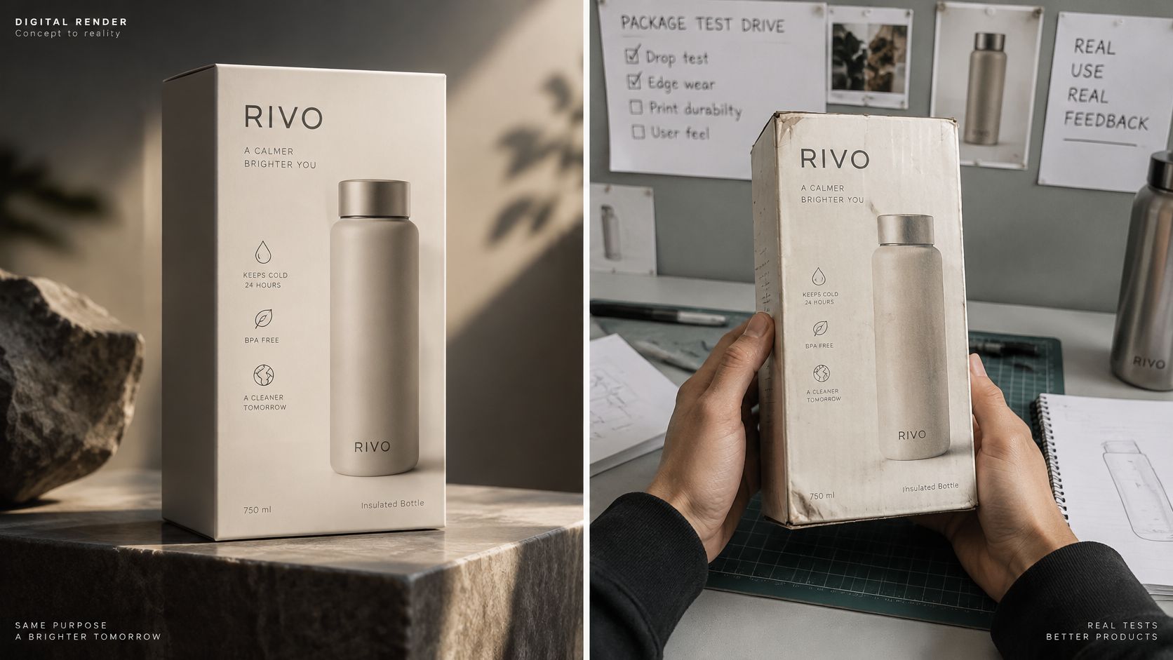
What a render is good for: brand recognition at three meters, visual hierarchy, shelf presence, and telling two SKUs apart when the only difference is a flavor band. Those are real questions, and a render answers them faster and more cheaply than any physical sample. Where it stops is equally clear. A digital render can't reliably confirm grip, opening force, seal integrity, fit, tipping, assembly sequence, abrasion, leakage or transport performance (Regulation (EU) 2025/40). None of that improves because the image has a nicer shadow.
That's why I work to an evidence standard rather than a beauty standard. Paper or board answers volume and proportion. A weighted sample answers stability. A fit sample answers clearances between insert, lid and carton. A representative material prototype answers stiffness, texture and how the closure feels in the hand. One attractive prototype is not proof of production readiness, and treating it as proof is how a team ends up defending a design that fails its first filling trial.
The EU's Packaging and Packaging Waste Regulation, adopted in January 2025, raises the cost of that mistake, because manufacturers must demonstrate compliance through technical documentation (the regulation text). A folder of persuasive renders doesn't close that requirement.
The most valuable mockup in a project is usually the least attractive one. A taped board model that collapses under a filled carton has just saved a tooling deposit.
Say a team approves a stand-up pouch from a render. The front panel looks balanced, the logo sits well, the net-weight statement is legible. Then a board model gets filled and stood on a shelf. The gusset opens wider than the die-line assumed, the front panel shifts, and the net-weight statement lands on the curve where nobody reads it. Cheap to find on a Tuesday afternoon. Expensive to find after plates are cut.
A staged review looks like this when it is done properly.
Our own projects run the same sequence, with detailed specifications and 3D mockups before production, precisely because the mockup exists to settle the specification rather than decorate it. When the format is a resealable pouch, the closure and the seal are the parts no render can test, so this guide to choosing resealable snack bags is a useful companion to the structural conversation.
The question to ask at the end of every concept review is narrow and slightly uncomfortable. Which question has this mockup answered?
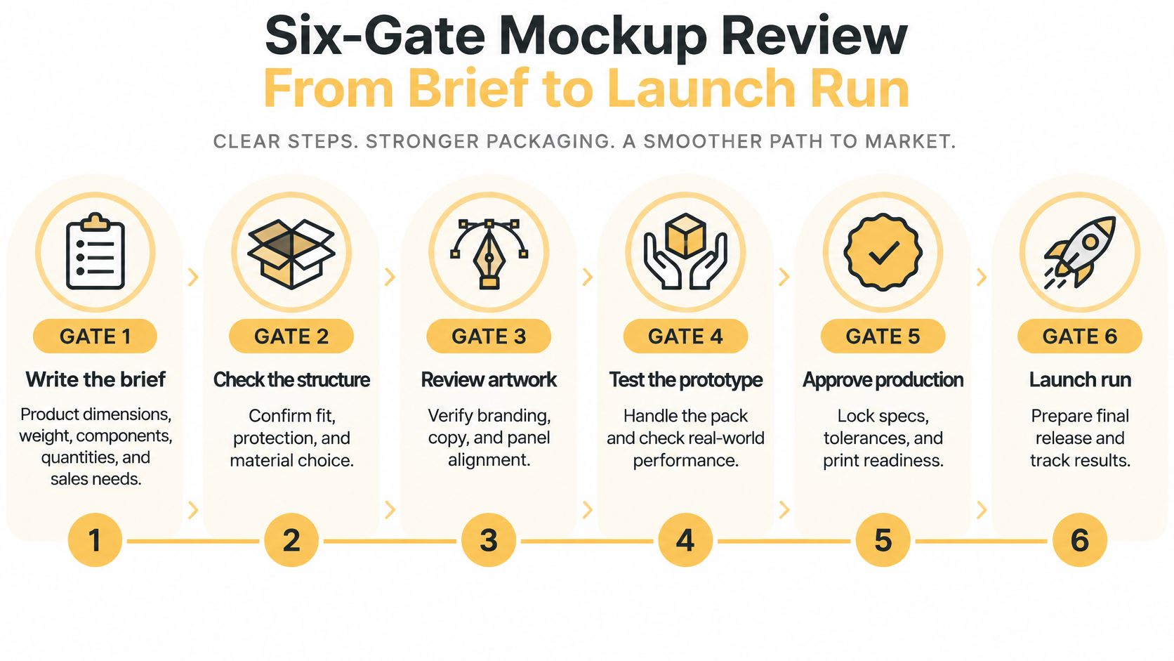
Six-Gate Mockup Review From Brief to Launch Run
Mockup review fails when it's a single approval meeting. It works when it's a sequence of gates, each one closing only when a specific piece of evidence exists.
- Write the brief. Product dimensions, weight, components, order quantities, sales channel and filling method. These set most of the structure before a designer opens a file, and a brief missing any of them produces a mockup that answers the wrong question.
- Build the 2D layout on the dieline. The artwork goes on the approved dieline, and folds, cuts and safe areas get checked there before anything is rendered. A flat file reviewed in isolation hides exactly the problems that cost money later.
- Make the digital mockup. Test hierarchy, legibility and shelf presence at thumbnail size and at arm's length. This is the stage where a render earns its keep.
- Build the physical sample that matches the open question. A weighted sample for stability, a fit sample for inserts and cartons, a representative material for stiffness and closure feel. One sample rarely answers more than one of these.
- Test the printed artwork on the actual container. Then check the smallest container and the longest product name before extending the range. The most common slip is artwork that looks fine flat and breaks at a seam.
- Log the decision and the open questions. Each gate should leave a record of what was approved, on what evidence, and what is still unresolved.
The six gates in one view:
| Review gate | Decision to approve | Evidence required | Manufacturer review |
|---|---|---|---|
| Concept | Brand direction and hierarchy | Digital render and 2D layout | No, internal review |
| Structure | Format, size and closure | Dimensioned die-line and fit sample | Yes, confirm tolerances |
| Artwork | Dieline placement, safe areas, folds | Artwork on approved dieline with fold checks | Yes, confirm print specifications |
| Pre-tooling | Tooling commitment | Physical prototype reviewed against product and carton | Yes, before tooling spend |
| Print proof | Color and finish | Printed proof on real container | Yes, at press check |
| Launch run | Full production release | Approved proof and checks on smaller and longer variants | Yes, before release |
The structure and pre-tooling gates are where the expensive failures concentrate. A structure error found after tooling means paying twice for the same die, and structural design includes reviewing a physical prototype before the final structure is committed to. Pre-tooling is also the gate where the pack gets checked against the actual product and the actual shipping carton, which is the moment a beautiful design meets a scoop that doesn't fit.
Gate rule: a gate closes when its evidence is on file, not when the meeting ends. Open caveats sit beside the gate and travel with the pack. They don't get deleted to make the timeline look tidy.
Manufacturer review belongs at four of the six gates, and skipping it at the structure gate is the most reliable way to break a schedule. The factory knows its tolerances, its plate specifications and what its equipment does to a thin board far better than a design studio does. Bringing them in at pre-tooling, once the spend is already committed, is the wrong end of the process. The wider sequence that surrounds these gates, from positioning through to print files, is set out in this guide to packaging design from concept to production.
Building Disposal and Recycling Details Into the Mockup
Sustainability mockups almost always look the same. Kraft board, matte texture, a little visible fiber, maybe a recycled-paper icon. They almost never show what a recycler or compliance reviewer needs, which is what the pack is made of and where each part of it goes.
In the EU that gap now has a legal edge. Regulation 2025/40 sets life-cycle environmental and labelling requirements, requires conformity information in technical documentation, and allows standardized digital data carriers such as QR codes to communicate the destination of separate packaging components (the regulation text). It also states that integrated components must be included when design-for-recycling and recycled-at-scale performance are assessed.
Annotate the Mockup, Not Just the Deck
The fix is a mockup sheet with the invisible decisions written on it, next to the render.
- Material layers. Board, liner, barrier coating, adhesive, and the order they sit in. A cross-section diagram costs an hour and answers the first question a recycler will ask.
- Separate components. Closure, label, sleeve, window, tamper band. Anything a consumer has to remove is a design decision, not a detail for the factory to resolve.
- Disposal route per component. Not one instruction for the whole pack. A lid that goes in the bin and a body that goes in the paper stream need two instructions, and the mockup is where they should appear first.
- Claim substantiation. Every green claim on the artwork tied to a test, a certificate or a material data sheet, with the reference noted beside it.
- Data carrier placement. If a QR code is doing the explaining, put it on a surface that survives handling. Not across a fold, not on a curved shoulder where the print distorts, not where a label will peel.
Take a kraft-look pouch with a laminate interior and a plastic closure. It photographs beautifully and it may be hard to recycle, because the layers can't be separated and the closure is a different polymer from the film. The look promised one thing and the construction delivered another, and no render was ever going to show the difference.
Marketing language and engineering must align, and the claims brands are making make that alignment more urgent. A roundup of sustainable packaging trends for consumer brands is a reasonable primer on which claims are being scrutinized. For beverage formats, where the pack carries most of the brand's environmental story, a sustainable beer packaging guide is worth reading beside the technical file.
The outcome is a mockup that doubles as a handoff document. Manufacturers get the layer stack and component list, compliance gets the references, and the brand gets a pack whose appearance matches its construction. It also stays adaptable, because the annotation layer is the part that changes when a market's labelling rules differ, not the design.
Common Mockup Mistakes and How to Avoid Them
The costliest mistake in packaging mockup work is treating a render as proof of production readiness. It's expensive because it converts a design opinion into a tooling commitment, and it usually surfaces at the press check or the first filling run, when the options are down to two and both are costly.
The environmental case for settling format early isn't abstract either. EPA data show U.S. plastic generation reached 35.7 million tons in 2018, 12.2% of all municipal solid waste, and containers and packaging were the largest plastic category at more than 14.5 million tons (EPA plastics data). Format-level choices, not just material-level ones, are where that volume gets set.
- Judging artwork flat. A file opened in a viewer has no seams, no curves and no cap. Fix: put the artwork on the container before sign-off, and use a printed proof in the actual format to catch issues.
- Extending from one size. One approved design pushed across a range without testing the smallest container and the longest name. Fix: build one representative assembled proof first, then check the small container, the long statement and the different physical formats.
- Skipping the carton and insert fit. A pack that looks right and won't ship. Fix: a fit sample with the insert, lid and shipping carton in the room at the same time.
- Letting the look outrun the claim. Kraft color and recycled-paper imagery on a laminate structure. Fix: a material cross-section on the mockup sheet, and no claim without its reference attached.
Pouches, caps and curved labels are where artwork fails most often, because each one bends the print surface. A seam through a word mark, a cap that crops a variant name, or a label that disappears around a shoulder are flat-file problems that only appear on the object.
Examples of Mockups Guiding Real Packaging Decisions
A supplement brand arrives with three flavors and two sizes, a 30-gram pouch and a 60-gram pouch, with a scoop tucked beside the pouch inside a retail carton. The 3D render looks coherent across all six combinations. The flat artwork check passes, because every file is legible on a screen.
Then three checks land in sequence, and each one catches a different failure.
The printed proof on the 60-gram pouch shows the longest flavor name wrapping onto the side seam, where the film overlaps itself during forming. The fit sample shows the scoop doesn't clear the carton lid once the 60-gram pouch is packed. The 30-gram front panel turns out to be too short for the compliance block once the panel is laid out at true scale, so the mandatory text either shrinks below the readable minimum or moves onto the back.
None of those three failures appear in the render, and all three would have been discovered after tooling if the render had been treated as approval.
A vape brand meets the same pattern in a different shape. The product route, whether that's a device, a pod or a disposable, has to be settled before the identity and packaging system are built, because each route brings different regulatory panels, different dimensions and a different component count. Reviewing all variants together, including the longest name and the smallest format, is the only way to see where the system breaks. Identity decisions made before the range is fixed tend to fail at exactly those two extremes.
A project where identity and packaging were built as one system rather than two handoffs is documented in the Elegant identity and packaging case study, and the difference shows up in how little the pack changes when it moves between formats.
The pattern holds across categories. The mockup that matters is the one that tests the riskiest variant, not the most attractive one.
Confirm Your Mockup Stage Before You Commit
The last decision isn't which mockup to build. It's which stage the pack is at, and what evidence the next commitment requires. You can answer that before you contact anyone.
For structural work, product measurements, weight and samples where they exist are the inputs that decide whether a mockup is even necessary yet. Add the component list (closure, insert, label, carton, secondary packaging), the order quantities, the sales channel, who owns the artwork, and the approval sequence with names against each gate. A precise brief covering dimensions, components, quantities, artwork responsibilities and approval steps is part of what makes a project credible, so it's worth an hour of preparation instead of a week of email guesses.
A good proposal states what's included and names the unresolved inputs without inventing outcomes. If a studio quotes a fixed structure before it has seen the product, that quote is a guess with a typeface on it.
Three actions close the loop. Name the open question in one sentence, choose the cheapest mockup that answers it, and schedule the manufacturer review at the gate where tooling or print spend starts. If the brief already contains those items, the conversation with a studio is short, and it's about the work rather than the missing information.
Mylarmen takes a brief with your product dimensions, components, quantities and approval steps and tells you which mockup stage the pack is at, then builds the render and the physical prototype against the same specification so nothing is lost between vendors. Structural design, die-lines, 3D mockups and prototype printing sit with one team, which is what keeps a validation check from turning into another handoff. Bring the project you already have in mind to Mylarmen and start with the question you can't answer yet.